Nature Photographers Network
This is the preserved archive of the original Nature Photographers Network. The community continues at naturephotographers.network.
Bougainvillea
‹ PreviousFlora GalleryNext ›

Bougainvillea

by Gary Yeoh

Gallery: FloraPosted June 12, 2011161 views18 comments
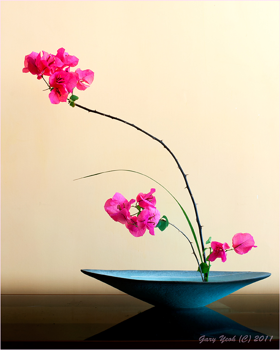
Have been studying Mapplethorpe's flower images over the weekend. Most of his images include the vase or container and colorful bg. Inspired by his images, I try to combine what I learn in Ikebana with flower portrait using the bougainvillea which i in full bloom from my terrace.

This post is actually taken after an earlier version which I have included below. My wife said that the original arrangement was a little top heavy and so I pruned some of the blooms in this one. The processing and framing are also different. In this one, the gradient is brighter at the top. The second post, the gradient is inverted with bright area near the base which is seen in many of Mapplethorpe's images. Would be interested to hear your views on the gradient.

BTW I am fascinated and pleased about how the bowl turned out in the images.

D90 50mmF1.4 F11 1.3sec tripod. I tried doing a stack but there were artifacts in the Helicon stack for some reason so this is a single shot.

Comments

18 comments
Comment posted by Gary Yeoh on June 12, 2011 at 6:29 AM
Original version.

D90 50mmF1.4 F11 1sec. Thanks for looking and C&C appreciated.
Registered on September 1, 2009, 588 Posts, 8184 Comments
Comment posted by scott lanz on June 12, 2011 at 8:32 AM
I really like this one, Gary. Very artistic. Maybe your best of these. I like the simple arrangement, the contrasting pink and blue, the BG, and, in particular, the reflection of the bowl on the table which stood out to me before reading your comments. I also like this one much beter than the earlier version because of the light, the BG gradient, and the more prominent bowl reflection.
Registered on November 14, 2003, 840 Posts, 12902 Comments
Comment posted by Pat Sampson on June 12, 2011 at 10:14 AM
Gary,

I'm not sure where to start. You've certainly captured Mapplethorpe's style - remarkably so, I think.

I prefer the first image in the vertical format. The arrangement in it seems better balanced to me and I like the more prominent shadow. I also prefer the lighter bg. So that's the one I'll critique.

Arrangement - beautifully balanced. I'm not sure about the leaf at the bottom that's blocking the base of the stems. I might consider moving it to the viewers right and giving it, it's own space. I'm also not sure about the leaf at the top. I might clone it out. Shapewise, I don't think this leaf adds anything. I love the S curve of the main stem and the echoes from the subordinate grass and smaller stem. I also like the position of the solid shapes in the image. I think what I like most about it, is the sense of tension against the grace of the lines. It reminds me of a system of lever springs. I like the arrangement a lot.

Container - love the shape and texture of it and the color is perfect for the blooms.

DOF - I wish you could have gotten the Helicon to work. Parts of the image seem soft to be but that may be the light. I'm not sure which.

BG - Love the table and the gradient. There might be a touch more color (pink/red/yellow) in the bg than I'd prefer but I'm not sure of that and for the most part, I think it's perfect. I'd probably spend hours fiddling with it and end up where you already are.

Table - I think the table is near perfect. I also like where you've positioned it in the frame. I suppose it could be a touch higher but I think this position says the image is about the blooms and not the bowl and its shadow.

Lighting - I love the strong shadow of the bowl as well as what appears to me to be a reflection of it on the table. I don't know that the quality of the light is plus for the image but I don't think it hurts it either. So I guess I'm saying I'm ok with it but it's not a strength of the image to my eye. It would be really interesting to me to see this exact still life done in a light box.

Mood - Serene and elegant but alive with a sense of energy provided by the tension in the lines and shapes of the blooms.

Overall Impression - I like it very much. I just expect that you'll get much better at this. Outstanding work.

pat
Registered on May 19, 2007, 953 Posts, 15989 Comments
Comment posted by Bob Duff on June 12, 2011 at 12:01 PM
Boy Gary you're a quick study. This image/arrangement is simply elegant and a joy to feast your eye upon. :toast:
The colour combo of the bougainvillea and bowl is perfect. The lines are great and the shadow on the table is a real plus.
Great job.

As another image one with no leaves and to only have a single bloom at the base follow by 3 blooms and the next branch up and then 5 blooms at the top might be one to consider.
Registered on April 21, 2010, 160 Posts, 1675 Comments
Comment posted by Ken Smith on June 12, 2011 at 12:17 PM
Decisively, the first version is superior. The table now is included in the composition and the vase softly lite looks better. Balance is improved and less empty space. You cleaned up the b/g smudges and I prefer the lighter tones. That vase and light on it excels. My only minor..minor nit...would be the top blooms that are underexposed compared to the lower ones...A little more filtered light (window off to the right?) would cure it, in my opinion. A wonderful shot!!
Registered on September 5, 2008, 449 Posts, 2444 Comments
Comment posted by Charlie Baugh on June 12, 2011 at 1:30 PM
This is so beautiful in all ways Gary. Without hesitation I chose the first image and the gradient is so subtle and soft, I just love this image. You apparently spent significant time with this arrangement and it shows. I couldn't begin to explain in detail as Pat is able to do so well, but hope my feeling of joy in this work comes across.
Registered on April 18, 2011, 329 Posts, 1985 Comments
Comment posted by Richard Teller on June 12, 2011 at 1:31 PM
Very simple and elegant image. Everything works very well together. I like this image better the the second one posted here. I think the reflection on the table really adds to the image.
Registered on August 23, 2010, 1162 Posts, 6692 Comments
Comment posted by Carol Hyman on June 12, 2011 at 2:34 PM
Gary, The bowl is gorgeous. I personally prefer the second image even though it's a little top-heavy. And I would have liked to see more gradient in the background, but that's a personal preference, and very much, up for grabs. I'm sure others feel differently.

Not sure why but the eye does go to the bowl. Perhaps an arrangement that is lower so the flowers are more prominent.

What you're attempting is not easy. Keep at it. Maybe the stack will work next time.

Cheers,

Carol

Cheers,

Carol
Registered on January 18, 2007, 597 Posts, 8062 Comments
Comment posted by Craig Strand on June 12, 2011 at 6:19 PM
Exquisite!
Registered on March 30, 2008, 416 Posts, 2885 Comments
Comment posted by Bill Fach on June 12, 2011 at 6:57 PM
Gary: This is FINE! I like the vertical orientation best. Everything about this one works for me from subject to comp to lighting. Superbly crafted image. >=))>
Registered on November 1, 2003, 1805 Posts, 26981 Comments
Comment posted by Ramamohan Pai on June 12, 2011 at 7:53 PM
I like the first posted version as well - a great example for less is more. I like the gradation in colors in the first posted version as well. There is a lot of information shared in this thread, which I will get to a bit later.
Registered on November 1, 2003, 550 Posts, 9037 Comments
Comment posted by Patricia Brundage on June 12, 2011 at 7:59 PM
The slight upward tilt at the top makes the difference for me (in the vertical image). I think the lighting is a little more even in the horizontal version. Both are very artistic and beautiful. Love this series of images, :wavey:
Registered on March 23, 2006, 1111 Posts, 6531 Comments
Comment posted by Gary Yeoh on June 13, 2011 at 2:24 AM
Thanks everyone for your comments. I really appreciate them - it so helpful to get feedback when trying something different.

Pat:
Your critique is so comprehensive and covers every aspect of the image, some I have not even consciously think about. It took me about 2 hours to put the arrangement together and it just looked 'right' to me. I left the leaves on the branches to make the arrangement more natural and to add color but I agree that they can easily be left out. The PP of this image is relatively straight forward compared to what I do with the Sampsonesque style. The thing I struggled with in the PP is the gradient and bg which I think can be improved on. The softness in parts of the flower is due mainly to the light. This was taken late afternoon with thick rain clouds and the setup is quite a way from the right windows.

Bob:
Trimming away fresh flowers sort of go against my instinct and I did resist the idea initially when my wife suggested it. I also remember my Ikebana teacher saying that trimming away flowers is a sign of maturity of the arranger. Trimming down to 1,3,5 may be the ultimate in minimalism and would probably work. I also wish that some of the flowers had opened and the white petals would probably help the image some.

Ken: Yes, the light is from the floor to ceiling window on the right. This was taken in our living room on the glass top coffee table which was placed against the supporting pilar which is about 15 feet from the window. I like the color on the pilar so I could not have moved closer to the window. The lighting improved about 1 hour after I finished shooting when the clouds parted. But by then, I was busy processing the images and did not retake. :frown:
Registered on September 1, 2009, 588 Posts, 8184 Comments
Comment posted by Brigitte Lorenz on June 13, 2011 at 9:29 AM
beautiful image, Gary...color, composition and wonderful light works great together...excellent example for less is more...I like this a lot ( prefer the original version )

Brigitte
Registered on January 10, 2009, 187 Posts, 1507 Comments
Comment posted by Albert Darmo on June 13, 2011 at 11:16 AM
Hi Gary :wavey: Always listen to your wife. she has exquisite taste. she picked you for a spouse :smile: The first arrangement is the winner. The balanced composition of lines and color are marvelous :toast:
Albert Darmo
Registered on November 25, 2008, 1386 Posts, 11978 Comments
Comment posted by Ian Wolfenden on June 13, 2011 at 11:23 AM
This is superb, Gary ! I prefer the first version, where the composition seems that much stronger and the reflection of the vase that much more effective. I also think the gradient better in the first - more subtle really. A wonderful image !
Registered on May 18, 2007, 1108 Posts, 7647 Comments
Comment posted by Giuseppe Guadagno on June 14, 2011 at 1:11 PM
Lovely image Gary. I agree with Pat, even if I think that some of his critics may be part of the Ikebana style. Only one thought: the light in some sepals of the flowers seem a bit too high washing the colors.
Take care.
Registered on February 3, 2007, 827 Posts, 5052 Comments
Comment posted by Larry Lynch on June 16, 2011 at 7:03 PM
What a beautiful, elegant presentation. Just exceptionally fine. I personally prefer the first one. :toast:
Registered on September 16, 2006, 773 Posts, 9940 Comments