Nature Photographers Network
This is the preserved archive of the original Nature Photographers Network. The community continues at naturephotographers.network.
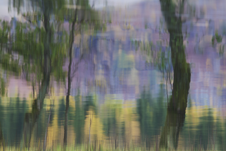
Monet (2 versions)
‹ PreviousLandscape GalleryNext ›

Monet (2 versions)

by Kah Kit Yoong

Gallery: LandscapePosted June 9, 2011329 views23 comments
Perthshire, SCOTLAND

A straight reflection shot. Would appreciate your opinions on which version you prefer.

Canon 5DMkII, 300mm 4L IS.

I pay tribute to three photographers who encourage me to try something different on my blog this week, one of whom is an NPN member.

’Pushing the Envelope’

Comments

23 comments
Comment posted by Kah Kit Yoong on June 9, 2011 at 8:22 AM
And the flipped version.
Registered on September 27, 2006, 636 Posts, 10682 Comments
Comment posted by Alister Benn on June 9, 2011 at 8:27 AM
As I said on your blog post, excellent image, and I feel the additional flip to make it "odd" add to its appeal.
Registered on June 9, 2011, 23 Posts, 258 Comments
Comment posted by Alister Benn on June 9, 2011 at 8:29 AM
Have you got you flips in the wrong order? The one at the top seems to me have been flipped with the grass reflections at the bottom. The second one (that you say is flipped) appears to me to be the traditional regular image with the grass at the top pointing down, like a true reflection? Now I am confused..
Registered on June 9, 2011, 23 Posts, 258 Comments
Comment posted by Kah Kit Yoong on June 9, 2011 at 8:41 AM
The one at the top is actually flipped so let's go with version 1 and 2. :wink: :wink:
Registered on September 27, 2006, 636 Posts, 10682 Comments
Comment posted by Bill Chambers on June 9, 2011 at 8:41 AM
I like the first version best for my tastes, but for some reason the color looks a bit flatter than on your website. Still, a wonderful design - very much like a Monet.
Registered on April 10, 2005, 753 Posts, 21216 Comments
Comment posted by Alister Benn on June 9, 2011 at 8:42 AM
Thanks for the clarification, sanity restored :-)
Registered on June 9, 2011, 23 Posts, 258 Comments
Comment posted by Mohammad Hosseini on June 9, 2011 at 8:49 AM
Hi Kah,
Nice to meet you.
I like the one on top. The second one I maybe would crop out the upside down grasses!!!
Isn't second one just 90 degree rotation of the fist one?
Anyhow, it is great to know that you have tried something different.
Registered on May 16, 2011, 15 Posts, 301 Comments
Comment posted by Harley Goldman on June 9, 2011 at 9:46 AM
Real sweet. Very Monet. I will take the one on top, door number 1. Very nice work.
Registered on November 19, 2003, 586 Posts, 11271 Comments
Comment posted by Eva McDermott on June 9, 2011 at 12:06 PM
I like the first post best Kah Kit. Very painterly, very Monet, very beautiful work! Wonderful mix of purples, yellows and greens.
Registered on January 4, 2009, 1015 Posts, 13229 Comments
Comment posted by Koveh Tavakkol on June 9, 2011 at 12:18 PM
The top version is beautiful!
Registered on September 1, 2009, 41 Posts, 608 Comments
Comment posted by Gary McGhee on June 9, 2011 at 1:17 PM
Definately the second one for me Kah, it's how I would have seen the scene had I been there. I think you could probably crank the saturation up a bit too for my tastes.

Cheers, Gary.
Registered on April 15, 2010, 142 Posts, 2416 Comments
Comment posted by Jack Graham on June 9, 2011 at 3:07 PM
Love #1----peaceful. beautiful work as usual.
jg
Registered on November 26, 2003, 158 Posts, 574 Comments
Comment posted by Jim Hackley on June 9, 2011 at 4:09 PM
The first image or top image, I like grass effect on the bottom vs the top of the image, well seen, very creative.
Registered on September 17, 2009, 302 Posts, 5535 Comments
Comment posted by John Williams on June 9, 2011 at 6:12 PM
Door number one for me as well Kah. Because I expect the photo to look more like the second post, the first is slightly disorienting, like a reflection of a reflection. This adds to the step away form crystal clear reality.
Registered on September 6, 2007, 221 Posts, 5985 Comments
Comment posted by Rodney Dugmore on June 9, 2011 at 6:35 PM
Yes the first is preferable to me too.
Graphically the composition isn't that strong IMHO.
I'm sort wanting to see a more complete representation of the tree.

Definitely a creative observation.
Registered on January 3, 2004, 76 Posts, 1028 Comments
Comment posted by Anthony Vincent on June 9, 2011 at 7:45 PM
Despite what one might think, reflections are actually quite difficult. All the ingredients must come together in order for maximum impact. Color, light, composition, and shutter speed are vital here. You managed some splendid color and sharpness.
The purples make the shot though. Mind asking what is reflecting to create that soft purplish color?

Great vision and execution
Registered on February 5, 2009, 199 Posts, 2775 Comments
Comment posted by Morris McClung on June 9, 2011 at 9:07 PM
I prefer #2. Both are beautiful impressions of nature. Excellent work, Kah!
Registered on May 7, 2007, 670 Posts, 19650 Comments
Comment posted by Kah Kit Yoong on June 10, 2011 at 2:24 AM
Anthony, the I think it's reflected stripped birch trees that cause the purple colour. The hills are covered in intense purples which are reflected. You can get a better idea from this other photo from the same spot.
http://www.naturephotographers.net/imagecritique/ic.cgi?a=vp&pr=160123&CGISESSID=59a98c3a0fb0c318a0952a6a9de5713d&u=30582
Registered on September 27, 2006, 636 Posts, 10682 Comments
Comment posted by Mark Seaver on June 10, 2011 at 10:00 AM
I vote for #1. Your title is right on the money. The reflections are lovely and the scene is very soothing.
Registered on January 23, 2011, 1103 Posts, 17270 Comments
Comment posted by Hamed Musharbak on June 10, 2011 at 10:01 AM
very very artistic :toast: :toast:
Registered on June 1, 2009, 372 Posts, 2282 Comments
Comment posted by Anil Rao on June 10, 2011 at 11:40 AM
Very nice, Kah. I love the mysterious and dreamy quality.

Of the two versions, I prefer the first.
Registered on November 15, 2003, 234 Posts, 4923 Comments
Comment posted by Nick Bristol on June 10, 2011 at 1:26 PM
Very nice Kah. I really like the feel of this and enjoy the colors very much. Great reflection shot. I like 2 the best.

Nick Bristol
Lone Rock, WI
Registered on February 1, 2004, 752 Posts, 14140 Comments
Comment posted by David Edwards on June 11, 2011 at 6:59 PM
A beautiful abstract, Kah Kit, and it's great to see you're trying new things. I love the painted texture to the image and it's soft color. I prefer the original post (1st version) as it looks like an abstract painting of some trees by the water, whereas the repost (2nd version) looks like a painting of the water reflections themselves, and more like an image that has been purposely inverted (although I know it's the other way around). Perception is an interesting thing. Beautiful work.
Registered on December 6, 2008, 142 Posts, 2623 Comments