Gallery: LandscapePosted June 3, 201193 views7 comments
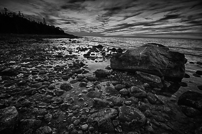
This was taken on the shore of lake Michigan near Mackinaw City. I didn't have my split ND filter so this is a composite for sky and fore ground. Then a b/w conversion was applied.
7D
10mm
f22
1/4,1/15
iso 500
Comments
7 comments
Comment posted by Stan Rose on June 3, 2011 at 10:18 PM
The scene has a lot of potential--all the nice reflections and such--but the processing needs some work. The sky looks kind of 'pasty' looking and the whole scene looks possibly oversharpened given the haloes around the rocks. A little more detail in the shadows would also help i think.
Registered on September 15, 2005, 836 Posts, 17099 Comments
Comment posted by Hamed Musharbak on June 4, 2011 at 9:39 AM
very good comp Todd, but the shadow in this scene killed the highlight a bit, this image needs a more highlight in some area and im agree with Stan
Thanks for sharing
Registered on June 1, 2009, 372 Posts, 2282 Comments
Comment posted by Todd Bielby on June 4, 2011 at 12:50 PM
Better?
Registered on March 10, 2011, 169 Posts, 392 Comments
Comment posted by Rodney Dugmore on June 4, 2011 at 5:58 PM
Todd this is nice.
I think the repost has better tonality but as presented the resizing has really killed the detail and clarity,
Nice.
Registered on January 3, 2004, 76 Posts, 1028 Comments
Comment posted by David Edwards on June 4, 2011 at 6:29 PM
I very much like your comp here, Todd. I like your low angle and use of the wide-angle to accentuate the spreading of the sky and fg rocks. The main rock is countered nicely with the trees on the left and everything looks nicely balanced to me. The scene also looks great in b/w, however the contrast seems very strong to me, particularly in the land section where the image looks very "gritty". The repost has increased the contrast even further, which I don't think has helped. Perhaps starting with a much lower contrast image and building up the mid-tone contrast slowly (and locally) would maintain some shadow detail while still producing punch in the image imho. Just my suggestion.
Registered on December 6, 2008, 142 Posts, 2623 Comments
Comment posted by Stan Rose on June 5, 2011 at 8:49 PM
I agree with David--the brightness of the repost is defintiely better, but it still has that 'gritty' looks as David puts it. Its hard to diagnose without knowing exactly how this was worked up--probably should start from the original.
Registered on September 15, 2005, 836 Posts, 17099 Comments
Comment posted by Todd Bielby on June 5, 2011 at 8:56 PM
Yeah thanks Stan and David I will take it back to the drawing board. When I finished with it I didn't like the grittiness either. Maybe that's why I left it darker. Maybe I could take into lightroom and reduce the clarity slider. Not sure, I will have to play with it some more because I really like the drama and comp of the scenery. Thanks for taking the time to give your input.
Registered on March 10, 2011, 169 Posts, 392 Comments

Comments
7 commentsThanks for sharing
I think the repost has better tonality but as presented the resizing has really killed the detail and clarity,
Nice.