Nature Photographers Network
This is the preserved archive of the original Nature Photographers Network. The community continues at naturephotographers.network.
Ruckel Creek, take 2
‹ PreviousLandscape GalleryNext ›

Ruckel Creek, take 2

by Daniel Rappaport

Gallery: LandscapePosted June 1, 2011193 views13 comments
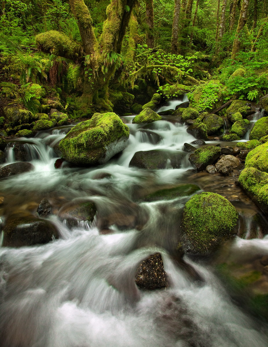
On my first from this spot I did everything to narrow my presentation and simplify. This is perhaps over the top too much stuff, but I love it.
Canon 5D Mk2, 24-105mm 4L at 24mm
Polarizer
iso 320, f16, composite for DOF and shadow detail, 0.5sec to 2sec.
Since this is about detail, the larger version is better.

Comments

13 comments
Comment posted by Stuart Williams on June 1, 2011 at 2:23 AM
very good - but following on the heels of your previous image, this will provoke comparisons with that. There, the composition was perfect, here slightly less so but all the other qualities of the previous image (motion, glow) remain strong.
Registered on December 7, 2007, 247 Posts, 4792 Comments
Comment posted by Kah Kit Yoong on June 1, 2011 at 4:20 AM
Probably not quite as good as the last one which this is pretty damned fine too. Everything flows and fits together very nicely.
Registered on September 27, 2006, 636 Posts, 10682 Comments
Comment posted by Harry Lichtman on June 1, 2011 at 7:16 AM
Another dramatic view. I think a small crop off the bottom would keep the eye in the image a bit more. Also, there seems to be a greenish/yellow color cast to the water which I might try to selectively correct. It looks like many terrific compositions are available from this one bend in the stream.
Registered on September 17, 2010, 304 Posts, 3507 Comments
Comment posted by Gary McGhee on June 1, 2011 at 7:18 AM
Both are nice Daniel but I prefer this one, the larger foreground has increased the depth of the shot which I like. You certainly succeeded in the details.

Gary.
Registered on April 15, 2010, 142 Posts, 2416 Comments
Comment posted by Matt Anderson on June 1, 2011 at 8:56 AM
I like it.
Beautiful intimate scene.
Registered on September 6, 2007, 346 Posts, 2696 Comments
Comment posted by Jack Garrett on June 1, 2011 at 9:30 AM
I absolutely love it! Great comp, color an flow treatment. I do agree with cutting off just a bit of the bottom...just below the first rock.
Registered on November 7, 2007, 41 Posts, 251 Comments
Comment posted by Nicolaus Wegner on June 1, 2011 at 9:49 AM
I prefer wider views so this fits my tastes very well compared to your previous post. Nothing wrong with the last one either, but this one gives all that stuff room to breathe.

Never get tired of seeing shots from these places...amazing greens.
Registered on February 21, 2010, 133 Posts, 1509 Comments
Comment posted by Harley Goldman on June 1, 2011 at 10:26 AM
Great view of the rain forest? I like this a lot. I don't think I saw the other one, so no need to compare. This turned out very well. I would agree with Harry's slight crop suggestion, but that is small taters. Good work.
Registered on November 19, 2003, 586 Posts, 11271 Comments
Comment posted by Mike Ryan on June 1, 2011 at 10:32 AM
Looks great Daniel. Nice work with the blend to control the light. I will agree with the crop and the adjustment to the greenish color cast in the background portion of the water. Minor stuff though. Good work!
Registered on June 29, 2008, 85 Posts, 636 Comments
Comment posted by Phil Pogledich on June 1, 2011 at 1:02 PM
Gorgeous shot . . . definitely my favorite between the two you've posted from this location. I'd agree with the suggestion of a small crop off the bottom.
Registered on August 24, 2009, 123 Posts, 3099 Comments
Comment posted by Lon Overacker on June 1, 2011 at 1:20 PM
Daniel,

Even though I failed to comment on your previous take from here, I think this image is stronger even though I think they come across quite a bit differently. The previous is darker (mood as well as brightness,) more compact, where as this image here seems to flow freely, it's more open - and for that I really like this one. This is beautifully composed and the greens are vibrant, as they should be here (and not over the top IMO.) The only observation I have is that the color balance in the water changes from the lower teir through to the middle in the water specifically. The middle portion has a bit of a green tint to it (not surprising given the surroundings) which is different than a more neutral cast in the lower section of the water. There is also a bit of green fringing in the lower submerged rock just where the water turns white, falling off the rock.

Very minor, but if you plan on printing this - and you should!, you might consider shaving off a very little bit from the left to remove the little cascade of white on the frames edge, in the lower half, left side edge. No biggie, but either I want to see all of that little cascade, or none.

I'm only getting real nitpicky here because I think this is a beautiful image and worth the extra little tweaks for an awesome print.

Lon
Registered on November 24, 2006, 521 Posts, 19147 Comments
Comment posted by Mark Pelton on June 1, 2011 at 8:09 PM
Very nice, but I actually like a rectangular crop of the top of the image. To me, the top of the image is much more appealing, plus I prefer the horizontal view. I love the maple leaning across the stream.
Registered on November 25, 2003, 380 Posts, 4647 Comments
Comment posted by David Edwards on June 2, 2011 at 7:50 PM
I agree with Lon that this image has a brighter and more cheerful mood than your previous shot. I also prefer this one due to the two main mossy rocks that lead the eye towards the main tree in the upper left, however I may try a crop with a little off the bottom to below the first rock. This is an amazing scene, beautifully captured.
Registered on December 6, 2008, 142 Posts, 2623 Comments