Nature Photographers Network
This is the preserved archive of the original Nature Photographers Network. The community continues at naturephotographers.network.
Curves + REPOST
‹ PreviousFlora GalleryNext ›

Curves + REPOST

by Steve Kennedy

Gallery: FloraPosted May 20, 2011150 views20 comments
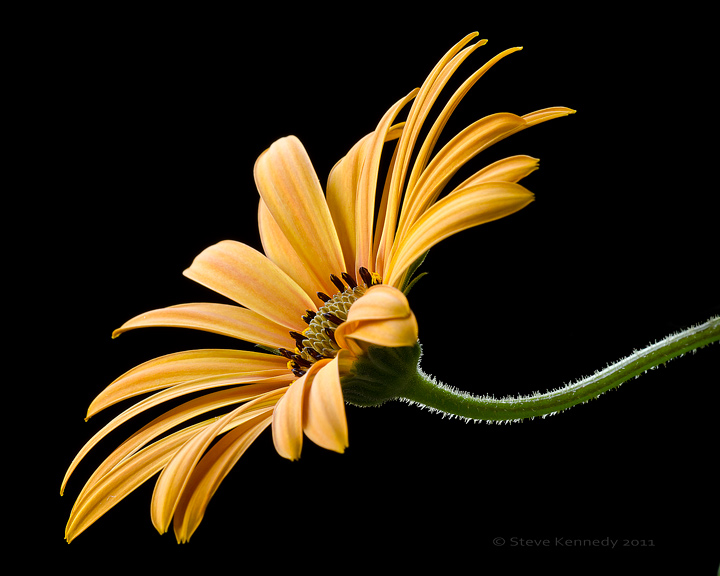
I was playing in the garden this afternoon and liked the curves in this stem. I used a black terry-cloth towel for a background to help highlight the stem and the light orange color of the bloom.

D7000
150 mm macro
f22
1 second
ISO 200
tripod
All natural lighting

I did clone out a distracting leaf and cropped slightly.

All comments welcome.

Comments

20 comments
Comment posted by Gary Yeoh on May 20, 2011 at 3:16 AM
Steve:
The curve stem and the cilia together with the great DOF real make image sing. The black bg make the flower pops. Well done.
Registered on September 1, 2009, 588 Posts, 8184 Comments
Comment posted by Pat Sampson on May 20, 2011 at 8:49 AM
Beautifully done Steve. Great lines throughout the image and excellent detail as well. I think your bg worked extremely well here also. Very fine work for my tastes. if you wanted, you could also rotate this 90 degrees clockwise and have an alternative aspect ratio if you needed it. It's elegant though regardless of the orientation.

pat
Registered on May 19, 2007, 953 Posts, 15989 Comments
Comment posted by mark cillo on May 20, 2011 at 9:43 AM
Wow! This is outstanding! The lighting is perfect and the black BG really works here. :wavey:
Registered on July 27, 2008, 143 Posts, 1483 Comments
Comment posted by David W. Kelly on May 20, 2011 at 10:11 AM
Beautiful comp and processing Steve. I love the curve of the stem and it's detail. :toast:
Registered on October 7, 2005, 883 Posts, 6590 Comments
Comment posted by Walt Sterneman on May 20, 2011 at 10:50 AM
This is very nice Steve. You have handled the light quite well. I really like the color with the black BG.
Registered on March 24, 2010, 73 Posts, 1268 Comments
Comment posted by Bob Duff on May 20, 2011 at 10:52 AM
Great light and a sweepingly elegant comp. Excellent.
Registered on April 21, 2010, 160 Posts, 1675 Comments
Comment posted by Jeremy Week on May 20, 2011 at 10:54 AM
Wow!! Perfect comp and DOF along with wonderful color. :toast:
Registered on February 19, 2007, 62 Posts, 394 Comments
Comment posted by Steve Kennedy on May 20, 2011 at 12:42 PM
Thank you for the nice comments everyone. Pat, an interesting suggestion and I like the result. Thanks!
Registered on March 9, 2009, 79 Posts, 676 Comments
Comment posted by Bill Fach on May 20, 2011 at 1:22 PM
Steve: I'll have one of each. Fantastic capture no matter the orientation. I may give a slight nod to the vertical since I seem to have a natural bias for vertical comps. Really nicely done.>=))>
Registered on November 1, 2003, 1805 Posts, 26981 Comments
Comment posted by Nathan Buck on May 20, 2011 at 6:16 PM
This is wonderful Steve! I love the sharpness. The color is nice too. The repost works better for me. Great shot all around!

Nathan
Registered on November 1, 2003, 1101 Posts, 13589 Comments
Comment posted by scott lanz on May 20, 2011 at 6:22 PM
:toast: for the repost.
Registered on November 14, 2003, 840 Posts, 12902 Comments
Comment posted by Jeff Loomis on May 20, 2011 at 6:59 PM
I'll add another vote for the repost. Both are fantastic, but I guess the vertical seems more like we're used to.
Registered on January 26, 2010, 68 Posts, 719 Comments
Comment posted by Anne K. Rusk on May 20, 2011 at 9:57 PM
This is wonderfully simple (not to do, but to appreciate!) and stunning. It is crisp, bold, and balanced. I love this forum for opening my eye to ideas like the rotation. I wouldn't have thought this image could get any better, but the rotation really blows me away! Great job, Steve!
Registered on October 10, 2010, 65 Posts, 904 Comments
Comment posted by Ken Smith on May 21, 2011 at 2:37 AM
Man ...this is the perfect pov and perfect lighting to make those hairs electric! You pushed the limits of one frame to get that dof for a 150mm macro. Well done!
Registered on September 5, 2008, 449 Posts, 2444 Comments
Comment posted by Pat Sampson on May 21, 2011 at 7:36 AM
I think the original is a bit more unusual Steve but the re-post, for whatever reason, seems to have a bit more impact to me. You could certainly present it either way. Again, a very fine image.

pat
Registered on May 19, 2007, 953 Posts, 15989 Comments
Comment posted by Ian Wolfenden on May 21, 2011 at 7:44 AM
Beautifully lit and composed, Steve. It works for me either way - but perhaps the portrait version is the stronger. The detail in the centre is the highlight of a very fine image.
Registered on May 18, 2007, 1108 Posts, 7647 Comments
Comment posted by Bruce King on May 21, 2011 at 9:30 AM
Nice work Steve. I really like the composition of the original. It's just different enough to be a real eye-catcher and it holds my interest well. Good choice of bg and the processing is spot on. Well done.
Registered on January 14, 2010, 276 Posts, 2212 Comments
Comment posted by Albert Darmo on May 21, 2011 at 10:27 PM
Hi Steve :wavey: Pat said it all :toast:
Albert Darmo. Canada
Registered on November 25, 2008, 1386 Posts, 11978 Comments
Comment posted by Bernie Kasper on May 23, 2011 at 8:56 PM
Either one is a piece of art to me Steve, well done !!

:toast:
Registered on June 5, 2005, 251 Posts, 3734 Comments
Comment posted by Patricia Brundage on May 25, 2011 at 6:56 AM
The curve, flower, dof and placement in both images are outstanding. Terrific image! :toast:
Registered on March 23, 2006, 1111 Posts, 6531 Comments