Gallery: FloraPosted May 14, 201191 views8 comments
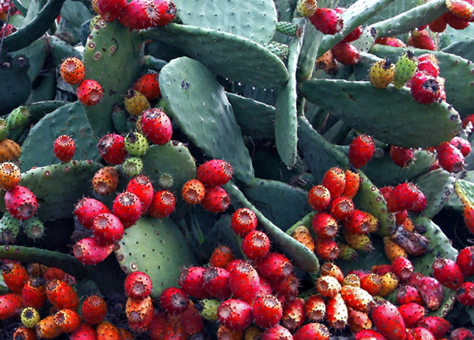
Taken with a Canon 30D, f 7.1, 1/100.
Comments
8 comments
Comment posted by Bob&Charly Nelson on May 14, 2011 at 4:04 PM
I see a ton of different ideas here Lucy. As this is, to my untrained eye, this strikes me as a little too busy with no set point of interest. I might return to try some isolated berries. I really interesting plant for sure.
Registered on October 27, 2005, 289 Posts, 4202 Comments
Comment posted by Pat Sampson on May 14, 2011 at 4:21 PM
I like the color and detail in this a lot Lucy. Compositionally, my tastes tend towards more structure. You have patterns of circles and ellipses throughout the image but I don't really find any one place to rest my eye. So I agree with Bob.
I think this is the first time I've commented on one of your images, so welcome to the gallery. This is a neat subject and very interesting. I hope you'll post more in Flora.
pat
Registered on May 19, 2007, 953 Posts, 15989 Comments
Comment posted by Ian Wolfenden on May 15, 2011 at 4:42 PM
I love the colours and textures here, Lucy, and the lighting. Like others, I might prefer either a major feature to focus on, or a stronger sense of pattern if you want to avoid that. It's an appealing image in any case - hope to see more from you.
Registered on May 18, 2007, 1108 Posts, 7647 Comments
Comment posted by Bill Fach on May 15, 2011 at 7:33 PM
Lucy: Welcome to the finest Flora gallery on the planet and thanks for a fine first post here. This is close for me but I do see what the others have mentioned. I do see a slight cyan color cast and would counsel a little warming up. For me the most interesting part of the image is the lower 2/3 with the high concentration of buds. Simply cropping from the top about 1/3 of the way down makes this more compelling IMO. Nicely seen. >=))>
Registered on November 1, 2003, 1805 Posts, 26981 Comments
Comment posted by Mark Seaver on May 15, 2011 at 8:26 PM
I find these "abstract" compositions to be the most challenging. When there really isn't a main point of interest and subsidiary elements it's hard to keep a viewer's eyes from roaming to rapidly. I agree with Bill that the lower part with all the buds is the strongest part. If you crop the top 1/4, you'll get a triangle of buds on the left side. That might help. What you've got here is a good idea and the processing looks fine.
Registered on January 23, 2011, 1103 Posts, 17270 Comments
Comment posted by Lucy Aron on May 15, 2011 at 8:51 PM
Thanks everyone for the thoughtful feedback. I'll play with the suggestions, esp since there seems to be general agreement about the cropping. And yes, Bill, I did run a blue though not cyan filter on the leaves. They looked too yellow-green what with the bright sun. Likely could've ratcheted it down a tad.
Not sure, Mark, what you mean about "triangle of buds" on the left side. Might you clarify?
lucy
Registered on February 25, 2011, 189 Posts, 1160 Comments
Comment posted by Bill Fach on May 16, 2011 at 9:22 PM
Lucy: Not sure if Mark will revisit this but I've drawn a rough outline of what I think he was talking about and also did a crop. As for the color cast this looks better on my monitor at home. I saw it the first time on my laptop. Keep 'em coming. >=))>
Registered on November 1, 2003, 1805 Posts, 26981 Comments
Comment posted by Lucy Aron on May 17, 2011 at 10:34 AM
Thanks for taking the time Bill. I shoot a lot of leaves without flowers so tend to focus quite a bit on them. But yes I agree the crop here is better.
lucy
Registered on February 25, 2011, 189 Posts, 1160 Comments

Comments
8 commentsI think this is the first time I've commented on one of your images, so welcome to the gallery. This is a neat subject and very interesting. I hope you'll post more in Flora.
pat
Not sure, Mark, what you mean about "triangle of buds" on the left side. Might you clarify?
lucy
lucy