Nature Photographers Network
This is the preserved archive of the original Nature Photographers Network. The community continues at naturephotographers.network.
"Propagation of Light"
‹ PreviousLandscape GalleryNext ›

"Propagation of Light"

by James Fougère

Gallery: LandscapePosted May 14, 2011502 views47 comments
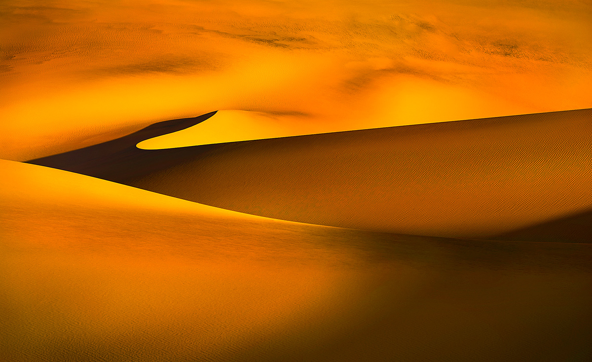
I do very much appreciate all the feedback from my last Mesquite Sand Dune image. I was able to realize that focusing the composition on the curves and lines of the dune was the best presentation :smile:

Here is another image I did take with a telephoto lens from the same sunrise shoot at the Death Valley dunes. I sure hustled all over those dunes, and glad I did, because as you move around, coupled with the changing light from sunrise, opportunities show themselves.

The larger presentation included does show more detail in this scene.

Please all comments are always welcome. Thank you for taking the time to have a look :biggrin:

Nikon 3Ds, 70-200 f2.8, ISO100, f8, 1/60, single image

Comments

47 comments
Comment posted by Adam Gibbs on May 14, 2011 at 1:42 AM
James! Very cool indeed. I really like your abstract approach.
Registered on November 1, 2003, 168 Posts, 870 Comments
Comment posted by Scott Smorra on May 14, 2011 at 1:46 AM
This is very nice James. The colors and lighting are exceptional. I really like those tiny ripples in the sand which are visible in the larger version. I bet this would look great as a large print.
Registered on November 2, 2009, 161 Posts, 2143 Comments
Comment posted by James Fougère on May 14, 2011 at 1:52 AM
Adam, I appreciate the comment, especially coming from you who has exceptional abstract images in your portfolio.

Scott, I would agree, I have a 30" display, and it looks clear, with great detail. I am looking forward to printing it BIG when my printer arrives in early June

Thanks guys
Registered on October 25, 2010, 41 Posts, 831 Comments
Comment posted by Vance Gese on May 14, 2011 at 2:37 AM
James, this is truly one phenomenal image. The sharp lines, the textures, the shadows and that gorgeous color make this a stunning dune image. That one ridge looks as though it disappears into infinity. Amazing.
Registered on November 13, 2008, 298 Posts, 6629 Comments
Comment posted by R.Bill Moser on May 14, 2011 at 2:42 AM
I like the abstract quality.....love the lines and texture and the warm tones. Awesome :toast:
Registered on January 29, 2010, 285 Posts, 4281 Comments
Comment posted by Scott Miller on May 14, 2011 at 2:42 AM
Shadows and lines and texture, oh my! Looks great to me
Registered on May 9, 2011, 23 Posts, 322 Comments
Comment posted by Stefan Gimpl on May 14, 2011 at 4:12 AM
The details and colors in this one are superb. great image :toast:
Registered on May 12, 2007, 26 Posts, 184 Comments
Comment posted by Jorne de Bruin on May 14, 2011 at 4:30 AM
Wonderfull composition, details and colours. Gotta love sand dunes! :wavey:
Registered on June 26, 2008, 178 Posts, 2136 Comments
Comment posted by Des Ong on May 14, 2011 at 8:06 AM
This is just great James but I find the saturation a bit too much.
Registered on July 12, 2007, 23 Posts, 234 Comments
Comment posted by Keith Bauer on May 14, 2011 at 9:13 AM
This is simply mesmerizing!! Too cool The flow of the lines,the ethereal qualities, the mood, the light... This one REALLY grabs my attention. Superb :smile:
Registered on November 20, 2003, 458 Posts, 4836 Comments
Comment posted by James Fougère on May 14, 2011 at 9:46 AM
Vance, your description of my image is exactly how I see this abstract, I am glad you like it :)

Des Ong
In regards to saturation, my guess is that you are using Micosoft Explorer, or Google Chrome as a web browser. I use MAC Safari, which uses the embedded color profiles from any image. I see this image exactly as it looked in PS, while using "MS windows jpg viewer", or Safari. But some other web browsers and jpg viewing tools, do not use the profiles, and in the case with images like this one that has red in it, the reds get saturated. I have learned recently that it is better to process an image with the calibrated monitor profile for web images, and save them with out a color profile for web, this way everyone will see the same image :biggrin:

It is unfortunate that all browsers are not using the embedded color profile like Safari does, it would be better for all of us on NPN!
Registered on October 25, 2010, 41 Posts, 831 Comments
Comment posted by Paul Wegemann on May 14, 2011 at 12:10 PM
This is incredible! I love your interpretation of the dunes. Did you get sand in your gear?
Registered on December 14, 2006, 58 Posts, 1888 Comments
Comment posted by Bruce King on May 14, 2011 at 12:13 PM
Spectacular image James. The lines, awesome color and the way the dunes fade to infinity make this one very special. Absolute magic. :toast:
Registered on January 14, 2010, 276 Posts, 2212 Comments
Comment posted by Fabio Giarrizzo on May 14, 2011 at 12:15 PM
Beautiful lines and gorgeous light- Great eye, Fabio
Registered on December 3, 2010, 90 Posts, 1614 Comments
Comment posted by James Fougère on May 14, 2011 at 12:23 PM
Paul - the wind had died out by morning for this opportunity, so sand in my gear was not to much of an issue :wink:

Thanks for the comments !
Registered on October 25, 2010, 41 Posts, 831 Comments
Comment posted by Dietrich Gloger on May 14, 2011 at 12:25 PM
Absolutely stunning! Amazing glow and I love the very graphic and effective composition. Excellent work!
Registered on January 26, 2007, 360 Posts, 9876 Comments
Comment posted by Bill Chambers on May 14, 2011 at 1:29 PM
This is really impressive James! The light, the shapes, the tones, colors, everything just comes together perfectly. One of the strongest images I've seen in a good while! True art!
Registered on April 10, 2005, 753 Posts, 21216 Comments
Comment posted by Kyle L. Krause on May 14, 2011 at 1:38 PM
Wonderful shot James, stunning light and composition. The distant dunes had me fooled; I thought it was the sky with some crazy colors. Great work!
Registered on June 15, 2010, 29 Posts, 605 Comments
Comment posted by dean hebert on May 14, 2011 at 2:21 PM
Lines, tones,detail. Love it! :toast:
Registered on August 4, 2010, 70 Posts, 1132 Comments
Comment posted by Phil Pogledich on May 14, 2011 at 2:30 PM
This is pure magic! Fantastic shot.
Registered on August 24, 2009, 123 Posts, 3099 Comments
Comment posted by James Fougère on May 14, 2011 at 5:49 PM
Thanks again for all the positive feedback!! I expected some nits or cropping advice!
Registered on October 25, 2010, 41 Posts, 831 Comments
Comment posted by Tony Kuyper on May 14, 2011 at 6:11 PM
The color and light here are almost surreal. The texureless lighter yellow areas are hard for me to understand, but their color works perfectly with the rest of the scene. I really like the abstract quality of this punctuated by just the dune edges.
Registered on November 1, 2003, 364 Posts, 22328 Comments
Comment posted by James Fougère on May 14, 2011 at 7:05 PM
Tony - . As for the lack detail in the light yellow sections of the dunes where the rising sun was directly hitting the dunes, I pushed the highlights to accentuate these sections of the image. If you look at this image at full size, there is detail everywhere :smile: I knew that this capture was going to be unusual and in abstract in nature. So I decided to take this image into the realm of the surreal. I guess I applied my own interpretation of what I had seen that day with a digital canvas at my disposal. I am hoping to print this image really BIG for my gallery.

Thanks for the comment.
Registered on October 25, 2010, 41 Posts, 831 Comments
Comment posted by Guy Tal on May 14, 2011 at 7:57 PM
Incredible image, James. One of the best dune renditions I have seen. Excellent composition and processing.

Guy
Registered on November 1, 2003, 566 Posts, 15507 Comments
Comment posted by Sarah Marino on May 14, 2011 at 9:06 PM
James - the light and curves are beautiful. I also like the processing a lot. The golden color of the sand and the darker shadows add a lot of depth to the image. Did you take any that excluded the shadow on the lower right? If so, I would like to see that composition, too. Very nice!
Registered on November 10, 2008, 23 Posts, 393 Comments
Comment posted by Jeremy Cram on May 14, 2011 at 10:16 PM
Beautiful color and lines. :toast:
Registered on June 4, 2006, 204 Posts, 818 Comments
Comment posted by Abdullaziz Bin Ali on May 14, 2011 at 10:29 PM
I love those golden areas :wink:
Registered on May 31, 2009, 112 Posts, 1590 Comments
Comment posted by Nancy Lea Sandy on May 14, 2011 at 11:04 PM
WOW!
Registered on January 24, 2011, 576 Posts, 6942 Comments
Comment posted by John Mumaw on May 14, 2011 at 11:14 PM
Simply one of the best sand dune images I've ever seen, James! Who are you kidding when you say your 'development' skills are subpar? :wink:
I look forward to seeing more from what appears to be an epic journey!
Registered on September 9, 2005, 62 Posts, 2289 Comments
Comment posted by Pramod Viswanath on May 15, 2011 at 12:28 AM
Fabulous image James. Loved the curves and the play of golden light and shadows! Larger version rocks!!
Registered on December 4, 2008, 60 Posts, 697 Comments
Comment posted by James Fougère on May 15, 2011 at 12:29 AM
Sarah - There was a large dune to the right that casted the shadow at sunrise. I do not have any versions without the shadow. Are you asking me for a cropped version of this composition? In order to eliminate the shadow, I would have had to wait until the sun was much higher in the sky, and the color would have been gone.

John - I am not joking around, I just started using PS 2 months ago, and still just learning more everyday. I just got the hang of using luminosity masking 1 week ago!! I am attempting my first B&W conversion using PS over the next few days!! I hope it comes out good! I also have images that require blending, and I am moving to a MAC in the next few weeks, so I will wait until I am running PS 5 to work on these images.


To everyone who has commented on this image; Thank you. I personally loved the image, but like any artist, one hopes that others feel the same :biggrin:

Registered on October 25, 2010, 41 Posts, 831 Comments
Comment posted by Kah Kit Yoong on May 15, 2011 at 2:55 AM
Gorgeous shapes and lighting. The composition is exquisite.
Registered on September 27, 2006, 636 Posts, 10682 Comments
Comment posted by Andreas Resch on May 15, 2011 at 6:37 AM
This one is very well composed and the power created by the harsh contrast and intense colors is lovely. Great job, James.
Registered on November 14, 2007, 322 Posts, 6101 Comments
Comment posted by Sarah Marino on May 15, 2011 at 12:19 PM
Hi James - I was not suggesting a crop as much as wondering if you had any other comps of this beautiful scene. My favorite part is left/middle part and I was curious if you had any compositions that isolated that part of the scene.
Registered on November 10, 2008, 23 Posts, 393 Comments
Comment posted by James Fougère on May 15, 2011 at 12:42 PM
Sarah - I see what you mean. I do have different compositions of this scene from different angles, I will check them out and post them, or email them to you directly :)
Registered on October 25, 2010, 41 Posts, 831 Comments
Comment posted by Enrique Vizcarra on May 15, 2011 at 1:20 PM
abstract and beatiful image
Registered on September 10, 2009, 223 Posts, 393 Comments
Comment posted by Taylor Reed on May 15, 2011 at 1:31 PM
Simply a gorgeous dunes image..
Registered on February 18, 2010, 26 Posts, 556 Comments
Comment posted by James Fougère on May 15, 2011 at 3:05 PM
Sarah - Here is a different image of the same dune from a different angle, that focuses on the section you asked about. What are your thoughts?

I prefer the first posted composition, but I like this as well.

Please all comments are always welcome. Thank you for taking the time to have a look :biggrin:
Registered on October 25, 2010, 41 Posts, 831 Comments
Comment posted by Nick Bristol on May 15, 2011 at 4:35 PM
James, This is incredible! Light, color, comp, all fantastic. Beautiful work. :toast: The new post looks very nice James, but I much prefer the original.

Nick Bristol
Lone Rock, WI
Registered on February 1, 2004, 752 Posts, 14140 Comments
Comment posted by Sarah Marino on May 15, 2011 at 4:45 PM
Hey James - Thanks for sharing the alternative view. I like the simplicity of the second image a lot, but think I agree that I like the first one more now that I have seen the alternative composition. Either way, the first one is a beautiful image! I hope everything is progressing for your gallery project!
Registered on November 10, 2008, 23 Posts, 393 Comments
Comment posted by Zack Schnepf on May 16, 2011 at 2:12 AM
This turned out great James. As you know, I love this composition, wonderful abstract. The processing looks great too, you must have an amazing teacher to have learned PS so fast :wink:

Aloha from Kailua Kona :toast:
Registered on November 1, 2003, 403 Posts, 2528 Comments
Comment posted by Stuart Williams on May 16, 2011 at 2:20 AM
gorgeous glowing sand. i find the top a little empty and would be tempted to play with cropping some of it off - towards a pano?
Registered on December 7, 2007, 247 Posts, 4792 Comments
Comment posted by Gino Cortez on May 16, 2011 at 12:59 PM
I love these kinds of photos that subtly blur the distinction between reality and artistic interpretation. The dune edge lines lead me right into the amorphous background which I can't identify, but I don't care because the colors and tones add all the more to the mystery of what I'm looking at. I really like this! :toast:
Registered on November 23, 2010, 57 Posts, 396 Comments
Comment posted by David Edwards on May 16, 2011 at 3:58 PM
Beautiful lines, James. The play of shadow and light is brilliantly captured here. A very elegant and engaging image with stunning detail.
:toast:
Registered on December 6, 2008, 142 Posts, 2623 Comments
Comment posted by Grant Collier on May 16, 2011 at 7:24 PM
Stunning shot!
Registered on July 29, 2005, 73 Posts, 430 Comments
Comment posted by Marsel van Oosten on May 17, 2011 at 8:43 AM
Great shot, love those lines. The image looks very oversaturated though, in all my 3 browsers.
Registered on March 9, 2004, 285 Posts, 2277 Comments
Comment posted by James Fougère on May 17, 2011 at 3:16 PM
Thanks again everyone :wink:

Marcel, It looks great using Safari. I have a new way of posting for the web that will eliminate the issue of saturation with reds. Processing in PS for the web with the calibrated monitor setting as the profile, and then striping the color profile when saving for web. This way everyone with any browser will see the same thing if there monitor is calibrated. Not sure, maybe everyone but me has already learned this! :biggrin:
Registered on October 25, 2010, 41 Posts, 831 Comments