Nature Photographers Network
This is the preserved archive of the original Nature Photographers Network. The community continues at naturephotographers.network.
Gunsight Peak
‹ PreviousLandscape GalleryNext ›

Gunsight Peak

by Chad Merrell

Gallery: LandscapePosted May 13, 2011228 views12 comments
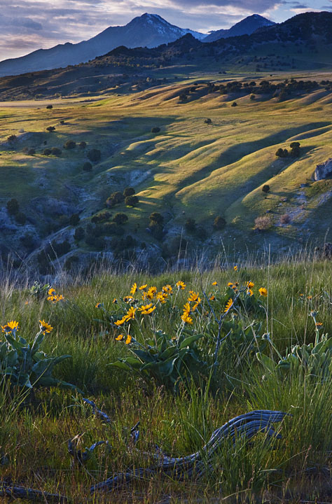
The peak in the background is the most prominant landmark in the valley here at home. I have seen it with beautiful light. Tonight I went looking for a composition for featuring the peak. The peak didn't get featured but I am not through trying. The sky doesn't look right but I don't know how to fix it.

Comments

12 comments
Comment posted by Sebastian Kraus on May 13, 2011 at 4:10 AM
Frame as at frame is good... only one think I don’t like is too much blue colour across photo. Work on this frame once again and I can say this will bring some results!

Regards
Sebastian

Registered on March 17, 2011, 30 Posts, 132 Comments
Comment posted by Andreas Resch on May 13, 2011 at 4:21 AM
I love the comp but I agree with Sebastian about taking out some of the blues. Otherwise this one got a lot of potential.
Registered on November 14, 2007, 322 Posts, 6101 Comments
Comment posted by Paul Duval on May 13, 2011 at 7:53 AM
Chad,

Not sure what processing program you have but you can fix the blue cast by using a tools common to some. In photoshop elements there's an Adjust Color feature and a remove color cast option. In Adjust Lighting there's a Levels feature that will allow you to back off the blue channel. Or In Adjust Color there an Adjust Hue/Saturation feature where you can adjust cyan or blue.All three would help fix the blues issue. A common problem with color casts is caused by the nasty WB ( White Balance ) setting on your camera. I had a situation and the funny thing is there were Balsam root flowers in the images just like this one. I accidentally set the WB on my Olympus to tungsten lighting and every image had a strong blue cast ( similar to this ). When I went to process the shoot I had to fix eery image with the Remove color cast tool. Your comp is good and I think with a simple adjustment this will be a very nice image.

Paul
Registered on June 30, 2009, 508 Posts, 1907 Comments
Comment posted by Guy Tal on May 13, 2011 at 10:01 AM
Beautiful scene. I like the twisted branch in the foreground.

Guy
Registered on November 1, 2003, 566 Posts, 15507 Comments
Comment posted by R.Bill Moser on May 13, 2011 at 11:47 AM
I do love the comp. but there's a blue color cast througout the image. I would try to remove those blues.
Registered on January 29, 2010, 285 Posts, 4281 Comments
Comment posted by Harry Lichtman on May 13, 2011 at 12:22 PM
Nice layers in this. Feels a little tight at the top, a little more sky might help balance this.
Registered on September 17, 2010, 304 Posts, 3507 Comments
Comment posted by Ron Pederson on May 13, 2011 at 2:02 PM
Nice comp and great light...where ever this may be, nice valley to have nearby. Yep, the blues could use some work. Very appealing image.
Registered on October 19, 2010, 95 Posts, 470 Comments
Comment posted by Chad Merrell on May 13, 2011 at 2:23 PM
Thanks everyone. I didn't realize how strong the color cast was until I fixed it (I hope) and compared.
Registered on July 8, 2010, 91 Posts, 304 Comments
Comment posted by Tony Kuyper on May 13, 2011 at 10:43 PM
It's a beautiful scene and I really like the depth and the different character of the "layers" as you move back into the scene. Agree, sky maybe isn't quite right, but it's a pretty small part of the scene. Just noticed second version. Yes, I like it better.
Registered on November 1, 2003, 364 Posts, 22328 Comments
Comment posted by dean hebert on May 14, 2011 at 3:03 PM
Beautiful framing. Repost is great. :toast:
Registered on August 4, 2010, 70 Posts, 1132 Comments
Comment posted by Scott Smorra on May 14, 2011 at 9:39 PM
The repost looks much better Chad. The original was just too cold with all that blue. I like the composition with the foreground flowers, mid ground canyon and background mountains.
Registered on November 2, 2009, 161 Posts, 2143 Comments
Comment posted by Mark Seawell on July 19, 2012 at 5:17 PM
I really like the corrected version although I'm happy to see the before and after. Love the composition, the foreground, middle and the mountains in the background are on point. Well done!

Mark
Registered on December 5, 2011, 197 Posts, 237 Comments