Gallery: WildlifePosted May 11, 2011128 views10 comments
Dear all
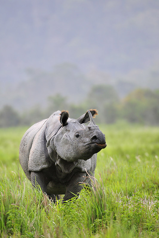
Made this in Kaziranga NP
D300, 200-400/F4 at 400 , ISO 400 , 1/100 HH
All C & C are most welcome
Harshad
Comments
10 comments
Comment posted by Peter Cross on May 11, 2011 at 2:20 AM
Nicely captured image. This doesn't look like a very happy camper, but I hear that's the nature of this beast. I like the lighting and the color palette of this shot. However, I think the image is too tight on this guy. I would suggest removing some of the top and adding room to the right if you have it. And just a bit to the left. I think it would work better as a horizontal.
Peter
Registered on April 3, 2010, 271 Posts, 1342 Comments
Comment posted by Stephen Kaluski on May 11, 2011 at 5:54 AM
Hi Harshad, I still feel less above would work better, but a good choice on format. I know why you have posted as is, but having two versions one for publication the other for presentation I do still feel, is the right route to go. Stance, colour and processing is spot on.
Steve
Registered on March 25, 2007, 189 Posts, 1064 Comments
Comment posted by Max Waugh on May 11, 2011 at 11:38 AM
I agree that the frame seems a bit narrow, but I like the general composition you were going for. Great colors. The yellow/reddish highlights of the mouth and ear tufts provide a nice touch.
Max
Registered on September 26, 2008, 428 Posts, 2329 Comments
Comment posted by Kedar Bhat on May 11, 2011 at 11:59 AM
thats a nice crisp image. I like the sharpness and the details on the face. agree with others, a slight crop from top
Registered on April 7, 2008, 77 Posts, 357 Comments
Comment posted by Vincent Grafhorst on May 11, 2011 at 1:52 PM
This is a good rhino image Harshad, I love the bright green vegetation contrasting with the grey & blueish tones. For me the comp with all that negative space above works very well.
Registered on February 24, 2006, 504 Posts, 7203 Comments
Comment posted by Anand Narayanan on May 11, 2011 at 2:17 PM
A bit of separation between the horn and the ear would have been nice. Still a splendid portrait with lovely lush greens.
Registered on October 25, 2009, 110 Posts, 835 Comments
Comment posted by kiran khanzode on May 11, 2011 at 3:15 PM
Love it "as-is" !
Registered on February 21, 2009, 83 Posts, 428 Comments
Comment posted by Morkel Erasmus on May 11, 2011 at 5:41 PM
excellent image Harshad, love the pose and I love the space above (though cropping a wee bit from the top won't hurt)
Registered on March 22, 2011, 385 Posts, 2068 Comments
Comment posted by Lon Sharp on May 12, 2011 at 9:35 PM
This would be perfect as a cover submission. If prepared for a wall I would then crop from the top to maybe a 4x5 ratio. Great exposure.
Registered on December 9, 2007, 258 Posts, 9892 Comments
Comment posted by Andrius Pašukonis on May 15, 2011 at 8:39 PM
Very nice!
Registered on July 23, 2005, 111 Posts, 408 Comments

Comments
10 commentsPeter
Steve
Max