Nature Photographers Network
This is the preserved archive of the original Nature Photographers Network. The community continues at naturephotographers.network.
Icon
‹ PreviousLandscape GalleryNext ›

Icon

by Richard Teller

Gallery: LandscapePosted May 9, 2011223 views4 comments
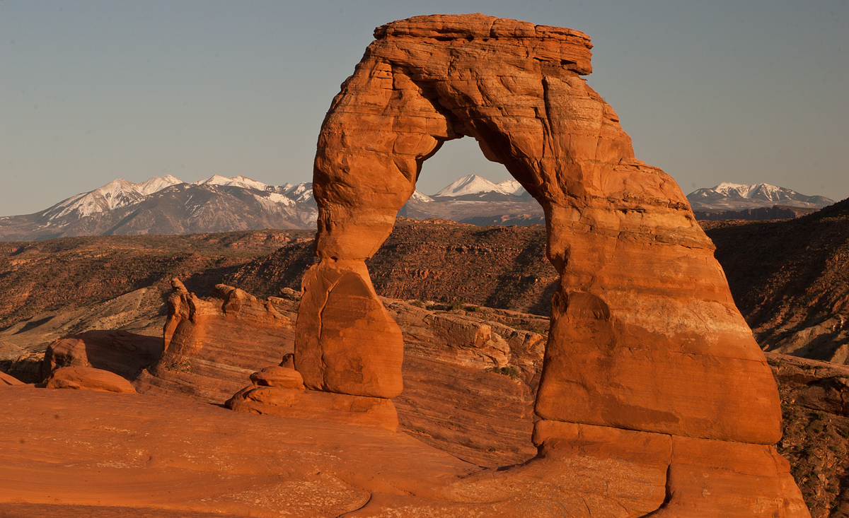
I apologize for posting this, but we just left Arches National Park. I was one of the many photographers at Delicate Arch at sunset. How could I not be there. WE are not at Bryce Canon and heading for Zion. I appreciate your patience and comments.

Canon 30D
Sigma 17-70
Aperture Priority
Aperture f22
Shutter 1/10
ISO 100
48mm
Polarizer
Tripod

Comments

4 comments
Comment posted by Scott Miller on May 9, 2011 at 11:25 PM
Personally, I don't have a problem with icons at all. They are icons for a reason - they are pretty. Maybe I will have to post my picture from nearly exactly where you are seated that I took in March. :)

Your framing looks nice, but the colors seem just slightly off to me. However, I am on a laptop screen that is completely uncalibrated right now, so maybe it is just that.

I would also have probably not used f/22 here. If you needed to let in less light you can always kick up the shutter speed to keep the aperture more toward the sweet spot with your lens.
Registered on May 9, 2011, 23 Posts, 322 Comments
Comment posted by Marc Adamus on May 9, 2011 at 11:30 PM
Richard, I don't necessarily have a problem with shooting icons. Honestly though, this is pretty close to the same shot anyone with a cell phone gets from here. It's missing some extra flare....or really anything to separate it from the masses. If your intent was to simply duplicate the norm, that's fine, but given this is a critique gallery consisting of photographers who have seen this a zillion times already....well, you know what I'm saying here. Some nice light or clouds would have helped. There's a few dust spots to clean up and it doesn't look like it's gone through any sort of editing. I know it's really hard to get 'outside the box' in a place that has one side of a stadium full of photographers every night but perhaps just some basic editing work here to make the most of the color and contrasts would help. Waiting an extra day or two to see if better skies and/or conditions materialize would also be a benefit, though I don't know if you could have. Doing something at night might also be fun? Anyway, hope that all doesn't sound too harsh a critique. I do like the basic design and framing of the peak evident in this one.
Registered on September 17, 2005, 780 Posts, 8091 Comments
Comment posted by Scott Miller on May 10, 2011 at 1:36 AM
The one big benefit that I see to posting icon shots here is the quality of the critique should be pretty high. Lots of people on this forum have sat in this spot and can post with great authority on how to get the most out of the location. So while they aren't the most interesting for the viewers of the shot - since as Marc says - we have seen it many times before, the poster should be able to learn a lot from the responses.

I do however understand not wanting this forum to have a bunch of different versions of the same shot from different photographers.
Registered on May 9, 2011, 23 Posts, 322 Comments
Comment posted by Kartik Venkatarama on May 10, 2011 at 1:17 PM
Hi Richard,

looking at your past work, it would seem landscape photography is not your usual milieu, so you're probably excited about a getting into it...nothing wrong with starting witht the icons! I'd say if general critiques are what you're looking for, what I'd point out here is the color balance...seems really warm, and as a consequence, the color contrast is insufficient to make the arch really pop. The framing is fairly standard, but that's fine.
Registered on July 27, 2007, 197 Posts, 830 Comments