Nature Photographers Network
This is the preserved archive of the original Nature Photographers Network. The community continues at naturephotographers.network.
Seal Rocks, Oregon
‹ PreviousLandscape GalleryNext ›

Seal Rocks, Oregon

by Scott Miller

Gallery: LandscapePosted May 9, 2011203 views12 comments
So due to my own stupidity, my account got messed up when I tried to move from the trial membership to the paid membership and all of my comments and posts got lost. In an attempt to take a positive out of the negative situation, I wanted to repost the handful of images I posted in the last few weeks after reworking them in response to the suggestions I got here.

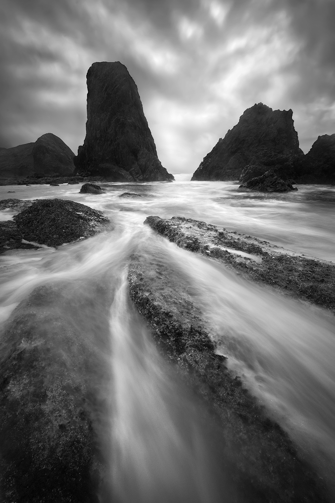
This is a rework of the first image I posted here. On the first go around, the main critique was the level of detail in the rocks, so this time I reprocessed this using three exposures: one of the rocks, one for the foreground, and one for the sky. The rocks and foreground are just different proceedings on the same raw file. The sky is from a few minutes before as the waves and cloud action I wanted didn't line up at exactly the same time.

5dii 17-40L @17mm, f/14, 2 seconds, ISO 640.

Comments

12 comments
Comment posted by Phil Pogledich on May 9, 2011 at 6:59 PM
I don't recall the original but I certainly like this quite a bit. The scene has fabulous depth and the detail in the rocks seems just right to me. I have a little bit of hesitation about the sky . . . it somehow feels a little unnatural but I can't put my finger on the reason why. Heck, who cares. Fabulous shot! Can't believe I'm the first to comment.
Registered on August 24, 2009, 123 Posts, 3099 Comments
Comment posted by Benjamin Olson on May 9, 2011 at 7:09 PM
I also don't recall the original, but this is very nice. I like the really strong leading lines and the opening in the sea stacks, which provide a nice place for my eye to follow through. The diagonal lines in the clouds reflect the leading lines of the FG. Very nice! :toast:
Registered on April 7, 2007, 169 Posts, 725 Comments
Comment posted by Harry Lichtman on May 9, 2011 at 11:08 PM
I like the rock exposure in this. Just enough for what we might expect to see - an improvement over the 1st, which was very good to begin with. :toast:
Registered on September 17, 2010, 304 Posts, 3507 Comments
Comment posted by Vlad Sadovsky on May 9, 2011 at 11:50 PM
Excellent Scott, i like a lot both this exact spot and your rendtion.Black and white works wonders, I was there about the same time (April), but focused on horizontal ratios. Your vertical framing is very interesting. Subjectively i am missing a little bit of the foreground to the left to complete the image. Well done!
Registered on November 12, 2010, 48 Posts, 358 Comments
Comment posted by James Fougère on May 10, 2011 at 2:32 AM
This a dynamic solid B&W conversion. I really like it! I am getting a new printer soon, and looking forward to printing images similar to this image on Aluminum, which really pops these types of high contrast images. :toast:
Registered on October 25, 2010, 41 Posts, 831 Comments
Comment posted by Jorne de Bruin on May 10, 2011 at 6:00 AM
A very nice b&w Scott, I especially like the lines of water leading me into the image to the rocks and the dramatic sky beyond. Good stuff! :toast:
Registered on June 26, 2008, 178 Posts, 2136 Comments
Comment posted by Mark Metternich on May 10, 2011 at 3:13 PM
Worthy of many replies! Way to go Scott!

Mark
Registered on June 19, 2009, 276 Posts, 6240 Comments
Comment posted by Scott Miller on May 10, 2011 at 5:15 PM
Thanks for the comments all. And Vlad, I agree, after getting back and looking at the shot I too wished for just slightly more to the left. Perfecting the image is as good a reason to go back as any. Thanks for the feedback.
Registered on May 9, 2011, 23 Posts, 322 Comments
Comment posted by Chip Phillips on May 10, 2011 at 5:47 PM
Nice work on the repost Scott. Did the other have more sky? I seem to recall a bit more sky which I liked. Not sure though. I think the added detail in the sea stacks is a great improvement. Keep up the good work. Chip
Registered on November 26, 2007, 128 Posts, 1436 Comments
Comment posted by Scott Miller on May 10, 2011 at 5:58 PM
Chip,

Nope, the original sky is very similar to this one. The only big change there is brightening the shadows in the sky a bit, which I did to keep them in balance with the more detailed foreground. Here is the original for reference Original

Thanks,

Scott
Registered on May 9, 2011, 23 Posts, 322 Comments
Comment posted by Chris Chamberlain on May 10, 2011 at 9:32 PM
Hey, you haven't been shooting with Marc A. have you? This reaaly looks like an Adamus inspired comp and his kind of conditions too. Anyway that can't be a bad thing. I like the comp a lot and the dark dramatic sky works well with the b&w presentation. I think I like the darker sky just as well as the adjusted version. But I like the increase in detail on the sea stacks here too though. Nice!

Chris
Registered on March 13, 2007, 500 Posts, 8365 Comments
Comment posted by Scott Miller on May 16, 2011 at 2:08 AM
Chris, sorry for the delay in responding. Actually, yes, I was out with Marc, he was actually the one who told me about NPN, and is why I joined the site. Good eye!
Registered on May 9, 2011, 23 Posts, 322 Comments