Gallery: LandscapePosted May 5, 2011118 views3 comments
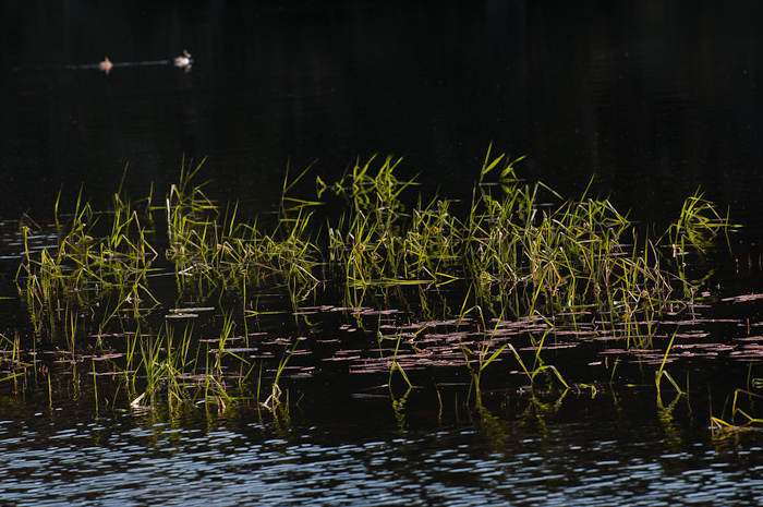
I can see that this might make a dark thumbnail, but I like this one dark. I was playing with the light and shadows. Nikon, D300, 70-300 Vr at 220mm, ISO 200, 1/250, f8.
Comments
3 comments
Comment posted by Scott Fricke on May 5, 2011 at 3:05 PM
I think the biggest nit for me is that the image seems to need a clockwise rotation. Everything looks like it is falling off to the left.
Registered on January 19, 2007, 133 Posts, 1448 Comments
Comment posted by Marc Adamus on May 5, 2011 at 7:32 PM
It definitely is tilted CCW and could use a rotation, but my main critique is the lack of focus on the birds. They are given a lot of extra space there with all that darkness so they are a commanding part of the composition. Therefore, I'd like to see them better with an f/22 aperture at ISO 800 or a blend for depth of field at f/8.
Registered on September 17, 2005, 780 Posts, 8091 Comments
Comment posted by RL Potts on May 6, 2011 at 6:07 PM
Thanks Scott and Marc. Undoing the rotate is not really an option. There seems to be something inherently vertiginous here. I think I will try to hammer this into submission with the lens distortion tool in Lightroom.
Registered on November 24, 2003, 188 Posts, 985 Comments

Comments
3 comments