Gallery: LandscapePosted April 24, 2011352 views15 comments
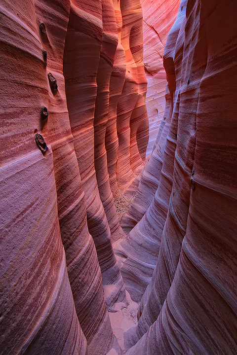
One more before I head to the Gorge. Looking for any critiques before it goes to print.
Thanks for your input, much appreciated!
Comments
15 comments
Comment posted by Nick Bristol on April 24, 2011 at 4:25 PM
Beautiful, Justin. I love the light and comp. Feels like I'm there seeing this for real. The colors are wonderful, and I especially like the hint of blue showing through. Amazing texture and detail. Looks like a great print!
Nick Bristol
Lone Rock, WI
Registered on February 1, 2004, 752 Posts, 14140 Comments
Comment posted by Jesse Estes on April 24, 2011 at 5:23 PM
Nice one Justin. I like the symmetry you managed to find here. The ground in the bottom keeps drawing my eye, and I would probably burn that area a little myself.
Registered on April 13, 2011, 20 Posts, 174 Comments
Comment posted by Neil Paskin on April 24, 2011 at 7:54 PM
No critique from me Justin - it's a wonderful shot. I've never been in a slot canyon but the colours look very pleasing and natural.
btw how wide would you say this is across? - just curious.
Registered on May 30, 2008, 7 Posts, 39 Comments
Comment posted by Barry Vangrov on April 24, 2011 at 8:22 PM
Can't think of any advice on this. Print it!
Registered on September 1, 2009, 148 Posts, 749 Comments
Comment posted by Floris van Breugel on April 24, 2011 at 8:40 PM
Such a beautiful little canyon
IMO there is not enough contrast here - the shadows in the folds of sandstone have been all but lost, and it's those shadows that really give the canyon depth and drama. I also think the color palette is a little too magenta/blue.. but that might be due to the different time of year/lighting compared to when I saw it (when it was much warmer in color).
Registered on December 19, 2008, 306 Posts, 4840 Comments
Comment posted by Tony Kuyper on April 24, 2011 at 8:46 PM
Looks good, Justin. Can't think of anything I'd change.
Registered on November 1, 2003, 364 Posts, 22328 Comments
Comment posted by Tom Dobrzanski on April 24, 2011 at 9:42 PM
"Zebra Canyon" - great name Justin :) Great light and colours! Not sure if there is anything to critique here so can't say anything apart from that I really like it!
Registered on September 27, 2010, 17 Posts, 164 Comments
Comment posted by Jared Ropelato on April 24, 2011 at 10:03 PM
nice light, lines and layers. Very good shot
Registered on March 1, 2011, 25 Posts, 204 Comments
Comment posted by John Mumaw on April 24, 2011 at 11:09 PM
You had some fine light here, but I agree with Floris in that the 'development' is a bit flat.
Registered on September 9, 2005, 62 Posts, 2289 Comments
Comment posted by Kah Kit Yoong on April 25, 2011 at 8:39 AM
It looks very naturally processed, beautiful colours. However I suspect as others have mentioned that people might expect more pop versus more natural.
Registered on September 27, 2006, 636 Posts, 10682 Comments
Comment posted by Bill Chambers on April 25, 2011 at 2:51 PM
Another beauty Justin. I do agree with Floris that contrast seems to need a boost, but I'm on my uncalibrated work monitor, so take that with a grain of salt. Lovely colors and light.
Registered on April 10, 2005, 753 Posts, 21216 Comments
Comment posted by Jim Hackley on April 25, 2011 at 3:56 PM
Interesting perspective and composition, I went right to the bottom of the image to see if there was enough room to walk through the canyon. For me, the colors and contrast work fine, every slot canyon image does not have to have flaming colors, well seen.
Registered on September 17, 2009, 302 Posts, 5535 Comments
Comment posted by Stefan Gimpl on April 26, 2011 at 2:45 AM
I like the colors as they are. No need to change anything IMO.
Registered on May 12, 2007, 26 Posts, 184 Comments
Comment posted by Steve Sieren on April 26, 2011 at 2:53 PM
I like the black nubby things on the left, makes you wonder what they are.
Registered on January 2, 2008, 360 Posts, 5321 Comments
Comment posted by Mark Metternich on April 29, 2011 at 1:12 AM
Was just here again the other day and it was full of mud AGAIN!
Nice job here. Maybe a little more contrast and color variation.
Otherwise it looks nice.
Registered on June 19, 2009, 276 Posts, 6240 Comments

Comments
15 commentsNick Bristol
Lone Rock, WI
btw how wide would you say this is across? - just curious.
IMO there is not enough contrast here - the shadows in the folds of sandstone have been all but lost, and it's those shadows that really give the canyon depth and drama. I also think the color palette is a little too magenta/blue.. but that might be due to the different time of year/lighting compared to when I saw it (when it was much warmer in color).
Nice job here. Maybe a little more contrast and color variation.
Otherwise it looks nice.