Nature Photographers Network
This is the preserved archive of the original Nature Photographers Network. The community continues at naturephotographers.network.
Sandstone Aurora
‹ PreviousLandscape GalleryNext ›

Sandstone Aurora

by Tony Kuyper

Gallery: LandscapePosted April 23, 2011725 views45 comments
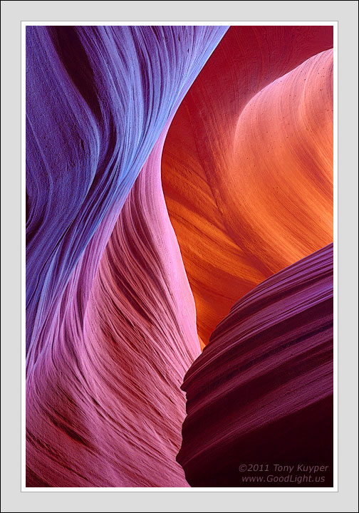
I've never seen northern lights in person. Mom's told me that I did as a child in Iowa, but I have no memory of it. From the start, this picture reminded me of the images of the aurora posted in this gallery throughout the winter, where I really like the movement and color of the lights.

While not sunspot related like the northern lights, the swirling lines of different colors in this image have their genesis in the sun nonetheless. It's the shadow and varying degrees of reflected sunlight that gives the different colors, though I'm always a bit surprised by how the hues differ so much from the brown/tan sandstone that is the rock's natural color.

Granted, I've edited the image to play up the color differences. Justin Reznick's picture posted earlier this week perhaps shows a more natural interpretation of the colors, though it should still be obvious that there's a lot of great color available in the scene with which to work.

I was quite surprised at seeing Justin's image. I started working on this version last Sunday, slowly tweaking it for a few days as I viewed the print in my living room. It was taken in November 2010. I hadn't gone to Antelope Canyon in over a decade and thought myself quite clever to have found a somewhat unique image. Not only did Justin crush my concept of exclusivity, but did so with impeccable timing by posting ahead of me. :frown:

Oh well. I think post-processing allows each of us to put our own spin on the same light. Justin and I had no knowledge of each other's picture, and I think it somewhat interesting how we each arrived at our own interpretation. :wavey:

Since I last posted, I've had a pseudo-computer crash needing to reload software and recalibrate the monitor. The print of this image looks like I want, but I'm having trouble getting the image to look right in the new version of Firefox (4.0). It seemed I could get a better print match with FF 3.x. I don't think I've quite figured out the right color management settings in this new version. If anyone has any reference for these, please let me know.

I'd be interested in your thoughts on this image and how it looks on your monitor. Always appreciate the feedback and frequently incorporate it into the image.

5D2, 28-200@70, f/18, 1.6 seconds, ISO 400

Comments

45 comments
Comment posted by Bret Edge on April 23, 2011 at 1:04 AM
This is gorgeous, Tony. I love the play of warm to cool tones and the soft, sweeping lines.
Registered on November 1, 2003, 711 Posts, 6363 Comments
Comment posted by Rick Lundh on April 23, 2011 at 1:16 AM
Tony, Gorgeous image! Funny how you and Justin worked your images so closely together! I might think that the upper left is a tad too purpleish...maybe your intent, but it feels just a tiny bit over the top...
Registered on April 28, 2004, 774 Posts, 4351 Comments
Comment posted by Koveh Tavakkol on April 23, 2011 at 1:55 AM
Love the array of colors here Tony. As far as your Firefox issues, it is possible your color management settings got changed. Are you seeing all images not look right or just some? You can check this setting:

1) Type "about:config" into your browser destination
2) Tell it you will be careful and continue
3) In the filter, type "gfx" to narrow down the criteria
4) Double click gfx.color_management.mode
5) Change the value from 2 to 1. (0 means don't color manage, 1 means always use profile, 2 means only on tagged images)
Registered on September 1, 2009, 41 Posts, 608 Comments
Comment posted by Rick Goldwasser on April 23, 2011 at 2:10 AM
Wow Tony, you've outdone yourself here! Normally, I barely even look at AC images, but this is really nice. While the colors seem a tad over the top (especially the pinks and blues on the left), the light, comp and especially the textures really make this an image that stands out among the millions of this canyon. Great stuff!!!
Registered on May 10, 2009, 127 Posts, 970 Comments
Comment posted by Enrique Vizcarra on April 23, 2011 at 2:37 AM


This is another amazing works!!!!


Registered on September 10, 2009, 223 Posts, 393 Comments
Comment posted by Tom Dobrzanski on April 23, 2011 at 5:11 AM
I, as most of us here, very much like you capture! Cold on the left and warn on the right, diagonal lines and smooth curves gives me a very nice visual contrast :) I have two monitors, calibrated and the one in sRGB. Your capture on the calibrated one looks great. On sRGB one it looks a bit flat. Though on calibrated one I would (only for my personal preference I guess) lighten a bit bottom RHS as it is a tad dark...but on sRGB monitor that part looks nicely lightened.
Nevertheless Tony, capture is amazing and I'm attracted by that visual contrast and its colours. :smile:
Registered on September 27, 2010, 17 Posts, 164 Comments
Comment posted by Neil Paskin on April 23, 2011 at 7:36 AM
Fabulous Tony. I love the balance of the image - I see four main areas each with their own interesting curves/shapes and red hue. They all play off each other wonderfully. I do like the upper left area with the purple tone but I have to agree wit Rick, it is a touch too purple - or maybe the transition from the warmer red down the left hand side is a little too abrupt.
Registered on May 30, 2008, 7 Posts, 39 Comments
Comment posted by Nick Bristol on April 23, 2011 at 8:30 AM
This is awesome. Just beautiful to look at. I love the light, shapes and lines. I also like the colors very much as they look here on my monitor (vibrant and very appealing). This is fantastic work, Tony!

Nick Bristol
Lone Rock, WI
Registered on February 1, 2004, 752 Posts, 14140 Comments
Comment posted by Stan Rose on April 23, 2011 at 8:59 AM
Sweet photo, Tony, like Rick i usually boycott AC images (i must have on Justin's--now ill have to go back to look!)
but this is wonderfully elegant. Im actually surprised at the 'too purple' comments--compared to the well known examples of AC by a few photogs who earn 6+ figures, this is relatively subdued. It looks vibrant but natural to me--not overdone. Maybe youve hypnotized me...
anyhow--Nice! :toast:
Registered on September 15, 2005, 836 Posts, 17099 Comments
Comment posted by Stefan Gimpl on April 23, 2011 at 9:47 AM
Great light here, Tony. I also like the composition and the lines in the image. My only suggest would be to pull back the saturation a bit.
Registered on May 12, 2007, 26 Posts, 184 Comments
Comment posted by Guy Tal on April 23, 2011 at 9:47 AM
Amazing amazing tones and sensuous curves. A signature TK image.

Guy
Registered on November 1, 2003, 566 Posts, 15507 Comments
Comment posted by John Mumaw on April 23, 2011 at 10:05 AM
Guy took the word ('sensuous') right out of my mouth.
I especially like the color transition on the left wall. Looks great on a calibrated monitor!
This place has come a long way from the day when one fellow sitting near the entrance in a lawn chair surrounded by ropes was the guide.
Registered on September 9, 2005, 62 Posts, 2289 Comments
Comment posted by Bill Chambers on April 23, 2011 at 10:11 AM
King Tony rides again. The care you use to post process an image is amazing. With your images I always look carefully and try to imagine where you've processed a particular spot, and it's generally extremely hard or impossible to actually tell becuase your processing is so smooth. I can look at this one and know where you likely worked on it, but the change is so subtle that I would never be able to prove it. Anyway, on to the image. The different hues and textures are so beautiful and always captivate me. Another killer image!
Registered on April 10, 2005, 753 Posts, 21216 Comments
Comment posted by Eva McDermott on April 23, 2011 at 10:36 AM
This is stunning and looks very natural to me Tony. The light definitely has your signature. Gorgeous work!
Registered on January 4, 2009, 1015 Posts, 13229 Comments
Comment posted by Harry Lichtman on April 23, 2011 at 11:21 AM
Tony - Love the composition - the colors look a little too electric for my tastes, so a more subdued version would be my personal choice. I was wondering why you decided to shoot at ISO 400? I would expect more noise than at 100. A couple of seconds longer exposure wouldn't seem to make any difference in this situation?
Registered on September 17, 2010, 304 Posts, 3507 Comments
Comment posted by Dan Baumbach on April 23, 2011 at 12:06 PM
I like the color and simplicity of this one. It looks great on my Mac with FF 3.6.

- Dan.
Registered on November 1, 2003, 473 Posts, 7980 Comments
Comment posted by Shane McDermott on April 23, 2011 at 1:21 PM
Hey Tony

This is incredibly beautiful. I like what you have done with the available color palette, very smooth transitions. This must look stunning in a large print. Well Done!

Shane :toast: :toast:
Registered on November 12, 2007, 49 Posts, 1074 Comments
Comment posted by Justin Reznick on April 23, 2011 at 2:32 PM
Beautiful Tony! Thanks for linking to my image, it's definitely fascinating to compare and a pretty amazing coincidence that we both posted this week! Having worked this scene and studying your image, it's interesting how the idea of having a level camera in a tight composition in a slot canyon goes out the window. You can really pick your plane of view to achieve the desired composition. I think you have a great POV and a wonderful array of color.
Registered on November 24, 2009, 79 Posts, 515 Comments
Comment posted by Mark Pelton on April 23, 2011 at 3:13 PM
Yes, definitely a signature TK image. Impeccable composition and I love the interpretation of colors. :toast:
Registered on November 25, 2003, 380 Posts, 4647 Comments
Comment posted by Sebastian Kraus on April 23, 2011 at 4:52 PM
Stunning photo! :wavey:
Registered on March 17, 2011, 30 Posts, 132 Comments
Comment posted by Daniel Rappaport on April 23, 2011 at 7:08 PM
This is so well composed that it would work in B&W. Given the inherently abstract nature of the subject, I can approach it with no preconceived ideas of color. That said, the color choices are striking and work very well.
Registered on September 9, 2009, 294 Posts, 2006 Comments
Comment posted by Gino Cortez on April 23, 2011 at 7:43 PM
The available colors and subtle transitions are spectacular. Yea, it's curvy and swervy too, but the color is what knocks me out. Really great, Tony. :toast:
Registered on November 23, 2010, 57 Posts, 396 Comments
Comment posted by Kent Mearig on April 23, 2011 at 8:08 PM
As someone who sees the aurora on rare occasion, I'll say the photo is very appropriately titled. It's beautiful, and the colors show what a camera can help us to see.

With regards to exclusivity, is that even remotely possible in AC? I hardly think it's worth bothering about as long as you're seeing for yourself.
Registered on September 4, 2006, 237 Posts, 4748 Comments
Comment posted by Gabi Lach on April 23, 2011 at 8:32 PM
Beautiful, clean and just perfect, Tony. :toast:
Registered on May 1, 2007, 101 Posts, 3187 Comments
Comment posted by Daniel Ewert on April 23, 2011 at 9:02 PM
Incredible!! What a beauty!
Registered on June 2, 2009, 103 Posts, 1500 Comments
Comment posted by Mark Seaver on April 23, 2011 at 9:08 PM
There's an amazing amount of movement in this image. On my monitor the lower right is a dark purple, the "spire" that runs from lower left to upper center is a light magenta, the upper left is dark blue, and the receding area upper right is a reddish orange. It looks pretty natural, the others, particularly the blue strike me a not so natural. Overall, they make for a very interesting image. I see from Justin's pic that he's got the blue also, so it must relate to the shadows...very interesting.
Registered on January 23, 2011, 1103 Posts, 17270 Comments
Comment posted by Aaron Feinberg on April 24, 2011 at 1:37 AM
Looks good to me. Not sure on color issues. I keep having them over and over again. Even calibrated my monitors and they looked worse. Blech. Think for the processing this is closer to what I imagine I would do. Just accentuating the color like a velvia. Rockin :)

aF
Registered on October 26, 2009, 399 Posts, 2789 Comments
Comment posted by R.Bill Moser on April 24, 2011 at 6:12 AM
This is amazing. :toast:
Registered on January 29, 2010, 285 Posts, 4281 Comments
Comment posted by Hamed Musharbak on April 24, 2011 at 11:11 AM
Wow :eek:

Registered on June 1, 2009, 372 Posts, 2282 Comments
Comment posted by Lorna Taylor on April 24, 2011 at 11:45 AM
Colours are stunning ,everything from deep purple to indigo ! Stunning work!
Registered on November 12, 2010, 254 Posts, 3083 Comments
Comment posted by Jesse Estes on April 24, 2011 at 10:05 PM
Nobody does these better man! These images normally all look the same to me, but your compositions and processing reasly set you apart from the crowd. :toast:
Registered on April 13, 2011, 20 Posts, 174 Comments
Comment posted by Jared Ropelato on April 24, 2011 at 10:09 PM
A stunner Tony. i love the flow from the bottom left to the top right. Great light and line.
Registered on March 1, 2011, 25 Posts, 204 Comments
Comment posted by Anil Rao on April 25, 2011 at 2:56 AM
You do these like nobody else. There are a lot of slot canyon images for sure, but your ones stand out every time. I think that says a lot of about your work.

In this particular image the colors are simply gorgeous.
Registered on November 15, 2003, 234 Posts, 4923 Comments
Comment posted by David Chauvin on April 25, 2011 at 8:21 AM
Classic Kuyper! I always enjoy your flowing compositions, color interpretations and impeccable processing of the slots. I can almost feel the texture in the waves of stone. I really need to get out there to see these in person. :cool: :cool:
Registered on August 5, 2004, 1007 Posts, 5595 Comments
Comment posted by Kah Kit Yoong on April 25, 2011 at 9:04 AM
It looks AWESOME on my monitor!
Registered on September 27, 2006, 636 Posts, 10682 Comments
Comment posted by Bill Leggett on April 25, 2011 at 5:52 PM
Outstanding rendition, Tony!
Registered on July 21, 2004, 706 Posts, 3233 Comments
Comment posted by Harley Goldman on April 25, 2011 at 6:25 PM
Another beauty by the sandstone master! Great shapes, lines and colors. I genuflect in the presence of the great master!
Registered on November 19, 2003, 586 Posts, 11271 Comments
Comment posted by Anthony Vincent on April 25, 2011 at 10:33 PM
How the heck did I miss this one. Sorry Tony, little late to the party. Images come and go but masterful work will always be remembered.

Excellent comp and colors.
Great work
Registered on February 5, 2009, 199 Posts, 2775 Comments
Comment posted by Doug Koepsel on April 25, 2011 at 11:29 PM
Wow! The medley of colors and curves really glow and flow.
Registered on April 1, 2010, 196 Posts, 1592 Comments
Comment posted by Jason Kim on April 25, 2011 at 11:45 PM
Wonderfully gorgeous, one of the nicest slot canyon shots I have ever seen, in fact. Just beautiful in all regards.
Registered on July 1, 2006, 60 Posts, 1233 Comments
Comment posted by Mark Metternich on April 29, 2011 at 1:15 AM
Yep that is a Tony! Great image as always.

I'd say the purple could be pulled back a tad, it seems to be pulling me too much that direction.
Registered on June 19, 2009, 276 Posts, 6240 Comments
Comment posted by Cory Freeman on April 29, 2011 at 9:18 AM
very sensuous Tony
Registered on December 16, 2003, 107 Posts, 1341 Comments
Comment posted by Ruben Vicente on May 2, 2011 at 5:32 PM
Woah, amazing palette of colors and shapes. Absolutely love it!
Registered on April 9, 2011, 4 Posts, 59 Comments
Comment posted by Terry Jung on August 22, 2011 at 2:34 AM
This is a pure joy for the eyes, those curves are phenomenal, and the gradient in the colors too. Superb !
Registered on March 2, 2011, 8 Posts, 72 Comments
Comment posted by Jared Ropelato on August 22, 2011 at 8:35 PM
great lines, color and comp here. Very nice.
Registered on March 1, 2011, 25 Posts, 204 Comments