Nature Photographers Network
This is the preserved archive of the original Nature Photographers Network. The community continues at naturephotographers.network.
Eye of the Leopard
‹ PreviousWildlife GalleryNext ›

Eye of the Leopard

by Stephen Kaluski

Gallery: WildlifePosted April 21, 2011151 views12 comments
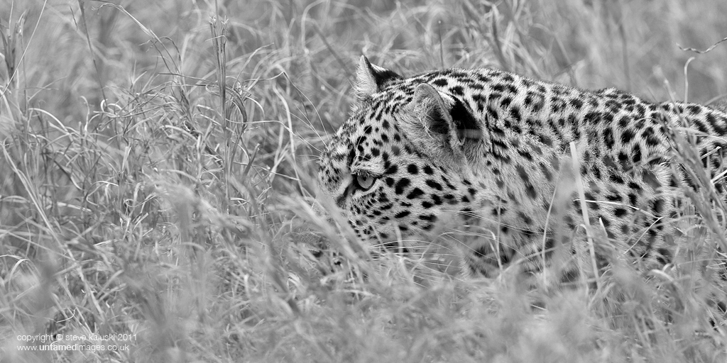
Firstly, no this is not Legadema, the Leopard in the NG documentary shot by the great Dereck and Beverly Joubert, just a juvenile leopard stalking it's prey in the early evening light. Shot in the Mara this one was having great fun pouncing and stalking in the tall grass. I just wanted to convey the stealth and concentration this leopard put in and hopefully going for the pano crop enhances this. Converted to B/W only because the colour version was almost mono chromatic in itself.

may get the opportunity to photograph Legadema later this year if she is around with a friend of mine.

Steve
MKIII 500f/4 1/160 f/4 ISO400 (resting on bean bag on passenger door, cropped to pano)

Comments

12 comments
Comment posted by Ashley Vincent on April 22, 2011 at 4:38 AM
I was sure I'd already posted up a comment on this :^. Ah well, happy to do so again ;^)

I really like the feel of this image; feline slinking through the grass, eyes locked intently on it's target, seemingly oblivious of anything else but that :^)

Generally speaking, wildlife images presented in B&W always leave me wondering what they'd look like in full colour, and this is no exception, however, I have to say this works very well in monotone.

Always enjoy looking at your images Steve, thanks for sharing :^)
Registered on March 1, 2011, 154 Posts, 2083 Comments
Comment posted by Stephen Kaluski on April 22, 2011 at 5:31 AM
Hi Ashley, I think you need to be careful with the subject chosen when converting to B/W as some do not lend themselves to it, or the actual content is wrong. Elephants, Rhino, Zebras are great for this, but occasionally to through in something else I feel is a nice change, providing it works, but guess that is another subjective POV. :wink: Personally if the author has posted in B/W then I feel you need to run with hit, however I hear what you are saying and I will post the colour version later, as to include it early on I feel detracts from the OP.

Appreciate the feedback and will let you know when the colour is posted.

Cheers
Steve :wavey:
Registered on March 25, 2007, 189 Posts, 1064 Comments
Comment posted by Brad Hill on April 22, 2011 at 9:02 AM
Hey Steve,

As always, I find it impossible to judge the relative success of a B&W conversion without seeing both versions of the image (colour plus B&W). In absolute terms I like this image - the composition works for me and the leopard is very sharp (as always!) and the eye is compelling. In most B&W images I like to see some true blacks (which seem present here) and some pure whites (or at least close to pure whites) - here I'm left wondering if driving the lightest tones in this image just a tad more might make it a little more eye-catching. But, that may make the leopard (where those lighter tones mostly reside) seem a tad unnatural. Which leaves me wondering if this image is well-suited to B&W conversion (and most of what I like about it is unrelated to the conversion...).

Just food for thought - hope this makes sense...

Cheers...

Brad
Registered on May 29, 2007, 431 Posts, 6061 Comments
Comment posted by Stephen Kaluski on April 22, 2011 at 9:28 AM
Hi Brad, well here you go. I still think people with make comments more to the colour rather than the B/W but lets see, or perhaps I am being optimistic. :biggrin: Personally I still do not like the colour version, but perhaps it too needs a tweak?

Thanks
Steve :wavey:
Registered on March 25, 2007, 189 Posts, 1064 Comments
Comment posted by Ashley Vincent on April 22, 2011 at 10:17 AM
Many thanks for posting the colour version Steve :^)

Having scrolled up and down this page repeatedly looking at one then the other, I've finally made my mind up: I much prefer the monotone you originally posted :^)

I think the reason why though is because I'm much more drawn to wildlife images that have artistic appeal rather than one's with a more natural history feel about them; what strikes me about the full colour version is how well is depicts the way the markings of the coat are so adept at camouflaging the Leopard in it's natural environment but, for my artistic taste, I find the the monotone more compelling for the simple reason the image speaks less of the surroundings yet volumes about what the Leopard might be thinking.

You've caught me after my nightly glass (or two!) of wine Steve, so none of this might make much sense to you, or anyone else for that matter - though I'll restrain myself from deleting this tomorrow morning if I read it again and cringe a little ;^p - all the same, in summary, the winner for me is the B&W, thanks again for sharing :^)
Registered on March 1, 2011, 154 Posts, 2083 Comments
Comment posted by Vincent Grafhorst on April 22, 2011 at 1:42 PM
Hi Steve, seeing both the color and B&W version I must say that I do understand why you converted this, it somehow isolates the leopard better from the vegetation. I like the eye here and the pano presentation also works well. What detracts from my appreciation though is that the snout is obstructed by that OOF grass...
Registered on February 24, 2006, 504 Posts, 7203 Comments
Comment posted by Jim Hackley on April 22, 2011 at 5:49 PM
Must of been fun and entertaining to watch the youngster pounce in the grass, I happen to like the B&W version after viewing the color image. The pano presentation works well, and the intense eye brings you right into the image, way to go.
Registered on September 17, 2009, 302 Posts, 5535 Comments
Comment posted by Stephen Kaluski on April 24, 2011 at 4:30 AM
Thanks everyone. :wavey:

I assume the glass (or two) is purely medicinal Ashley, comment very clear. :biggrin:

I see your point Vincent, but guess that is wildlife for you. :wink:

Cheers everybody.
Steve
Registered on March 25, 2007, 189 Posts, 1064 Comments
Comment posted by Wayne Willison on April 24, 2011 at 12:07 PM
Stephen, I like this very much. Almost always I'll go for the color, but BW has it's place in my heart, also. In this case after studying both versions the BW wins. The reason for me is I feel it more closely represents the wildness of the animal, allowing the grass cover its due by not bringing in another element, i.e. the green streaks.
Registered on April 10, 2009, 292 Posts, 3967 Comments
Comment posted by Steve Canuel on April 25, 2011 at 12:52 AM
Hi Steve,
Another vote for the B/W version. Usually prefer color but on this one I find the green blades of grass somewhat distracting. Your conversion minimizes their impact. The clear view of the eye and the fact that the OOF blade obscuring the nose is pointing in the same direction that the cat is heading makes that a non-issue for me on this one.
Registered on September 12, 2010, 53 Posts, 660 Comments
Comment posted by Luca Mussato on April 26, 2011 at 5:11 PM
I vote for the BW version. I like, when the shot or the subject permits it. In this case i like how the Leopard pops up and i also like the central position of its eye. A Vincent said unfortunately the grass covered the nose but he /she was stalking a prey so being hidden, almost invisible was its part.
Personally I would have darken the bg a bit to exalt even more the leopard.

Cheers, Luca
Registered on November 14, 2006, 118 Posts, 855 Comments
Comment posted by Ken Watkins on May 7, 2011 at 6:28 AM
I have to agree with Vincent on this the missing "snout" makes this a no no for me.
Registered on December 15, 2010, 1537 Posts, 4877 Comments