Nature Photographers Network
This is the preserved archive of the original Nature Photographers Network. The community continues at naturephotographers.network.
Avalanche Gorge
‹ PreviousLandscape GalleryNext ›

Avalanche Gorge

by Arthur Wycoff

Gallery: LandscapePosted April 1, 2011525 views11 comments
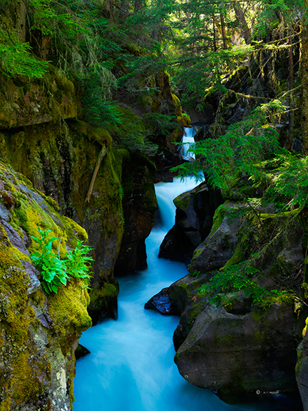
I am seeking your feedback on this image....it's composition, use of light and any other aspect of it that would enhance it's appeal.

It was taken with a Hasselblad's H4D-40 and 35-90mm zoom lens. It was taken in early morning in available light (no flash). I used a combination of Phocus and Photoshop CS5 software packages to handle the normal adjustments and Viveza 2 to slightly lighten the some of the facing rocks's surfaces as they were a bit dark.

The image was taken late last June in Glacier National Park.

This is my first post and I welcome your reaction.

Comments

11 comments
Comment posted by Rick Lundh on April 1, 2011 at 2:18 PM
Arthur,
Welcome! Great first post. I love this scene...commonly photographed, but still...beautiful. I love the color of the water...but maybe back off the saturation just a tad. Then, I would try to recover the detail in the shadows a bit. A fair portion of the frame seems pretty dark to me.
Registered on April 28, 2004, 774 Posts, 4351 Comments
Comment posted by Bill Chambers on April 1, 2011 at 2:38 PM
First off, welcome to NPN! This is a very nice post - I like the composition a lot, and I like the details of the rocks. The color looks a tad funky to me though, but I'm on an uncalibrated monitor so that may have something to do with that. Looking forward to more posts.
Registered on April 10, 2005, 753 Posts, 21216 Comments
Comment posted by Peter Richter on April 1, 2011 at 3:40 PM
Welcome to NPN, Arthur! An appealing image, I especially like the way the water is splitting the scenery. The warming light in the background works well together with the cold tones at the ground of the gorge. Thanks for posting!

Peter
Registered on November 10, 2010, 218 Posts, 2723 Comments
Comment posted by Philip Hodgkins on April 1, 2011 at 4:04 PM
Welcome to NPN! A decent image, if a bit centered. Definitely back off the saturation, particularly blue and green. Try the shadow/highlight tool to get more detail in the shadowed rocks. The image has potential, once you make a few minor adjustments.
Registered on July 24, 2006, 2741 Posts, 12349 Comments
Comment posted by Michael J Greene, on April 1, 2011 at 4:48 PM
Welcome to NPN Arthur. Beautiful composition. Lovely colors, I could see pulling back on the saturation just a tad (the rocks look a little purple), but it certainly looks very nice as presented. Great first post. Looking forward to seeing more.

Michael
Registered on June 18, 2009, 86 Posts, 2317 Comments
Comment posted by Zachary Lake on April 1, 2011 at 6:39 PM
Welcome! Nice composition, but I agree with what the others said about the colors - it looks a bit unnatural. Also, that tiny bit of highlighted ground (in the shape of a backwards "B") on the bottom right is a bit distracting. Otherwise nice shot!
Registered on July 1, 2008, 24 Posts, 120 Comments
Comment posted by Eva McDermott on April 1, 2011 at 6:42 PM
Welcome to NPN Arthur. Wonderful scene and comp but my first impression is there a bit too much cyan/blue in the water. Overall saturation is over the top for me so I would back off on that as others suggested. Rick mentioned it seemed a bit dark. I also agree. I would bring up the shadows as well. You may may find that helps makes the scene pop as opposed to increasing saturation. Hope that helps. Looks like a difficult place to photograph.
Registered on January 4, 2009, 1015 Posts, 13229 Comments
Comment posted by Richard Siggins on April 1, 2011 at 8:16 PM
Welcome Arthur.
Beautiful photo. I agree with others on the saturation. The greens look OK to me, but that blue is a bit unnatural. I would bring up the shadows a bit and them maybe darken that bright area in the right half of the top.

Registered on October 11, 2007, 115 Posts, 223 Comments
Comment posted by Lars Lentz on April 2, 2011 at 8:42 AM
I like the darkness of the rocks in the photo. The light streaming through on the right and hitting the tree-parts really stands out due to the darkness of the other areas of the photo. The same goes for the water - it stands out due to the darker rocks around it. I can still see all the detail in most of the rocks and I suspect you have very little of the histogram going off the dark end - and that is good. I think it is a good photo as-is. Nice work.
Registered on March 26, 2011, 42 Posts, 70 Comments
Comment posted by Lon Overacker on April 2, 2011 at 4:44 PM
Arthur,

Welcome to NPN and the Landscape/ES&S Gallery! A wonderful and colorful first post. I think you did very well to handle the dynamic range here and the composition is solid. I'm wondering though if you might be able to lighten the darkest rocks in the gorge. Looks a lot like how Velvia might render this scene. Also, and this is opinion and personal choice, but I think the saturation is just a tad heavy. I do understand though that glacial water will have a nice turquoise color to it, but it's the greens that are giving it away for me. Not too far off, just a bit. Otherwise, a strong image.

thanks for posting and we look forward to your images and contributions.

Lon
Registered on November 24, 2006, 521 Posts, 19147 Comments
Comment posted by Adrian Klein on April 3, 2011 at 9:24 PM
Welcome to NPN Arthur! I sure like this area and have photographed it before. Composition looks good to me. The colors are saturated but I would say more bold than overboard. This is all personal taste. Everyone has their thoughts on levels of color. I do agree that that a little more detail in the shadows would be good. Overall nice work. Next time try to get down in the water below. It's cold but that has been my favorite take on this area for me thus far.
Registered on June 10, 2007, 112 Posts, 1506 Comments