Nature Photographers Network
This is the preserved archive of the original Nature Photographers Network. The community continues at naturephotographers.network.
Apologies to Mike Moats
‹ PreviousFlora GalleryNext ›

Apologies to Mike Moats

by Bill Chambers

Gallery: FloraPosted March 26, 2011230 views15 comments
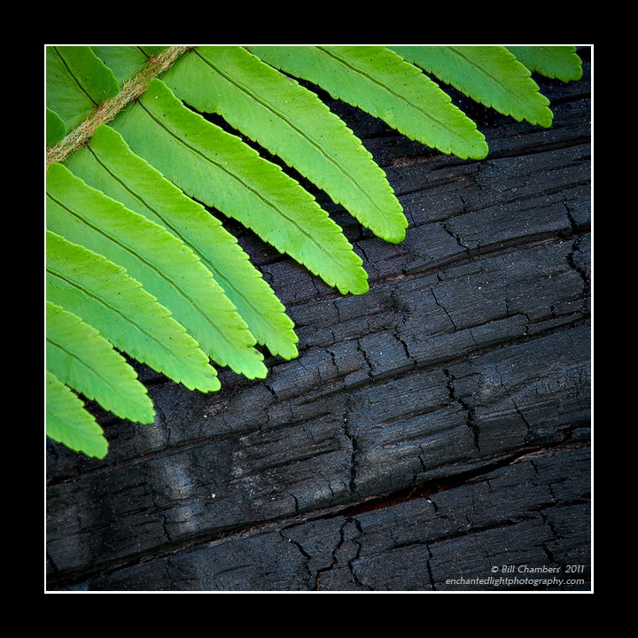
Yes, I stole this concept from Mike Moats, I admit it! I posted this in the Macro forum as well, but it not really macro. This does stress the fact that I need to buy me a good macro lens though. Anyway, I've always loved Mike's shot that's similar to this so I thought I would try something like it as well.

D2X w/ 70-200 VR @ 200mm
.3 sec @ f/16 - MLU and mc-30 remote release
100 ISO
No filters
tripod
Capture One 6, CS4, TK's actions

Critiques, suggestions, and comments always welcomed and greatly appreciated. Thanks for looking and sharing.

Comments

15 comments
Comment posted by Pat Sampson on March 26, 2011 at 1:14 PM
Great contrasts Bill - color, texture, compositional flow. I need to look at Mike's but this is striking.

pat
Registered on May 19, 2007, 953 Posts, 15989 Comments
Comment posted by Brigitte Lorenz on March 26, 2011 at 3:51 PM
Great composition, colors and texture...wonderful presented!!!

Brigitte
Registered on January 10, 2009, 187 Posts, 1507 Comments
Comment posted by Bob Duff on March 26, 2011 at 8:14 PM
Bill, this really works for me. Love the detail and sharp contrast between the fern and burnt branch. Great job.
Registered on April 21, 2010, 160 Posts, 1675 Comments
Comment posted by Mark Seaver on March 26, 2011 at 10:22 PM
The contrast between the fern and the burnt log it great. The details in both are also excellent. Nice shot!
Registered on January 23, 2011, 1103 Posts, 17270 Comments
Comment posted by Albert Darmo on March 27, 2011 at 11:08 AM
Hi Bill :wavey: The contrasts of texture and color, work wonderfully well here :jump: an inspired composition :cool: :smile:
Albert Darmo Canada
Registered on November 25, 2008, 1386 Posts, 11978 Comments
Comment posted by Bill Fach on March 27, 2011 at 11:38 AM
Bill: Great combination of elements and imitation is the sincerest form of flattery. I especially like your exposure of the wood that retained all the nice detail. You're doing really well with your 70-200. You'll be downright dangerous with a macro lens :smile: :wink: Wonderful shot. >=))>
Registered on November 1, 2003, 1805 Posts, 26981 Comments
Comment posted by Nathan Buck on March 27, 2011 at 12:55 PM
Very pretty Bill. The lines in several directions from the fern, contrasting to lines going in another direction from the charred wood are very interesting - not to mention the contrasting colors. Cool image.

Nathan
Registered on November 1, 2003, 1101 Posts, 13589 Comments
Comment posted by Michael Lowe on March 27, 2011 at 2:28 PM
Great contrasts here, Bill. A fine shot. :toast:
Registered on February 11, 2004, 777 Posts, 5252 Comments
Comment posted by Paul Duval on March 27, 2011 at 4:41 PM
Isn't stole a little strong of a word Bill? Borrowed was inspired by because if we saw both images together I'm sure there would be differences. There's something about charred wood ( to me representing death ( end of life ) juxtaposed with fresh greenery ( to me representing life) . It's technically fine and your message intentional or not is getting across well.


Paul
Registered on June 30, 2009, 508 Posts, 1907 Comments
Comment posted by Lorna Taylor on March 27, 2011 at 7:21 PM
Wonderful find Bill. I am sure Mike won't mind your beautiful tribute and your being inspired to create this lovely image!
Registered on November 12, 2010, 254 Posts, 3083 Comments
Comment posted by Miro Susta on March 27, 2011 at 9:02 PM
Very nice contrast. Bill you should call it "Young & Old". Nicely captured. :wink:
Registered on August 18, 2006, 719 Posts, 3736 Comments
Comment posted by Gary Yeoh on March 28, 2011 at 3:29 AM
Bill
This a very nice image indeed. Lots of interest and contrasting elements, top notch.
Registered on September 1, 2009, 588 Posts, 8184 Comments
Comment posted by Morris McClung on March 28, 2011 at 6:11 PM
Such a striking color combination, and the contrast of vibrantly alive, and toasted is superb! Excellent image, Bill! :toast:
Registered on May 7, 2007, 670 Posts, 19650 Comments
Comment posted by Larry Lynch on April 6, 2011 at 7:47 PM
Terrific contrast and comp. Love the colors and lifelike detail you captured. Terrific image.
Registered on September 16, 2006, 773 Posts, 9940 Comments
Comment posted by Lucy Aron on May 17, 2011 at 3:12 PM
Great simplicity and composition and color.


lucy
Registered on February 25, 2011, 189 Posts, 1160 Comments