Nature Photographers Network
This is the preserved archive of the original Nature Photographers Network. The community continues at naturephotographers.network.
Waiting for Spring
‹ PreviousPhoto Art GalleryNext ›

Waiting for Spring

by Barb Pflaum

Gallery: Photo ArtPosted March 22, 2011330 views8 comments
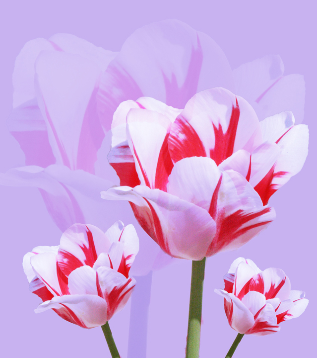
This is a new technique for me. I kind of like how it turned out, but I would like to know what other people think. I would also like to hear any suggestions for improvement. I created this mostly with layers and blending modes.

I titled this Waiting for Spring, because the spring flowers have not yet bloomed here. This tulip is from a photo from last spring.

Comments

8 comments
Comment posted by Floyd Hopper on March 22, 2011 at 11:26 PM
Great image. I like the bg how it reflects the tulips in the fg. My only nit, is the light green of the lower stem of the center tulip.
Registered on May 1, 2009, 652 Posts, 762 Comments
Comment posted by David W. Kelly on March 23, 2011 at 3:11 PM
Barb this is very creative. I like the way you have the larger flower in the BG with a lower opacity. Nice work.
Registered on October 7, 2005, 883 Posts, 6590 Comments
Comment posted by Marc Ward on March 23, 2011 at 5:45 PM
Barb,

This has a very fresh, poster-like feel to it. The large background tulip really makes this work. Nicely done...
Registered on February 26, 2009, 304 Posts, 1365 Comments
Comment posted by Craig Myers on March 23, 2011 at 10:47 PM
I've seen this technique used by portrait photographers. You've made it work well with flowers, too. I think I would like to see more pop from the main subject, however; perhaps less spillover of the pink background into the white of the petals. The light on the main stem can easily be cloned to match the green in the other stems. Thanks for giving me some food for thought in approaching some other subjects.
Registered on September 1, 2008, 85 Posts, 757 Comments
Comment posted by Ron Pederson on March 28, 2011 at 8:40 AM
Nice treatment; it does have a poster or card-like effect as Marc alluded to. I think I'd increase the contrast and saturation of the FG flowers just a bit to make it "pop" more.
Registered on October 19, 2010, 95 Posts, 470 Comments
Comment posted by Peter Richter on March 30, 2011 at 4:56 PM
Barb, you show us an interesting alienation effect, I like the fresh colors! Congrats on WP!

Peter
Registered on November 10, 2010, 218 Posts, 2723 Comments
Comment posted by SandyRichardsBrown on March 30, 2011 at 5:17 PM
Barb - congrats on the EP!
Great colors, perspective, and processing!
Sandy
Registered on November 24, 2003, 3937 Posts, 12909 Comments
Comment posted by Barb Pflaum on March 31, 2011 at 11:45 PM
Thank you for the WP! And thank you, everyone, for your comments and suggestions!
Registered on January 14, 2009, 316 Posts, 2724 Comments