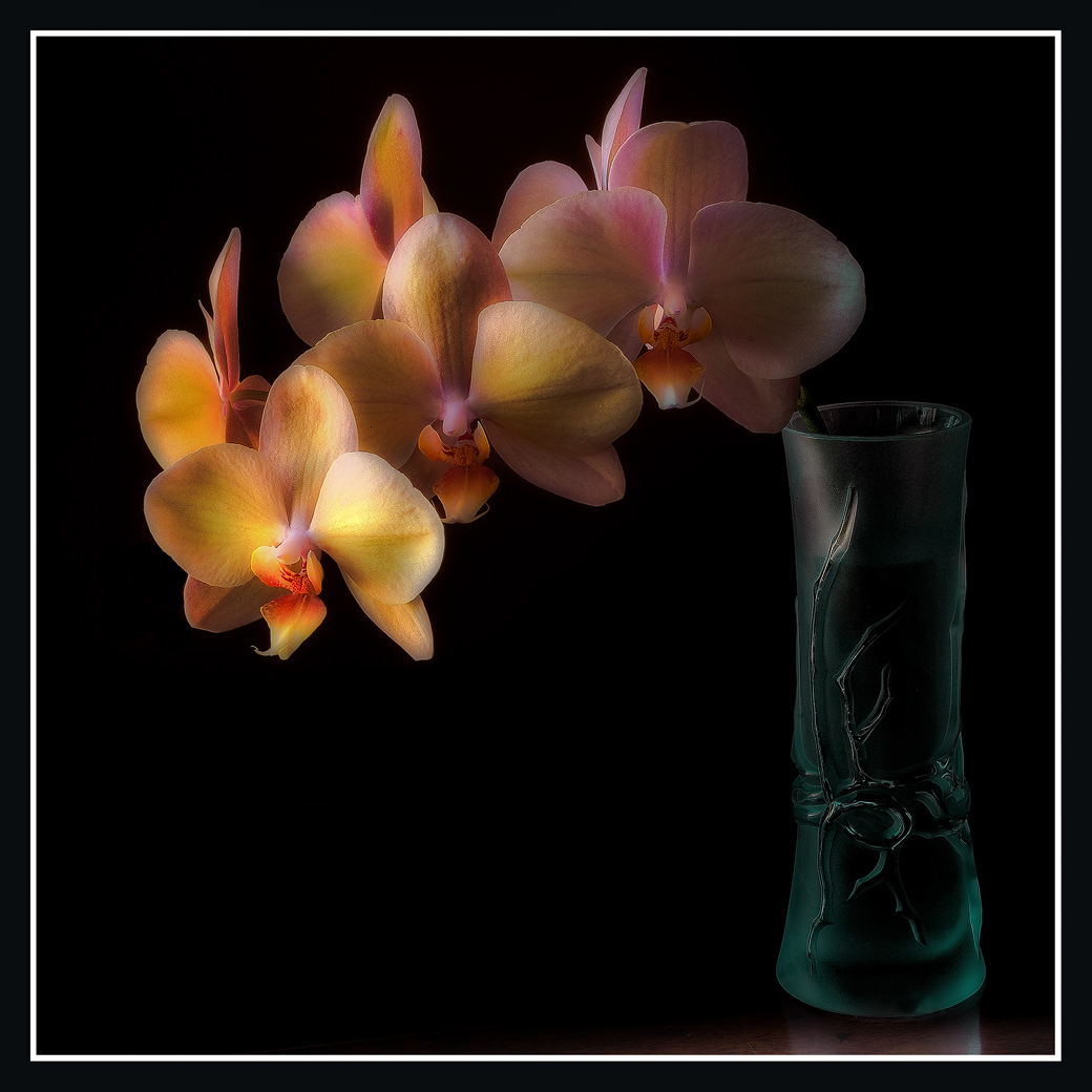
Rework of a stack from a year and a half or so ago.
Nikon D700
Zeiss 50 mm macro
Helicon Focus, CS 5, LR 3, Nik Suite, MacBook Pro 17
Comments and suggestions welcome.
pat
Comments
18 comments
Comment posted by Bill Fach on March 17, 2011 at 9:05 PM
Pat: Jaw dr pping fabulous! Spectacular lighting and another perfectly complementary vase. I always like how you get a tiny bit of reflected vase base on the tabletop. 4+ terrific. >=))>
Registered on November 1, 2003, 1805 Posts, 26981 Comments
Comment posted by SandyRichardsBrown on March 17, 2011 at 11:30 PM
Pat, this is gorgeous - just glows!
The positioning of the orchids and that vase really work great.
Sandy
Registered on November 24, 2003, 3937 Posts, 12909 Comments
Comment posted by Miro Susta on March 17, 2011 at 11:48 PM
Beautiful arrangement Pat. Very well done indeed.
Registered on August 18, 2006, 719 Posts, 3736 Comments
Comment posted by Ian Wolfenden on March 18, 2011 at 5:53 AM
Just extraordinarily beautiful, Pat ! All the half tones across the petals are superb, the composition perfect, and the glass the ideal compliment to the flowers. And, boy, does this have mood !!!!!!
Registered on May 18, 2007, 1108 Posts, 7647 Comments
Comment posted by Bob Duff on March 18, 2011 at 6:39 AM
Pat, Bill always wants your images so I won't fight him for that but please send me the vase
Great light and glow in the phal. The positioning and symetry of the blooms is perfect. The comp is very strong for this image.
My only nit is the white line in the border. Would have prefered it to be a complimentary colour. The white is a little too distracting for my tastes.
Registered on April 21, 2010, 160 Posts, 1675 Comments
Comment posted by Larry Lynch on March 18, 2011 at 7:47 AM
Just amazing Pat. Your work just gets better and better. Love this.
Registered on September 16, 2006, 773 Posts, 9940 Comments
Comment posted by David W. Kelly on March 18, 2011 at 9:00 AM
Pat this is beautiful and has a lot of mystery. I like the dark quality which really sets off the main orchid which has a wonderful glow. My only question is how did you get this in your scanner?
Registered on October 7, 2005, 883 Posts, 6590 Comments
Comment posted by Robert Dayton on March 18, 2011 at 9:49 AM
Excellent, Pat! Wonderfully composed with the vase placement.
The colors are lovely, and I like the change in the brightness from
the end of the flower as it recedes to the right. This is well thought
out, Pat, and extremely creative. I think that this would make an
awesome print.
Registered on November 11, 2008, 281 Posts, 3958 Comments
Comment posted by scott lanz on March 18, 2011 at 11:54 AM
Beautiful lighting. Well done.
Registered on November 14, 2003, 840 Posts, 12902 Comments
Comment posted by BorgesiusBeckles on March 18, 2011 at 12:28 PM
You just make me jealous Pat; No nit at all for me just perfect.Sweet soft colors against a nice bg.
Registered on November 25, 2003, 253 Posts, 434 Comments
Comment posted by Fabio Giarrizzo on March 18, 2011 at 1:14 PM
Beautiful shot- Great treatment of light and perfect composition- Very well done, Fabio
Registered on December 3, 2010, 90 Posts, 1614 Comments
Comment posted by Morris McClung on March 18, 2011 at 5:28 PM
Such a great vision to put this together and then your personal style just makes it into a gorgeous work of art.
Registered on May 7, 2007, 670 Posts, 19650 Comments
Comment posted by Gary Yeoh on March 19, 2011 at 2:26 AM
Classic Sampson portrait and simply gorgeous.
Love the glow in the petals and the receeding lighting from front to back. The only suggestion is perhaps to darken slightly the bright spot in the right most petal so it does not compete with the front bloom. The glass vase and reflection on the table are added bonuses.
Registered on September 1, 2009, 588 Posts, 8184 Comments
Comment posted by Pat Sampson on March 19, 2011 at 6:27 AM
Thanks for the comments. I appreciate them.
Bob,
I agreed with you about the striping and just went in to change it. Surprisingly to me, I couldn't find a color that didn't seem to clash with the white/grey in the reflection so I ended up leaving it white. Maybe if I hadn't seen it that way first, a complementary color would look more natural to me. I am surprised by it. You'll have to fight Terri for the vase. (smile) Part of her ebay collection.
Ian,
I'm trying to understand mood in images. I plan to read the following two Barthes papers shortly: "As Roland Barthes noted, Saussure’s model of the sign focused on denotation at the expense of connotation and it was left to subsequent theorists (notably Barthes himself) to offer an account of this important dimension of meaning (Barthes 1967, 89ff). In ‘The Photographic Message’ (1961) and ‘The Rhetoric of the Image’ (1964), Barthes argued that in photography connotation can be (analytically) distinguished from denotation (Barthes 1977, 15-31, 32-51). As Fiske puts it ‘denotation is what is photographed, connotation is how it is photographed’ (Fiske 1982, 91). However, in photography, denotation is foregrounded at the expense of connotation." I think there's more going on with mood than is suggested in this paragraph but no claim to understanding it at this point.
Gary,
Good advice on the bright spot. I've darkened it in my archival copy. Surprisingly, it's a light spot on the petal rather than a bright spot on the petal. I couldn't completely darken it away without making the image look unnatural in zoom. I did darken it some though. Thanks.
pat
Registered on May 19, 2007, 953 Posts, 15989 Comments
Comment posted by Brigitte Lorenz on March 19, 2011 at 6:57 AM
wonderful image, Pat...I like the mood and the colors a lot...great work!!!!
Brigitte
Registered on January 10, 2009, 187 Posts, 1507 Comments
Comment posted by Anne K. Rusk on March 19, 2011 at 6:01 PM
Okay, that seals it...I must learn to stack! Just when I think it can't get better, it does. Unreal!
Registered on October 10, 2010, 65 Posts, 904 Comments
Comment posted by Albert Darmo on March 19, 2011 at 6:25 PM
Hi Pat A marvelous achievement!! Your artistic control of light ,composition and color always amaze me.!
Albert Darmo. Canada
Registered on November 25, 2008, 1386 Posts, 11978 Comments
Comment posted by Harley Goldman on March 21, 2011 at 5:19 PM
How did you fit this in the scanner? Wrong techique, my bad. Another beautiful image, Pat.
Registered on November 19, 2003, 586 Posts, 11271 Comments

Comments
18 commentsThe positioning of the orchids and that vase really work great.
Sandy
Great light and glow in the phal. The positioning and symetry of the blooms is perfect. The comp is very strong for this image.
My only nit is the white line in the border. Would have prefered it to be a complimentary colour. The white is a little too distracting for my tastes.
The colors are lovely, and I like the change in the brightness from
the end of the flower as it recedes to the right. This is well thought
out, Pat, and extremely creative. I think that this would make an
awesome print.
Love the glow in the petals and the receeding lighting from front to back. The only suggestion is perhaps to darken slightly the bright spot in the right most petal so it does not compete with the front bloom. The glass vase and reflection on the table are added bonuses.
Bob,
I agreed with you about the striping and just went in to change it. Surprisingly to me, I couldn't find a color that didn't seem to clash with the white/grey in the reflection so I ended up leaving it white. Maybe if I hadn't seen it that way first, a complementary color would look more natural to me. I am surprised by it. You'll have to fight Terri for the vase. (smile) Part of her ebay collection.
Ian,
I'm trying to understand mood in images. I plan to read the following two Barthes papers shortly: "As Roland Barthes noted, Saussure’s model of the sign focused on denotation at the expense of connotation and it was left to subsequent theorists (notably Barthes himself) to offer an account of this important dimension of meaning (Barthes 1967, 89ff). In ‘The Photographic Message’ (1961) and ‘The Rhetoric of the Image’ (1964), Barthes argued that in photography connotation can be (analytically) distinguished from denotation (Barthes 1977, 15-31, 32-51). As Fiske puts it ‘denotation is what is photographed, connotation is how it is photographed’ (Fiske 1982, 91). However, in photography, denotation is foregrounded at the expense of connotation." I think there's more going on with mood than is suggested in this paragraph but no claim to understanding it at this point.
Gary,
Good advice on the bright spot. I've darkened it in my archival copy. Surprisingly, it's a light spot on the petal rather than a bright spot on the petal. I couldn't completely darken it away without making the image look unnatural in zoom. I did darken it some though. Thanks.
pat
Brigitte
Albert Darmo. Canada