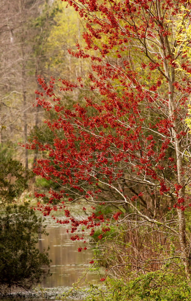
Across from Woody Pond
by Barbara Graham
Canon EOS REBEL T2i
EF-S55-250mm f/4-5.6 IS
3/9/2011 – 11:02:12 AM
1/1000
Manual
f/9
ISO 400
Focal length 250 mm
Harris Neck NWR, Southeast Georgia
Raw file processed in PSE9
Just trying again. I like the light, the colors, the red tree and the view. All feedback would be greatly appreciated. Thank you!

Comments
21 commentsI'm gonna step way out on a limb here and do something that I don't think has been done here before. I would like to challenge you and ask you to compare this image with your previous posting in Landscape.
I really don't want to put you on the spot, but I want to challenge you to be able to evaluate your own work. Although I did not comment on the previous post, I do have an opinion on both of these. I am glad to share my critique with you, but I would first like to hear your own evaluation between the two. Try and remove yourself from the images and critique them objectively. What do you think makes one image stronger than the other? What is appealing, distracting or otherwise prohibiting you or someone from engaging with these images?
Please feel free to contact me offline if you think I've over stepped my bounds here, but I really believe there is something to be gained here.
Lon
But of course you psoted the image here for some comments, so I'll add my opinion: I really like how you've framed the reds here in contrast with the green background, it really makes it stand out a lot. Ideally I might darken the bg just a tad, to make the lovely reds stand out even more here!
Gary.
Peter
As for me, I like the soft color of this - it almost looks like a slight Orton effect has been applied. I think a small crop off the bottom might help the composition somewhat. I don't mean this to be critical, but it seems you're still struggling a bit with your landscape compositions, at least when compared to your compositions in the Flora and Photo Art galleries. You're knocking them out of the park there. You've certainly made improvements IMO, but still have a way to go perhaps in landscapes. For that matter, who of us doesn't have plenty of room for improvement there? It could just be me, of course, perhaps I don't understand what your vision is; what you want to "say" with your landscapes. Anyway, just my thoughts...
Guy
1. Depth -- The previous post doesn't have any. This one does.
2. Center of interest - The previous post doesn't have one. This one has the red tree, though what's confusing to me about this is that the red tree is only one of the things I wanted to convey. The water underneath and past the red tree was also important to me. I don't know how that works, if there's more than one thing you want to convey.
3. The viewer's place in the image - The previous image doesn't have a place for the viewer to enter the image. In this one I think the water allows the viewer to enter the image and the trees and land beyond the water keep the viewer from leaving the image.
4. The viewer's interaction with the image - The previous image doesn't have anything to interact with. This one has the tree and following the water under the tree.
5. Rest area - The previous post doesn't have one. This one has the water.
6. Visual path - The previous post doesn't have one. This one does, though it starts more or less in a corner, which is not good.
7. Leaning out/in - The previous post has the trees leaning out. This one has the tree leaning in.
Summary: The previous post is not abstract enough to be an abstract, and as a "real" landscape doesn't have any place for the viewer. This one as a "real" landscape does have a place for the viewer.
Hopefully if I've got this all wrong it'll still be useful somehow. Thank again, Lon, very much.
One suggestion, if I may. Look seriously at the landscapes of others that you really admire. Figure out what it is that you really like about them. Is it the perspective, low or high, the light (time of day), technicals (f/stop, shutter speed, etc). Figure out what it is that appeals to you, and then try to emulate that. I'm not saying outright copy someone or steal their "style", but certainly it's ok to copy techniques that have proven to be successful for others. Again, just a thought.
It's really encouraging to see someone work as diligently as you do to improve your craft!
Thank you for taking the time and meeting my challenge! Like Bill eluded to, we're all still learning no matter what level one thinks they're at. And honestly, try not to judge yourself or your photography as being right or wrong. There is no right or wrong way to photograph something. Sure, lots of techniques, visions and creativity to create something that is more appealing to some and not to others, but in the end what we offer here or anywhere else is opinions on what appeals to us - not necessarily you. Hope that makes sense.
So Nancy and others, what I was after was simply trying to get Barbara to not only look within and do a self critique, but also from outside looking in and trying to assess what qualities in these images appeal to others. And rather than think that if you didn't follow a rule that you did something wrong, assess why someone may have commented about a particular aspect and whether or not that agrees with your own thoughts.
A perfect side note example is long shutter speeds, and silky water. Many folks don't like the effect, many others love it. There is no right or wrong.
Your self critique is quite detailed and covers a lot of ground, most all of which I agree with your critique. In you summary you called this one a "real" landscape. Here's where I would disagree with a minor point, but to make a point. The other image is just as "real." Here again, it's not an "is" or "isn't" situation. I simply look at it as one image has more appeal or impact than the other.
I find this image to be among your best. As mentioned by others the lovely red is isolated nicely with a soft background and this just has a pleasant feel about. The other one was a bit harsh with all the attributes that you and others have pointed out.
I'll go even a step further and ask what your approach was in capturing this image? Choosing apertures and shutter speeds are choices of creativity which I'm quite sure you have or are starting to realize. Choosing a somewhat wide aperture can produce a scene like this where the bg is soft and helps isolate your main subject. If you can get to the point where you are thinking about these choices and why before you capture the image and while you are "seeing" the landscape in front of you, I think you will be at that next level.
Lon
Now not to beat a dead horse here, but your aperture was not incorrect or correct. It was correct for what you were trying to accomplish! And clearly you chose wisely given what you just described as what your intent was. If you had said, "I chose f/5.6 to achieve maximum depth of field," I guess I could say you were incorrect. Do you see the difference? You made a creative choice and that was the correct choice for what you were trying to do.
Ok, even getting myself turned around here. Nice job with this image.
Lon
As far as more room on the right, that tree/shrub you see with the yellow at the right edge was in front of the red tree there. Would it have been better, maybe, to still move over more, even though it would have added another element to the image?
Keep working on your photographic skills and I think you will get some unique images because your subjects are different and creative.