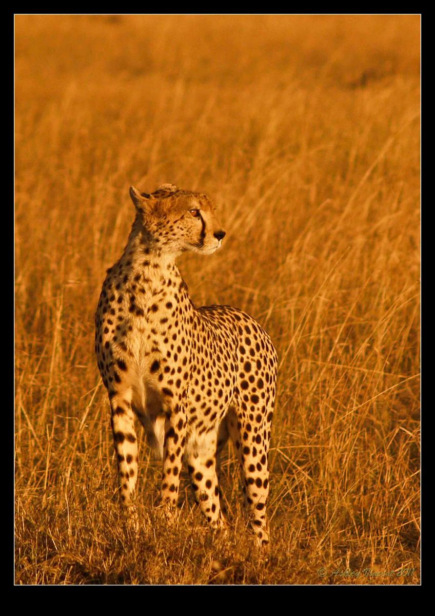
Masai Cheetah #2
by Ashley Vincent
Olympus E-500, 40-150mm f/3.5-4.5 @ 150mm, Creative Mode, f/4.5, 1/500 sec), ISO set 320, Handheld, JPG
Here's one more of the Cheetah series I took that I rather like, and only wish yet again I'd been shooting in RAW as well as with a longer lens ;^.
PP: Cropped off about 70% and brought the saturation down a touch.
Critique and comments most welcome, thanks for taking the time to read and view :^)
Kind regards,
Ashley

Comments
15 commentsThanks for your comment on my photo - I used aperture priority.
Beautiful shot here of the cheetah in a typical pose.
I read you toned down the saturation but the cheetah still looks a touch too yellow for me.
Best, Ingrid.
colors are o.k. for me. All of us are waiting for light like this
Petr
Ingrid: I can see from your website - which I've just taken some time to look through and admire this evening :^) - that you certainly have a lot more experience with photographing wildlife in Africa than I have, so I readily accept what you're saying. At the same time, as Petr observed, from my understanding this is exactly the kind of light most of us pray for and, as such, seeing as the situation in reality at the time I took these shots was easily as rich and golden as it appears here, unnatural as it may look to some, I decided to tone it down just a touch rather than lose too much of what I recall it as having been.
Hopefully you won't see this as a contradiction Ingrid, as that certainly isn't my intention, and I am looking for alternative perspectives, so thank you again for offering yours and I hope this won't be the last time :^)
Wishing you both a great weekend :^)
Ashley
Jules: Once again I hang my head in embarrassment ;^. Even though I can't actually see them, the "virtual" feet you speak of could well be there, so leaving more space at the bottom of the frame would have been a much better idea. Thanks again for pointing out what should have been obvious to me my friend :^)
Ingrid and Wayne: Having given your suggestions with respect to the saturation more thought, I came to the decision that in light of the fact both of you apparently have much more experience than me, I would be a fool not to act on your recommendation. Therefore, I have re-worked this image again; in PS I selected the subject and, in Hue/Saturation, I moved the Saturation slider down to -9, then to bring back the blacks a bit I shifted the Lightness to +9.
Further to this, I did a bit of sharpening (hopefully not too much!), cloned out a few of the brightest strands of grass (that I thought were a little distracting) and, to follow on Jules's observation, enlarged the crop some to allow for the "virtual feet" :^)
I'd be very happy to know if you think these adjustments are an improvement on my original post, or whether perhaps you feel the subject is still too saturated.
Thanks again for your time and consideration.
Kind regards,
Ashley
To my eye the cheetah fur on your second post looks more natural - thanks for reposting!
Ingrid.
Vijay: Although the colour contrast will be slightly different from the last re-work (can't recall the exact settings I used previously and I'm at the end of a really long day!), I've made an alternative crop to landscape so you, and I guess others who may be viewing this, can decide which one holds more appeal ;^)
Ingrid: Good to be back again ;^) and thanks for opening my eyes to alternative perspectives :^)
All the best :^)
Ashley
Quite frankly, having shot all those photos in Kenya in JPG format, much as I loved many of them at the time, since working only in RAW I'd pretty much given up thinking about these images being any good at all. So it's real pleasing to have my eyes reopened, as it were, to how lucky I really was with my camera :^)
Hope to be showing you more soon, thanks again and all the best :^)
Ashley
There are indeed more pixels in this last one, and I guess the reason why I cropped it originally as a portrait was that I wanted to make the subject more prominent in the frame. I still like the original crop, however, the longer I look at it in landscape the more I appreciate this format as well ;^)
Thanks again Kim for your valued feedback :^)
Cheers!
Ashley
I like the landscape version even better...gives his eyes something to look at
Seriously, this is an excellent example of what I was hoping for when searching for a photography discussion forum: an opportunity to receive feedback - even if I didn't initially or might not always agree with it - that would offer me the opportunity to regard my own work from an alternative perspective. And you guys have really done a great job in helping me view - and appreciate - this particular image from a number of different standpoints, thank you all very much and hope you'll all be willing to offer your thoughts, opinions and suggestions on future posts I make.
Wishing you all a great day/night ahead :^)
Ashley
Not always easy I know, but if the ears were forward and the tail was visible then I think it would have added just a little bit more to an already excellent image - well done :) cheers Stu
Thank you Stu, for viewing and offer your valued opinion :^) I hear what you're saying with respect to giving the Cheetah more room to look into by shifting her over to the left while at the same time this would remove "dead" area on that side. I did in fact shift her back and forth (left and right) numerous times before settling on this composition, and how far I should set her to the left was the most difficult decision I had to make.
Reason why I gave her more room on the left was that she was heading in that direction and, with her body facing that way as well, I figured best to leave a little more space for her to take her next strides into. I guess there's any number of different compositions one could make of this and it's always interesting for me to have alternative points of view, and thanks again for yours :^)
As mentioned in the previous photo thread, the two images of this Cheetah were taken from a longer series of shots I managed to fire off. I chose this one in particular because I felt it particularly emphasised her beautiful profile and the intensity of her focus on the distant Gazelle. I didn't stop to think about the position of her ears or the fact that this happened to be one of the few images I have that don't show her lovely tail, so again, thanks for pointing these aspects out to me too :^)
All the best :^)
Ashley