Nature Photographers Network
This is the preserved archive of the original Nature Photographers Network. The community continues at naturephotographers.network.
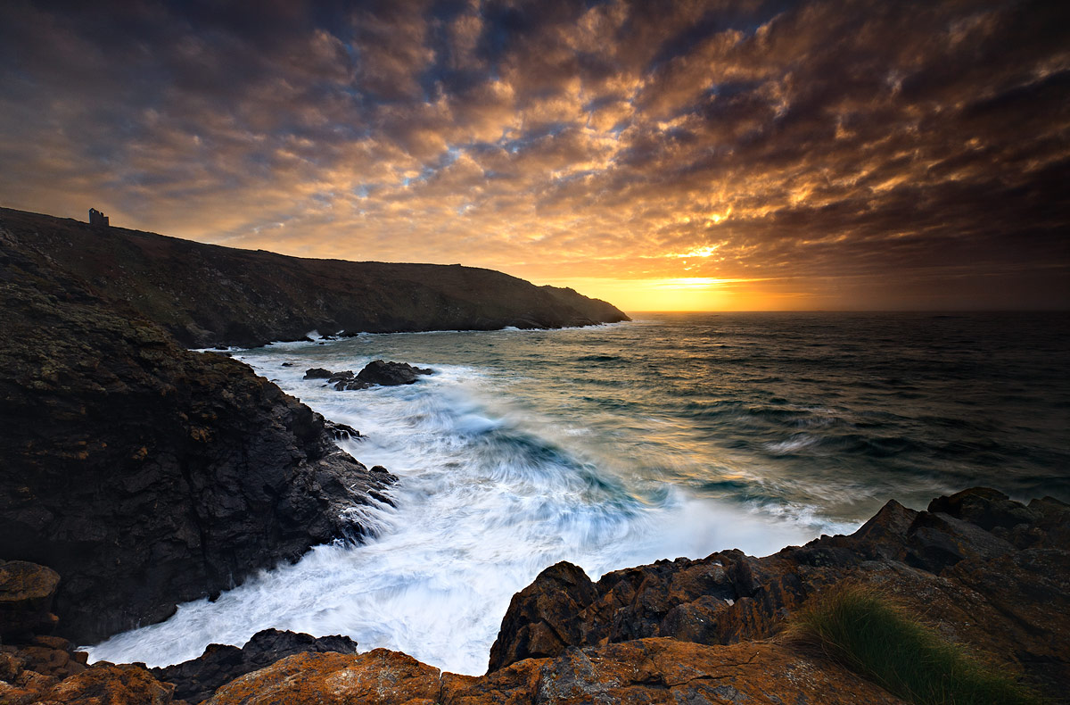
Sunset at Botallack
‹ PreviousMan & Nature GalleryNext ›

Sunset at Botallack

by Håkon Iversen

Gallery: Man & NaturePosted February 27, 2011115 views11 comments
LARGE VERSION INCLUDED

I'm in desperate need of feedback on this shot...I've worked on it for what feels like FOREVER. It was taken in Botallack in Cornwall, England during extremely challenging conditions. Insane amount of sea spray on both the filters and in the air made the raw file more or less completely without contrast. I've had to utilize more or less all of my photoshop knowledge to get the file to where it is now. That being said, the only thing I have done is add contrast locally and a bit of tweaking of the saturation (some places tones it down and some places enhanced).

So, what I need is some external feedback. Give me your first impressions please, I've been working so much on this that I've "looked myself blind"...(I'm not sure if that is an expression in English, hope you understand what I mean)

Canon 5D
Canon 17-40 @ 17mm
0.8sec
f/16
ISO100
Lee .9 and .6 ND grads (i think...might have just been the .9)
Heliopan Polarizer

Some input would be HIGHLY appreciated!

Cheers
Håkon

Comments

11 comments
Comment posted by Silvia Richter on February 27, 2011 at 3:03 PM
It is a strong composition, great shot! I especially like the formation of the clouds and the bright sunlight above the horizon.

Silvia
Registered on February 27, 2011, 18 Posts, 167 Comments
Comment posted by Basil Greber on February 27, 2011 at 4:10 PM
I like the large version a lot. I think the image works better in the large version because some of the detail in the crashing wave and the foam resolves there only. Anyways, I think this is a very intense shot. There is intensity in the colors, and there is intensity in the content (the wave). I like both. The color palette seems to be fairly dark (can't say for sure, uncalibrated monitor here), but I think it looks good and adds to the mood. A great shot.
Registered on November 8, 2005, 219 Posts, 1340 Comments
Comment posted by Bob Miller on February 27, 2011 at 5:01 PM
The way this image leads us is in is enough to say it's a big time keeper. The sky looks great. Vignetting may be a tad dark and might like to see a little bit more detail in the shadows but these nits are very minor. Beautiful and dynamic.
Registered on January 24, 2005, 152 Posts, 405 Comments
Comment posted by Kenn Leonhardt on February 27, 2011 at 5:53 PM
Awesome drama. I do find the right 1/3 of the shot to be overly dark and would brighten it up, but otherwise this looks great.
Registered on March 29, 2008, 27 Posts, 1710 Comments
Comment posted by Kartik Venkatarama on February 28, 2011 at 12:01 AM
I think it is a terrific and dramatic image, worth all the effort you put into it. I do think there appears to be an overly strong gradient near the sun's location in the right third of the frame. Some luminosity adjustments with a gradient mask should resolve that.
Registered on July 27, 2007, 197 Posts, 830 Comments
Comment posted by Håkon Iversen on February 28, 2011 at 8:44 AM
Thanks for the feedback! Yes, it must be viewed large to be able to see the details on the rocks to the left.

As for the dark right side of the shot, I have started to take steps towards correcting it!

Cheers
Håkon
Registered on August 16, 2010, 20 Posts, 123 Comments
Comment posted by David W. Kelly on February 28, 2011 at 1:41 PM
Beautiful color and comp and the vignetting works nicely.
Registered on October 7, 2005, 883 Posts, 6590 Comments
Comment posted by Paul Marcellini on February 28, 2011 at 6:49 PM
Defintiely need to see the large. A great sky and view. I might tone down the white a touch since the whole image is so dark, or bring the mids up just a bit.
Registered on November 27, 2007, 250 Posts, 2468 Comments
Comment posted by Kah Kit Yoong on March 1, 2011 at 8:27 AM
A very dramatic shot in every way. There's a heavy vignette that might me worthwhile using the vignette tool to correct.
Registered on September 27, 2006, 636 Posts, 10682 Comments
Comment posted by Doug Roane on March 1, 2011 at 6:43 PM
Excellent image and very good compostion. Fix the triangle of darkness on the right, as has been said, and you've got a winner! Nice work!
Registered on December 12, 2008, 213 Posts, 2226 Comments
Comment posted by Eva McDermott on March 4, 2011 at 7:44 PM
I really like the comp and wave action Håkon. The right 1/3 looks a little too dark. Do you have Tony Kuyper's Luminosity Layers and Masks? I find them indispensible in situations like this. You can selectively lighten or darken specific tonal ranges. I would also reduce the vignetting. This of course all depends on what statement you are trying to make. Hope this helps and hope you show us the repost.
Registered on January 4, 2009, 1015 Posts, 13229 Comments