Nature Photographers Network
This is the preserved archive of the original Nature Photographers Network. The community continues at naturephotographers.network.
A Tangerine Blue
‹ PreviousLandscape GalleryNext ›

A Tangerine Blue

by Andrew Morrill

Gallery: LandscapePosted February 27, 2011661 views26 comments
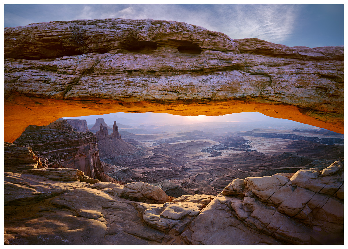
I posted a very different (very bad!) version of this last year. The original was very difficult and I (and my dying monitor at the time) was simply not up to the challenge. I'm hoping this latest version is much better (always hard to tell after I've been staring at it so long).

Obviously this was taken in a very popular location, and I've tried to do something a little different. For a few years I had had a vision of this shot that would include the sky (to color contrast with the vibrant orange) and a good chunk of the valley below - as I felt most shots didn't give a very good sense of scale. Plus I've always thought the canyons below are really what make this location special. Love to hear what you think.

Just for fun, and in case you're interested, I'm posting the original scan and the older edited version below (WARNING - it's hard on the eyes :eek:). --- My philosophy on photo editing is much like many photographers these days - I'm trying to get back to the "feeling" of being there - closer to how my eyes remember it than what was on the film (more below by the original). I'd be interested to hear your thoughts on the subject. Also, does seeing the original skew your perception of my latest version?

Larger version available.

Comments/critiques/suggestions very appreciated as always. :biggrin:

Walker Titan 5x7, Provia 100F, Schneider 110mm XL, Singh-ray 2 stop soft, drum scan

Comments

26 comments
Comment posted by Andrew Morrill on February 27, 2011 at 2:48 AM
The original version --- keep in mind this is a drum scan and the point is not to look good, but to retain as much information as possible. The film on a light table looks much better. Also, notice the top of the arch is much darker than it would have been - because of the GND to try and save detail in the sky.
Registered on June 10, 2010, 51 Posts, 216 Comments
Comment posted by Andrew Morrill on February 27, 2011 at 2:53 AM
My version from last year - the main failure was that I didn't fully remove the global very strong blue cast before I moved on to the more local edits. (plus my dying monitor didn't help :rolleyes:) Now - whenever I do global color correction I always go back to it over a period of days to make sure I've got it right before I move on. But I'm quite happy to be moving on from this version. :jump:
Registered on June 10, 2010, 51 Posts, 216 Comments
Comment posted by Jim Greenwood on February 27, 2011 at 7:25 AM
The new reworked version is an obvious, distinct and dramatic improvement. I've been to this location a few times over the years, and the colors and ambiance of your most recent composition are very much as I remember them to be. Well done!
Registered on November 9, 2003, 229 Posts, 1523 Comments
Comment posted by Peter Richter on February 27, 2011 at 7:39 AM
Andrew, your latest version has a fine natural look, the framing makes it outstanding. Although I have never got the chance to visit this place until now, I feel like standing in the middle of the scene.

Peter
Registered on November 10, 2010, 218 Posts, 2723 Comments
Comment posted by Abdullaziz Bin Ali on February 27, 2011 at 9:03 AM
Well Andrew, you have done an excellent job here
it is obviously took you a lot to achieve this result
I really like it especially the bottom part of the arch which is in orange, I feel it gave the work some power and great contrast with the general tone
:wavey:
Registered on May 31, 2009, 112 Posts, 1590 Comments
Comment posted by scott lanz on February 27, 2011 at 9:28 AM
Excellent rework. The detail is remarkable, and the colors look very good. :toast:
Registered on November 14, 2003, 840 Posts, 12902 Comments
Comment posted by David Chauvin on February 27, 2011 at 9:30 AM
An amazing improvement! :toast: If I had to recommend one thing it would be to deepen the shadows in the upper left on the arch. They seem a bit light to me.
Registered on August 5, 2004, 1007 Posts, 5595 Comments
Comment posted by R.Bill Moser on February 27, 2011 at 10:28 AM
I think your reworked version is indeed a dramatic improvement. The reworked version has a natural look
Registered on January 29, 2010, 285 Posts, 4281 Comments
Comment posted by Jake Case on February 27, 2011 at 10:56 AM
Wow, I definitely think you succeeded in creating your own unique vision on this "overdone" location. Both of the areas you wanted to emphasize, the sky and the canyons below, really do add interest and depth to the photo. The processing has kind of a grunge quality that I don't think I've ever seen used on a shot of Mesa Arch before, and definitely sets a great mood. My only nit is that I think the blue color cast is still rather strong, especially when you look at the highlights in the arch. Otherwise I think this is a outstanding photo!
Registered on December 13, 2010, 38 Posts, 167 Comments
Comment posted by Bob&Charly Nelson on February 27, 2011 at 11:50 AM
I am all for the new and improved version Andrew. This image shows great depth and detail. Good work.
Bob :wavey:
Registered on October 27, 2005, 289 Posts, 4202 Comments
Comment posted by Mark Pelton on February 27, 2011 at 12:20 PM
New version is a vast improvement. Thanks for showing the other versions. I wouldn't change a thing.
Registered on November 25, 2003, 380 Posts, 4647 Comments
Comment posted by Art Escobado on February 27, 2011 at 12:56 PM
The rework is very nice!!
Registered on January 7, 2007, 0 Posts, 775 Comments
Comment posted by Scott Fricke on February 27, 2011 at 1:46 PM
Kudo's for spending the time to rework this, you did a masterful job on this version. Great colors, texture and composition, very well conceived!
Registered on January 19, 2007, 133 Posts, 1448 Comments
Comment posted by Eva McDermott on February 27, 2011 at 3:20 PM
Stunning post Andrew. Nice detail in the shadows and balanced color compared to your follow up posts. The detail in the large view is spectacular.
Registered on January 4, 2009, 1015 Posts, 13229 Comments
Comment posted by Tony Kuyper on February 27, 2011 at 4:30 PM
Much improved, Andrew. Interesting how we get better with time, isn't it. I really like the controlled light in this image. You'd expect it to be darker given that you were shooting into the sun, but you brought out the textures very well. I could see selectively taking some blue/cyan out of the and even it's glowing underbelly. Even though these were very cool-colored in the original film version, making them warmer would offer nice contrast with the sky, I think. Obviously, this is a comment on how to interpret an image, and going with your own feelings usually is the best idea, though I also advocate listening closely to what the print has to say.
Registered on November 1, 2003, 364 Posts, 22328 Comments
Comment posted by Vance Gese on February 27, 2011 at 8:22 PM
Incredible image, Andrew. Love that light and the wonderful view of the distant landscape. Your processing of the drum scan has brought out such intricate detail and tone in the rock and given the light a gorgeous quality, and a completely different feel than your previous processing. Thanks for providing the drum scanned image; I can see that a drum scan allows far more potential than my flatbed scanning ever will. Superb work.
Registered on November 13, 2008, 298 Posts, 6629 Comments
Comment posted by Chris Chamberlain on February 27, 2011 at 9:46 PM
Nice shot! The redux looks great. I was there once, back when I didn't have a clue as to what I was doing. I'd like to go back, as now I think I at least have some clue.

Chris
Registered on March 13, 2007, 500 Posts, 8365 Comments
Comment posted by Lon Overacker on February 27, 2011 at 10:54 PM
Andrew,

Wow, what a difference a year makes! Thanks so much for sharing the original and progression. My first question is though, how did you overcome the light leaks?? Great job with any cloning or whatever you may have done. That original processing was gaudy, if I can say that... but this current version is quite excellent. You did a great job pulling out the detail and recovering the color throughout. Great job with this one.

Lon
Registered on November 24, 2006, 521 Posts, 19147 Comments
Comment posted by Luis Argerich on February 28, 2011 at 12:40 AM
What a fantastic image, when I saw the thumbnail it looked like a reflection of someting, what a difference!
I like how deep the view seems to be, the light, the colors, everything.
Registered on December 22, 2009, 91 Posts, 1349 Comments
Comment posted by Andrew Morrill on February 28, 2011 at 1:37 AM
Thanks everyone for the feedback, I really appreciate it.

Tony - I think I might try and warm up the arch a bit more - as it does seem cooler than the rock below. I've had a lot of trouble with funky color in the very top section of the arch and also the deep shadows in the arch due to low exposure - but more can be done I think.

Lon - the top right light leak I fixed with a gradient using colors sampled from the sky itself. The bottom light leak was fixed by just color correcting it and then darkening it substantially. Those pesky light leaks have plagued me - I've finally learned to pull the film cover as fast as possible to avoid leaks.
Registered on June 10, 2010, 51 Posts, 216 Comments
Comment posted by Jason Blankenship on February 28, 2011 at 3:30 PM
Wow, what an incredible difference in processing. Great job!
Registered on May 20, 2008, 15 Posts, 94 Comments
Comment posted by Jason Kim on February 28, 2011 at 6:07 PM
Really nice view, I like that you chose to include the sky here. I just love the landscape that is far off in the background, and I think I commented the same when you posted the original a while back. I think it would benefit from a slight warming of tones and some of Tony's recs. I wouldn't hesitate to brighten the upper sky a bit, it feels just a tad too dark here. I think this still has some more potential but it's looking really good.
Registered on July 1, 2006, 60 Posts, 1233 Comments
Comment posted by Gary Crabbe on February 28, 2011 at 9:48 PM
Wow; if you got that from that, then all I can say is congratulations. Extremely well done on the recovery.
Registered on November 1, 2003, 182 Posts, 1840 Comments
Comment posted by Andrius Pašukonis on March 1, 2011 at 12:53 AM
Absolutely stunning work!
Registered on July 23, 2005, 111 Posts, 408 Comments
Comment posted by Arild Heitmann on March 1, 2011 at 6:36 AM
The latest version is a huge improvement from the last one. HUGE improvement! Great shot...
Registered on October 13, 2010, 27 Posts, 378 Comments
Comment posted by Jared Ropelato on March 2, 2011 at 11:59 AM
Andrew,
first, great original shot and great improvement on processing. This is a very nice photo. May I make the following suggestions?
Your idea of creating color contrast is a very good one, as is your idea about the stunning view of the valley before. I love both. I would like to see the color contrast side by side for best effect, meaning I would like so see some blue sky directly under the orange lit underside of the arch as opposed to it being above and separated by the front facing side of the arch.
Also, While you captured amazing detail in the side of the arch, I feel it may be a little too bright and therefore stealing focus from the brilliant orange glow underneath. I would like to see some of the shadow from the original to give it a more natural feel and to let that warm light really glow. Take all of this with a grain of salt as it may be my monitor making it appear too bright.
That said, I have to say that from the orange stripe down, this image is absolutely perfect. Your technique, detail, recovery, light and shadow are flawless.
Overall a great image Andrew, and your work and dedication has paid off.
Registered on March 1, 2011, 25 Posts, 204 Comments