Nature Photographers Network
This is the preserved archive of the original Nature Photographers Network. The community continues at naturephotographers.network.
Glad
‹ PreviousFlora GalleryNext ›

Glad

by Nancy Lea Sandy

Gallery: FloraPosted February 25, 201131 views6 comments
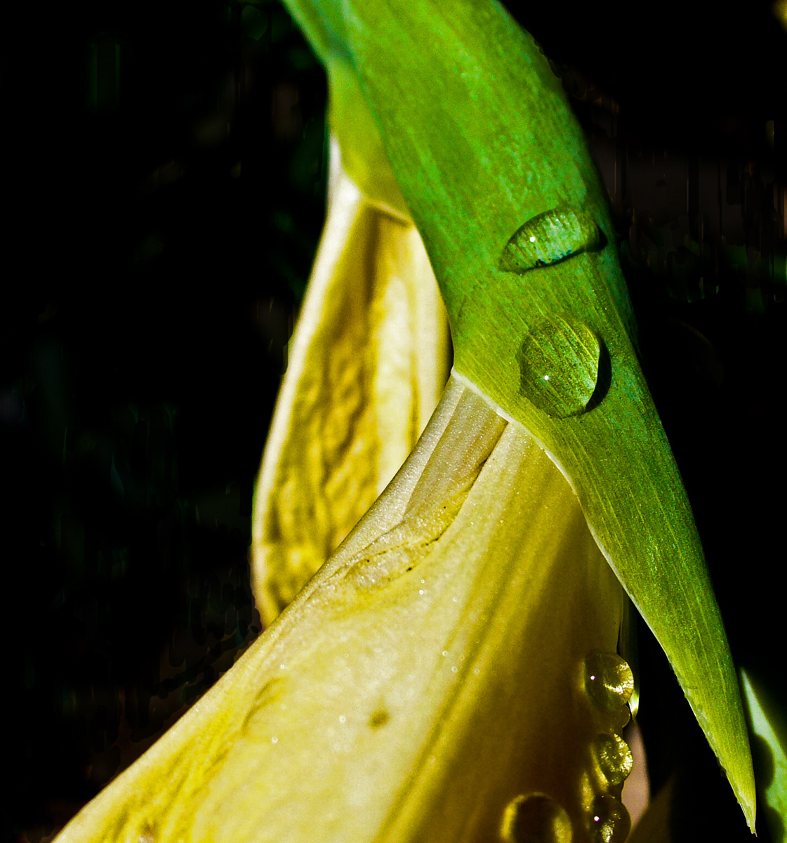
I have a processing problem with this image. The highlights were badly blown so I made adjustments in PS-shadow/highlight. I also cloned out some distracting color in the background. I'm still not completely happy with the results but I do like the graceful curve and the waterdrops. What else can I do with this? Suggestions very welcome. Thanks for looking

1/500sec f/5.6 6mm

Comments

6 comments
Comment posted by Carol Hyman on February 25, 2011 at 11:00 PM
Hi Nancy,

I too like the graceful curve and the waterdrops.

You might want to add a layer to carefully darken the background yellow/whites.

Carol
Registered on January 18, 2007, 597 Posts, 8062 Comments
Comment posted by Bill Fach on February 26, 2011 at 1:09 AM
Nancy: I do like your comp and the drops. If the RAW file was blown there's really not much PS trickery that will revive it. The real trick is to check your histogram in the field immediately after capture to see if there are any hot spots and then compensate accordingly. >=))>
Registered on November 1, 2003, 1805 Posts, 26981 Comments
Comment posted by David W. Kelly on February 26, 2011 at 8:24 AM
I didn't see the original but the processing is good. You might want to try a black and white conversion. :smile:
Registered on October 7, 2005, 883 Posts, 6590 Comments
Comment posted by Michael Lowe on February 26, 2011 at 8:43 AM
Nancy, Im not much with post processing so I try to get it right in the field. Always check your histogram and a diffuser is helpful in strong lighting conditions. I like the composition and drops. :wavey:
Registered on February 11, 2004, 777 Posts, 5252 Comments
Comment posted by Derek Yow on February 26, 2011 at 11:48 AM
Nancy: Looks like a tricky shot to pull off, but I think you've done pretty well with this.
My suggestion is exactly in line with Carol's recommendation of darkening the BG. Dont give up on this yet..!
Registered on May 18, 2010, 26 Posts, 655 Comments
Comment posted by Pat Sampson on February 26, 2011 at 3:29 PM
Nancy,

This looks pretty good to me as is. I like the textures and the light in the droplets. I do like David's suggestion of a black and white conversion.

pat
Registered on May 19, 2007, 953 Posts, 15989 Comments