Nature Photographers Network
This is the preserved archive of the original Nature Photographers Network. The community continues at naturephotographers.network.
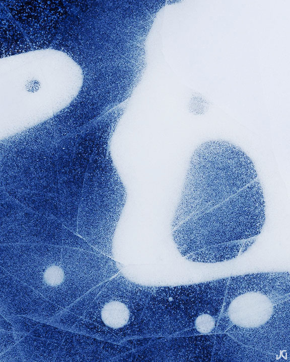
Picasso On Ice (w/crop)
‹ PreviousLandscape GalleryNext ›

Picasso On Ice (w/crop)

by Jimmy Gekas

Gallery: LandscapePosted February 9, 2011237 views28 comments
Rocky Mountain National Park, Colorado

My last post told the story of why I was in Colorado and how much fun I had meeting all the cool photographers from the Rocky Mountain Region of NPN. This image is also from that trip

I know that it may not work for everyone, as some of the white detail is gone in this web version, but I was more interested in the cool shapes and contrasts. The art part of this image is what I was after and I was ok in sacrificing some of the details. Thanks to Jesse Speer for a little added guidance in the processing :wink:

Comments

28 comments
Comment posted by Lorna Taylor on February 9, 2011 at 5:36 PM
Love this ice abstract, beautiful work!
Registered on November 12, 2010, 254 Posts, 3083 Comments
Comment posted by Harley Goldman on February 9, 2011 at 6:19 PM
Fascinating abstract.
Registered on November 19, 2003, 586 Posts, 11271 Comments
Comment posted by Nick Bristol on February 9, 2011 at 7:18 PM
This is really cool looking, Jimmy. I think the shapes are facinating and I love the frost and cracks in the ice. I like the blue a lot too. I can easly over look the loss of detail in the white because of the interesting shapes and lines. I like it!

Nick Bristol
Lone Rock, WI
Registered on February 1, 2004, 752 Posts, 14140 Comments
Comment posted by Floris van Breugel on February 9, 2011 at 7:42 PM
You're really going out there with this one! I love the title too. The bottom half of this is incredible; the top half isn't so interesting to me - largely because of the mass of white in the upper right. A 4x5 horizontal crop of the bottom works a bit better for me. Very nice take on the oft-photographed icy bubbles :smile:
Registered on December 19, 2008, 306 Posts, 4840 Comments
Comment posted by Anne K. Rusk on February 9, 2011 at 9:10 PM
The texture, tone and comp look great. Congrats on an excellent outing! I agree that a 4x5 might work better. :toast:
Registered on October 10, 2010, 65 Posts, 904 Comments
Comment posted by Joseph Kayne on February 9, 2011 at 10:08 PM
Matissesque :toast:
Registered on November 1, 2003, 573 Posts, 2619 Comments
Comment posted by Chris Chamberlain on February 9, 2011 at 10:33 PM
Okay, it's getting weirder, in a good way, I like it! Another great abstract! If we get another good dose of winter weather, I'm gonna head up to the Carson Pass area and see what I can find!

Chris
Registered on March 13, 2007, 500 Posts, 8365 Comments
Comment posted by Kory Lidstrom on February 9, 2011 at 10:59 PM
Wow, I really like this. It's a very compelling abstract. I really can't think of any nits.
Registered on November 19, 2008, 49 Posts, 1035 Comments
Comment posted by Gary Yeoh on February 9, 2011 at 11:31 PM
A very fine abstract. Love this. :toast:
Registered on September 1, 2009, 588 Posts, 8184 Comments
Comment posted by Timothy Epp on February 9, 2011 at 11:33 PM
Reminds me of attacking amoebas..nice!
Registered on January 1, 2009, 72 Posts, 333 Comments
Comment posted by Jimmy Gekas on February 10, 2011 at 1:12 AM
Here's a crop.... not quite the horizontal 4x5, but at least some of the top right is gone. I couldn't get myself to crop off the smaller circles on the top half of the image.
Registered on July 26, 2007, 244 Posts, 2807 Comments
Comment posted by Vance Gese on February 10, 2011 at 2:22 AM
Superb composition, Jimmy, and I love the details and the lines and forms. I do prefer your second, cropped version which does bring down the prominence of the large white form, and you seem to have just a touch more detail in the whites, just a touch at least, that I don't think detracts from your intention at all. Fantastic.
Registered on November 13, 2008, 298 Posts, 6629 Comments
Comment posted by Floris van Breugel on February 10, 2011 at 3:58 AM
Yea that crop looks better - I agree those circles are worth keeping :smile:
Registered on December 19, 2008, 306 Posts, 4840 Comments
Comment posted by Stuart Williams on February 10, 2011 at 4:14 AM
wonderful - brilliant eye on this. :toast:

crop is even better.
Registered on December 7, 2007, 247 Posts, 4792 Comments
Comment posted by Julian Barkway on February 10, 2011 at 7:04 AM
Less Picasso and more Joan Miró, I would say... :wink:

Beautiful shapes, though.
Registered on January 18, 2007, 344 Posts, 1961 Comments
Comment posted by John Mumaw on February 10, 2011 at 7:41 AM
This was one of my favorites from your recent series, and the crop made it even better!
Registered on September 9, 2005, 62 Posts, 2289 Comments
Comment posted by Darren Huski on February 10, 2011 at 8:14 AM
Cool ice abstract. Good colors there too.
Registered on August 17, 2008, 61 Posts, 340 Comments
Comment posted by Ian Cameron on February 10, 2011 at 8:41 AM
Hi Jimmy

Superb image and the cropped image you have made is exactly where I would crop it and for me makes a great image, stunning.
Registered on August 6, 2004, 1125 Posts, 3318 Comments
Comment posted by Gabi Lach on February 10, 2011 at 9:39 AM
This looks great, Jimmy. Very creative and beautiful. Love it!
Registered on May 1, 2007, 101 Posts, 3187 Comments
Comment posted by Lon Overacker on February 10, 2011 at 4:49 PM
Jimmy,

The crop makes it for me. I wasn't all that excited about that expanse of white, but the patterns are fascinating. The crop balances out nicely.

Lon
Registered on November 24, 2006, 521 Posts, 19147 Comments
Comment posted by Eva McDermott on February 10, 2011 at 6:31 PM
Fantastic abstract Jimmy. Repost works much better for me.
Registered on January 4, 2009, 1015 Posts, 13229 Comments
Comment posted by Matthew Goldsmith on February 10, 2011 at 9:26 PM
Sweet abstract. The crop is phenomenal.
Registered on June 29, 2010, 37 Posts, 286 Comments
Comment posted by Tony Kuyper on February 10, 2011 at 11:20 PM
This is so nice, Jimmy. What wonderful shapes and textures.
Registered on November 1, 2003, 364 Posts, 22328 Comments
Comment posted by Anne K. Rusk on February 11, 2011 at 12:10 AM
I think your crop hits this one out of the park, Jimmy! So well done! :toast:
Registered on October 10, 2010, 65 Posts, 904 Comments
Comment posted by Morris McClung on February 11, 2011 at 10:29 AM
A work of art! Excellent vision, Jimmy.
Registered on May 7, 2007, 670 Posts, 19650 Comments
Comment posted by Mel Ladewig on February 11, 2011 at 2:42 PM
Very cool shot and pretty different from most of the stuff that we see from that location.
Registered on July 24, 2005, 114 Posts, 1205 Comments
Comment posted by Preston Birdwell on February 11, 2011 at 3:18 PM
Very nice, Jimmy! Great use of negative space. I really like the color scheme.

Well done!

--P
Registered on November 1, 2003, 471 Posts, 5188 Comments
Comment posted by Ben Horne on February 12, 2011 at 1:33 AM
Sweet shot Jimmy! Your crop repost is fantastic. The dark ULC on the original was what bothered me. The crop takes care of that. You have a sort of Yin Yang thing going on here too. :toast:
Registered on August 27, 2009, 51 Posts, 959 Comments