Nature Photographers Network
This is the preserved archive of the original Nature Photographers Network. The community continues at naturephotographers.network.
Beach Shot
‹ PreviousLandscape GalleryNext ›

Beach Shot

by Bill Chambers

Gallery: LandscapePosted February 1, 2011279 views15 comments
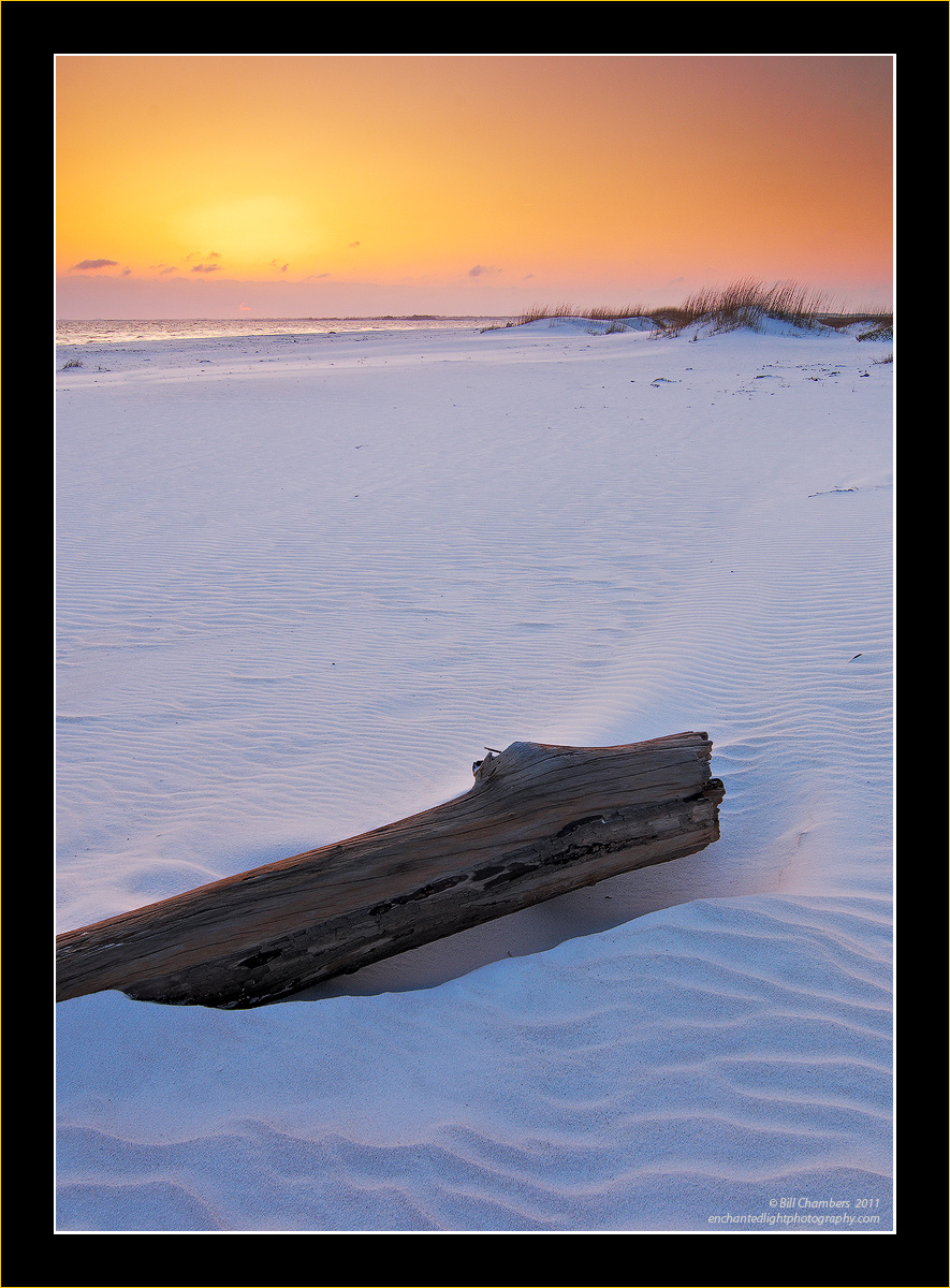
OK, I'm seeking suggestions on this one. Very unhappy with the way this turned out - a very static image with no energy to it. Besides getting lower and closer to the buried pine tree (my own critique), what are your suggestions for improvement.

LARGE version available for great detail.

Thanks in advance for your suggestions!

D2X w/ Tokina ATX 12-24 @ 18mm
1/6 @ f/11 - MLU and mc-30 remote release
100 ISO
Don't remember about filtration
Capture One 6, CS4, TK's Lum, Sat, and Sharpening

Thanks for looking and sharing your opinion.

Comments

15 comments
Comment posted by Dan Baumbach on February 1, 2011 at 7:37 PM
I don't know, Bill. The light on the sand ripples is very nice. If it were me, I'd go for a closeup with the sand ripples and a piece of the log.

- Dan
Registered on November 1, 2003, 473 Posts, 7980 Comments
Comment posted by Wade Hardy on February 1, 2011 at 8:13 PM
The light is wonderful and its a beautiful beach scene.

My two observations are:
1. I kind of wish the log wasn't cut off on the left side and normally you have nice or better foreground subjects and/or leading lines into the scene.
2. I feel like the large open space in the mid ground doesn't compare - in interest - to the extreme top and bottom of the frame. I guess getting a lower perspective, like you mentioned, could help alleviate that somewhat.

Anyway - those are my thoughts.
Registered on May 2, 2006, 121 Posts, 1824 Comments
Comment posted by Paul Duval on February 1, 2011 at 8:20 PM
Bill, Ansel was the master of eliminating blank midground by tilting the camera with a small aperture. From a height above. I've tried many times to emulate some of his photographs, but always seem to come up short. Then I saw the image on the cover of Ansel Adams in the National Parks on the top of his station wagon photographing in Yosemite. In one of his iconic photographs. The boulders in the fore ground and Mt. Williamson dominating the back ground with back lit clouds dancing around the mountain. The boulders are far away from the base of the mountain, I believe he foreshortened the midground by tilting the plane of the lens. In Elements which is very similar to CS there is a filter called correct camera distortion, but you can use it to create camera distortion as well. Tilting the image vertically could help. You could have to find a way to get higher if you wanted to retry, Ansel on top of his car is a good 8ft taller. Anyway this could be just the muttering of a crazy old man.

Great foreground and sky, but the midground is suffering a little.But I think thats why you asked

Paul :jump:
Registered on June 30, 2009, 508 Posts, 1907 Comments
Comment posted by Daniel Cartamil on February 1, 2011 at 9:38 PM
Well, let's face it, that log isn't the most exciting foreground element, I think you would have been better off with just the ripples.
Registered on November 15, 2007, 50 Posts, 601 Comments
Comment posted by Michael J Greene, on February 1, 2011 at 9:43 PM
Very pretty colors and detail Bill. I really don't have any suggestions. The sky looks awesome. :wavey:
Registered on June 18, 2009, 86 Posts, 2317 Comments
Comment posted by Jay Patel on February 1, 2011 at 9:58 PM
Nice light and textures. Well captured scene.
Registered on August 28, 2008, 87 Posts, 566 Comments
Comment posted by Tony Kuyper on February 1, 2011 at 10:18 PM
Maybe I'm just too much of a Bill Chambers groupie, but I don't see any problems here. Sorry. :frown: I just like it a lot.
Registered on November 1, 2003, 364 Posts, 22328 Comments
Comment posted by Vance Gese on February 1, 2011 at 10:22 PM
Your image has nice composition Bill with the log and the nice sand ripples, the diagonal line in the sand leading the eye back towards the dunes on the right and the horizon. For me, the ripples in the sand with the light and textures really are outstanding. Perhaps a simpler, horizontal composition would work with the log placed in the left hand side with sand ripples and that light filling the rest of the frame to the right and above the log. Perhaps you tried that at the time and it didn't work though. Just a thought. I really like this as it is though.
Registered on November 13, 2008, 298 Posts, 6629 Comments
Comment posted by Anil Rao on February 2, 2011 at 2:48 AM
I am with Tony. This has turned out great. The composition is unique and adds a lot of interest to what is obviously a very beautiful scene.
Registered on November 15, 2003, 234 Posts, 4923 Comments
Comment posted by Julian Barkway on February 2, 2011 at 6:00 AM
I think you're being a little bit hard on yourself, Bill. This is a fine composition but, since you're unhappy with it, my feeling is that you could definitely make more of the FG log. Was it half-buried or fully exposed? Cut or fallen? Did it have branches? As it is, the image seems a bit bland and generic. Showing more of the log and, come to that, a more interesting BG would give it the character it needs, imo.
Registered on January 18, 2007, 344 Posts, 1961 Comments
Comment posted by Bill Chambers on February 2, 2011 at 7:02 AM
Thanks all for your suggestions and comments.

Paul - neat idea. I've used the lens distortion tool a lot to straighten trees, etc. but I've never trying using it in a creative sense. I'll have to try that.

Julian - I wish it did have some branches or something of interest, but it didn't. This was the only part of the tree that was exposed, the rest was buried.

The barren midground is defintiely a problem; perhaps this is one image that is just destined to remained buried in obscurity! :biggrin:
Registered on April 10, 2005, 753 Posts, 21216 Comments
Comment posted by Morris McClung on February 2, 2011 at 11:46 AM
Your usual great light and color in this one, and I agree completely with Dan about the sand textures being enough for this shot. But, I know you probably have a ton of those and wanted an additional element here. Maybe crop the thing out and go for a square of the top half? :smile:
Registered on May 7, 2007, 670 Posts, 19650 Comments
Comment posted by Nick Bristol on February 2, 2011 at 12:46 PM
Great light, color and amazing detail as with all your shots Bill. Might not have quite the impact as some of your work, but I actually like this quite a bit. I just enjoy looking at this, and think it has a very nice feel. I would just sit on the log and enjoy the view for awhile. :wink:

Nick Bristol
Lone Rock, WI
Registered on February 1, 2004, 752 Posts, 14140 Comments
Comment posted by Scott Fricke on February 3, 2011 at 12:24 AM
A gorgeous shot Bill! The light is amazing and the patterns on the sand, particularly in the LRC are very nice. The only issue for me is the log going out of the frame, I think I would have liked to see it going below the sand. The mid-ground doesn't bother me as it has such a nice light quality that adds to the feel of the image.
Registered on January 19, 2007, 133 Posts, 1448 Comments
Comment posted by Stan Rose on February 3, 2011 at 8:17 AM
I have a very simple suggestion--lose the dang tree!! Its the equivalent of the ubiquitous large fg rock for me here, totally unecessary and counterproductive. If I crop the bottom half, the top half here is jaw-droppingly stunning. Shots dont all have to have fg and bg, and simpler is almost always better--especially here :wink:
EDIT/PS: if you have your heart set on the log, i also like the bottom half here--a little better light on the wood and it would be a great intimate. The problem wiht the whole here is that theres no tie from top to bottom--they compete--shooting from a lower angle, with more light on the log, would alleviate that.
Registered on September 15, 2005, 836 Posts, 17099 Comments