Nature Photographers Network
This is the preserved archive of the original Nature Photographers Network. The community continues at naturephotographers.network.
Untitled
‹ PreviousLandscape GalleryNext ›

Untitled

by Justin Reznick

Gallery: LandscapePosted February 1, 2011462 views28 comments
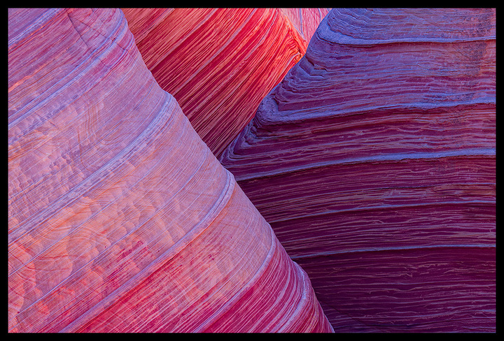
Not sure why I can't find a title yet... still working on it!

I wrote a blog post "The Quest for Originality in Nature Photography" to accompany my images from the Wave. Check it out if you have the chance.

Thanks for any C&C's in advance, much appreciated!

Canon 7D, Canon 70-200mm f/4L IS, f/16, 0.4 sec.

Comments

28 comments
Comment posted by Harry Lichtman on February 1, 2011 at 1:26 PM
Justin - This is really a sweet shot. While having never been there, it seemsWave images are often shot, but the comp and colors here are beautiful. I like the warm-cool-warm of the rock in the image. No improvement tips from me on this one - just print it! :toast:
Registered on September 17, 2010, 304 Posts, 3507 Comments
Comment posted by Richard Hartmann on February 1, 2011 at 2:32 PM
Rock Bands… Ancient Bands…. Ancient Records… Exposed Past….
Time Compressed… Colored Past… Colorful History…. Forbidden Mountain Bike Fantasy…
Colorful layers of sediment thrusted skyward by tectonic movement…..

Hmm… this is hard. Oh, Hard Rock Bands…. Hard Records… Hardened Past….

I give up.

I really like the tight comp and compression from the long lens.
Registered on January 15, 2009, 13 Posts, 772 Comments
Comment posted by Aaron Feinberg on February 1, 2011 at 2:47 PM
Fun w/ layers...nice work

aF
Registered on October 26, 2009, 399 Posts, 2789 Comments
Comment posted by Ben Horne on February 1, 2011 at 4:22 PM
I enjoyed your blog post. I too am drawn to the intimate details. I really like the layers here, as well as the warm and cool colors. Based on the direction of the light, I would assume that this was in the late afternoon/early evening? The colors are very interesting. It's impressive how the camera will pull out colors that our eyes have a hard time seeing. Here, the reflected light from the blue sky really contributes to the photo.
Registered on August 27, 2009, 51 Posts, 959 Comments
Comment posted by Phil Pogledich on February 1, 2011 at 4:23 PM
Very beautiful and, I have to agree, original. Wonderful work!
:toast:
Registered on August 24, 2009, 123 Posts, 3099 Comments
Comment posted by Dorin Bofan on February 1, 2011 at 5:20 PM
The display of light, the color and the textures are simply mesmerizing. And it's very original. Your blog post is very inspiring and the images you came back with are among the most interesting from this place, great visual experiences that must have been so fun to create.
Registered on April 30, 2007, 122 Posts, 3086 Comments
Comment posted by Wade Hardy on February 1, 2011 at 5:39 PM
Love the composition, soft light, and colors. Great job getting a very original shot from the wave.
Registered on May 2, 2006, 121 Posts, 1824 Comments
Comment posted by Nathan Buck on February 1, 2011 at 6:00 PM
Very original and very nice Justin. I love the banding of the rocks and the sweet light. The compression from the zoom is fantastic. I find in looking at the shot that the rock is so perfect, except in the top left of the frame that my eye keeps getting drawn to that area. If this were mine, I would either clone that out if possible, or crop to eliminate those creases in the rock.

Nathan
Registered on November 1, 2003, 1101 Posts, 13589 Comments
Comment posted by Mark Seaver on February 1, 2011 at 6:02 PM
Great movement in the rock patterns. The light bands in the shadowed rocks seem a touch blue. I agree with you that the tight composition really works well.
Registered on January 23, 2011, 1103 Posts, 17270 Comments
Comment posted by Doug Koepsel on February 1, 2011 at 8:16 PM
Justin, your blog was thought-provoking and a pleasure to read. The intersecting lines on the close-ups work well.
Registered on April 1, 2010, 196 Posts, 1592 Comments
Comment posted by Justin Reznick on February 1, 2011 at 8:21 PM
Somebody just pointed out on my blog post that Tony Kuyper has a comp extremely similar to this with the layers taking on 3 different types of light. Being a big fan of Tony's I feel silly I hadn't seen it before. I'm glad someone pointed it out to me and I would like to give Tony a big shout out on his stellar image. And man, what a title he has too:).
Registered on November 24, 2009, 79 Posts, 515 Comments
Comment posted by Tony Kuyper on February 1, 2011 at 9:51 PM
Déjà vu all over again. Hope you don't mind if I put in a link to my comp. Seriously, I'm certain that you were unaware of my image when you took yours; there are so many pictures now that it's nearly impossible to keep track. I like how the two pictures show the difference the light can make. Mine was taken almost midday in May. This looks like it might be a different season and I like how the cooler colors seem to enhance the texture. Ah, yes, the quest for originality in nature photography--c'est la vie.
Registered on November 1, 2003, 364 Posts, 22328 Comments
Comment posted by Vance Gese on February 1, 2011 at 10:36 PM
Superb, Justin. The lines , color, the abstract nature of the image, the light, everything, all of it is simply fantastic. Wouldn't change a thing.
Registered on November 13, 2008, 298 Posts, 6629 Comments
Comment posted by Bill Chambers on February 1, 2011 at 10:43 PM
Beautifully composed Justin, with great texture and color. Excellent.
Registered on April 10, 2005, 753 Posts, 21216 Comments
Comment posted by Justin Reznick on February 2, 2011 at 12:23 AM
Ben - Yep, late afternoon

Mark - Excellent find with the blue in the shadows. Thank you! Here is a reworked version:

Registered on November 24, 2009, 79 Posts, 515 Comments
Comment posted by Andrew Morrill on February 2, 2011 at 12:33 AM
Thank you, thank you, thank you for not posting the same old wave composition! Also love the unique color in this. From your blog I think I do agree with you about shooting the "already" done shots (how customers don't really care), but I'm a photographer and have just seen the "other" 2 composition far too often. Great job.
Registered on June 10, 2010, 51 Posts, 216 Comments
Comment posted by Dietrich Gloger on February 2, 2011 at 12:48 AM
"Triangular" (hmm, maybe generic?)

Fantastic, such a simple and strong design.

I wil check out your blog article later, no time at the moment, but that's a topic I am always interested in.
Registered on January 26, 2007, 360 Posts, 9876 Comments
Comment posted by Stuart Williams on February 2, 2011 at 2:30 AM
superb, intersecting lines. to my eye the 'block' to the right seems slightly contrived in its colours and textures (as if you had to work a little to pull the stuff out); the FG / left one seems to be exposed perfectly and less contrived. indeed, i am loving the textures, lines and superbly fine details in that left block ... so much so that i feel much less satisfied with the other two. does that make any sense?

am glancing at your blog now ...
Registered on December 7, 2007, 247 Posts, 4792 Comments
Comment posted by Lorna Taylor on February 2, 2011 at 9:47 AM
Just beautiful, wonderfully seen!
Registered on November 12, 2010, 254 Posts, 3083 Comments
Comment posted by Morris McClung on February 2, 2011 at 11:38 AM
How about, "Over, under, around and through?" :biggrin: Beautiful shot and excellent use of lines.
Registered on May 7, 2007, 670 Posts, 19650 Comments
Comment posted by Mark Metternich on February 2, 2011 at 1:57 PM
Awesome! :toast:

Maybe a little maganta/purple, but still very cool!
Registered on June 19, 2009, 276 Posts, 6240 Comments
Comment posted by Jimmy Gekas on February 2, 2011 at 2:07 PM
Very nice, Justin! Love the colors, lines and textures. Well done!!! :toast:
Registered on July 26, 2007, 244 Posts, 2807 Comments
Comment posted by Rodney Ninow on February 2, 2011 at 2:37 PM
The blues in the shadows don't bother me at all. I prefer the first version. Shadows are often blue, and it is especially noticeable when next to warm light. The late great Galen Rowell said that he was always looking for edges, one of them being cool light intersecting warm light.

Nice job!
Registered on January 11, 2009, 7 Posts, 123 Comments
Comment posted by Steve Sieren on February 3, 2011 at 3:03 AM
I like the endless lines through out the shot Justin. The cool tones are nice too and look great against the bright reds. The one thing I think could be taken into consideration is the background seems sharper then the foreground. I think that minimizes depth to a certain degree. I'd like to see the foreground sharper and have it fade off just enough to create better depth here. So blur the heck out it! j/k Maybe just enough to no one would notice.
Registered on January 2, 2008, 360 Posts, 5321 Comments
Comment posted by Andreas Resch on February 3, 2011 at 11:41 AM
Excellent shot, Justin. The rework looks even better.
Registered on November 14, 2007, 322 Posts, 6101 Comments
Comment posted by Aaron Burdick on February 3, 2011 at 2:56 PM
Wow! This is really wonderful. I can't wait to go to the Wave! Shooting for this April or May. Excellent processing and composition.
Registered on May 1, 2009, 31 Posts, 197 Comments
Comment posted by Anthony Vincent on February 3, 2011 at 9:11 PM
Gorgeous, thought it was a Kuyper at first. The cooler tones work really well and nice framing.

Great job Justin
Registered on February 5, 2009, 199 Posts, 2775 Comments
Comment posted by Zack Clothier on February 4, 2011 at 10:10 AM
Beautiful abstract Justin, the colors are amazing. Will check out your blog post later. :toast:
Registered on January 28, 2010, 343 Posts, 2257 Comments