Gallery: Photo ArtPosted January 27, 201168 views10 comments
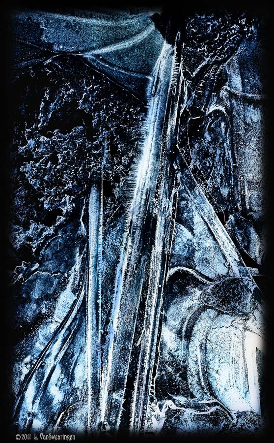
Boy, this one is waaay out of the box for me. I found some of my ice crystal photos from last year and decided to go wild.
Opinions???
Comments
10 comments
Comment posted by Gary Yeoh on January 27, 2011 at 7:45 PM
Lucy:
This is real cool. The shards look like sword blades gleaming in the sun, a scene from medieval time?? I am letting my imagination run wild with this abstract.
Registered on September 1, 2009, 588 Posts, 8184 Comments
Comment posted by Lucy VanSwearingen on January 27, 2011 at 8:52 PM
Thanks Gary,
All I did was make it BW, give it a little blue here and there, play with the shadows and light... and Voila! An abstract!
Registered on May 23, 2009, 800 Posts, 2042 Comments
Comment posted by Wayne Jones on January 27, 2011 at 10:16 PM
Lucy, The high contrast and the blue tones are very effective in conveying that COLD feeling. Your treatment of the strong abstract comp reminds me of some kind of bold art process. You should go wild more!
Registered on April 18, 2007, 953 Posts, 6435 Comments
Comment posted by Craig Myers on January 27, 2011 at 10:51 PM
I really like the graininess and the duo-tone treatment here; it nicely supports the subject
Registered on September 1, 2008, 85 Posts, 757 Comments
Comment posted by David W. Kelly on January 28, 2011 at 9:18 AM
A beautiful ice abstract indeed.
Registered on October 7, 2005, 883 Posts, 6590 Comments
Comment posted by Balakumar Kaushik on January 28, 2011 at 9:53 AM
Beautiful abstract with bizarre patterns. High contrast works well here.
Might brighten the ULC and darken the LRC.
Registered on January 4, 2008, 98 Posts, 1403 Comments
Comment posted by Lorna Taylor on January 28, 2011 at 9:55 AM
Wonderful image , great choice of processing!
Registered on November 12, 2010, 254 Posts, 3083 Comments
Comment posted by Bill Chambers on January 28, 2011 at 11:23 AM
I like the design and comp, but it appears a little dark for my tastes.
Registered on April 10, 2005, 753 Posts, 21216 Comments
Comment posted by Mark Seaver on January 29, 2011 at 6:15 PM
Fabulous result. As Gary says, it looks very medieval. I see swords, armor, a wing in the top right and some kind of animal with it's head resting on the armor in the bottom right.
Registered on January 23, 2011, 1103 Posts, 17270 Comments
Comment posted by Lucy VanSwearingen on January 29, 2011 at 6:39 PM
Thanks to everyone. I think I WILL go wild again....
Balakumar.. the ULC probably does need to brighten up a bit...maybe, the "bat wing"??. But, I actually worked to make the BRC darker. You'll laugh when I tell you how the lighter version looked. To me, it looked like a giant pumpkin with an upside down V! But, then I see the medieval swords, too!
Thanks again!!!
Registered on May 23, 2009, 800 Posts, 2042 Comments

Comments
10 commentsThis is real cool. The shards look like sword blades gleaming in the sun, a scene from medieval time?? I am letting my imagination run wild with this abstract.
All I did was make it BW, give it a little blue here and there, play with the shadows and light... and Voila! An abstract!
Might brighten the ULC and darken the LRC.
Balakumar.. the ULC probably does need to brighten up a bit...maybe, the "bat wing"??. But, I actually worked to make the BRC darker. You'll laugh when I tell you how the lighter version looked. To me, it looked like a giant pumpkin with an upside down V! But, then I see the medieval swords, too!
Thanks again!!!