Gallery: LandscapePosted January 27, 2011690 views24 comments
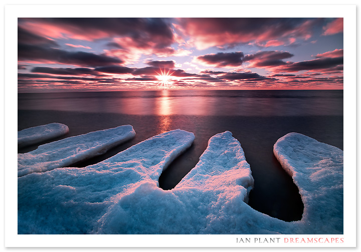
Ice formations on Lake Michigan at sunset. Canon 5DII, 16-35II, 6-stop ND filter, 2-stop reverse ND grad, f/16, 30 second exposure. Read my blog post A Week in the Life to learn more about why I hate this image.
Comments
24 comments
Comment posted by Matt Anderson on January 27, 2011 at 9:59 AM
Nifty fingers of ice.
Registered on September 6, 2007, 346 Posts, 2696 Comments
Comment posted by Andreas Resch on January 27, 2011 at 10:03 AM
Too bad about your troubles out there. The shot is very nice though. The only thing I would change is to put a bit more yellow into the reds.
Registered on November 14, 2007, 322 Posts, 6101 Comments
Comment posted by Ryan Montgomery on January 27, 2011 at 10:06 AM
Love the colors and the lines drawing me to the sun....clouds are excellent texture in the sky
Registered on January 14, 2011, 23 Posts, 26 Comments
Comment posted by Jerry Greer on January 27, 2011 at 10:13 AM
Beautiful! I've loved this pic from the first time I saw it. The blue of the reflected sky combined with the warmth of the setting sun, perfect!
Registered on November 1, 2003, 404 Posts, 1977 Comments
Comment posted by Nick Bristol on January 27, 2011 at 10:28 AM
That is alot of miles for one picture. I'm heading to lake superior next week. This is really nice, Ian. Beautiful colors and I love the fingers with that light.
Nick Bristol
Lone Rock, WI
Registered on February 1, 2004, 752 Posts, 14140 Comments
Comment posted by Lorna Taylor on January 27, 2011 at 10:45 AM
Just stunning, it truly is winters grip with those talons of ice and snow. Winter is not leaving with out a fight! Cheers
Registered on November 12, 2010, 254 Posts, 3083 Comments
Comment posted by R.Bill Moser on January 27, 2011 at 11:16 AM
stunning pic. I agree with andreas to put a bit more yellow into the reds.
Registered on January 29, 2010, 285 Posts, 4281 Comments
Comment posted by Michael Anderson on January 27, 2011 at 11:57 AM
Those fingers of ice are awesome! The scene feels a bit overcooked in the pinks and cyans, although that leads to nice color compliment tension. I wonder how this would look with the pinks more yellow and the cyans more blue? Awesome comp and a perfect sunstar!
Registered on January 31, 2006, 228 Posts, 3072 Comments
Comment posted by Jimmy Gekas on January 27, 2011 at 12:05 PM
WOW! I love this, but bummer about your troubles. The light on this is really special.
Registered on July 26, 2007, 244 Posts, 2807 Comments
Comment posted by Daniel Cartamil on January 27, 2011 at 12:09 PM
Great comp, and although I like the long exposure, the NDs have rendered this overly magenta...
Registered on November 15, 2007, 50 Posts, 601 Comments
Comment posted by Zack Clothier on January 27, 2011 at 12:11 PM
Really interesting FG Ian, love it! Would agree with Andreas about the sky, looks like your ND filter warmed the sky a bit to much. Checked out your site and noticed you have a lot of images from the Adirondack Park, next time you're in the area look me up, I'm always up for an adventure. Cheers.
Registered on January 28, 2010, 343 Posts, 2257 Comments
Comment posted by Mark Metternich on January 27, 2011 at 1:50 PM
This is not worth only "half a damn" IMO. It kicks as*
Nice job. Would not change a thing and worth the pain.
Registered on June 19, 2009, 276 Posts, 6240 Comments
Comment posted by Darren Colello on January 27, 2011 at 5:03 PM
A wonderful scene, very well composed. Thanks for sharing this beauty Ian.
Registered on July 27, 2009, 175 Posts, 1100 Comments
Comment posted by Ken Canning on January 27, 2011 at 6:09 PM
Beautiful and nicely unique. Agree with others about the reds. Great sun-star and no flare!
Registered on February 10, 2004, 88 Posts, 549 Comments
Comment posted by Donald Case on January 27, 2011 at 6:30 PM
Great shot. I read your blog post, but I bet you wouldn't trade your job for the world
Registered on January 28, 2010, 45 Posts, 99 Comments
Comment posted by Dennis Harding on January 27, 2011 at 6:43 PM
Great shot Ian. I love your composition but I also agree with the others about the red. In Photoshop try selective color. Select Red, increase the yellow a bit first and then also try decreasing the magenta.
Registered on January 19, 2011, 33 Posts, 408 Comments
Comment posted by Abdullaziz Bin Ali on January 28, 2011 at 2:04 AM
it looks beautiful
amazing :)
once i post i'll read the link
Registered on May 31, 2009, 112 Posts, 1590 Comments
Comment posted by James Fougère on January 28, 2011 at 3:10 AM
Very unique foreground! Nicely captured !
Registered on October 25, 2010, 41 Posts, 831 Comments
Comment posted by Balakumar Kaushik on January 28, 2011 at 3:40 AM
Wow, loved that FG pattern in ice. Did you cut it into that shape with ur ice axe Ian ?! ( just kidding). Lovely image with beautiful sky. Liked the warm reflection off the water and off the ice in FG. Somewhere above, as Mike mentioned, the scene looks a bit too pink but it looks nice.
Registered on January 4, 2008, 98 Posts, 1403 Comments
Comment posted by Arild Heitmann on January 28, 2011 at 7:29 AM
The composition couldnt have been better. The foreground is beyond amazing!
I agree with the comments about the pinks... But it`s no dealbreaker for me. This is amazing, Ian!
Registered on October 13, 2010, 27 Posts, 378 Comments
Comment posted by Rafael Rojas on January 28, 2011 at 8:11 AM
Wonderful post Ian. The image is great, and about what you say on your blog... hey, that is nature, and if getting great images would be easy, the fun would be finished. The problem, I agree, is having fun at the same time as making of photography your way of earning a living... Anyway, I really think people out there only see the glamorous side of photography...and not what is inside on one of those "bad days" :). However, go for a profession you do not really enjoy anymore, be enclosed into an office and not 4000 USD will be lost...but your whole life! ;-)
What does not destroy you, make you better (and I think this applies most of all for busines-men and artists! :))
Registered on March 1, 2009, 56 Posts, 623 Comments
Comment posted by Robert Dayton on January 28, 2011 at 10:25 AM
Awesome, Ian! Great lighting and spectacular FG shapes. I read
your blog. It shows your determination and energy.
Registered on November 11, 2008, 281 Posts, 3958 Comments
Comment posted by Morris McClung on January 29, 2011 at 12:54 PM
Nice shot, Wuss.
Registered on May 7, 2007, 670 Posts, 19650 Comments
Comment posted by Kory Lidstrom on February 2, 2011 at 11:36 AM
Well, I don't think that "half-a-damn" is a fair assesment of this image -- it's pretty nice! Sure, it's not the best thing I've ever seen, but the fingers and soft light make for a decent image.
Registered on November 19, 2008, 49 Posts, 1035 Comments

Comments
24 commentsNick Bristol
Lone Rock, WI
Nice job. Would not change a thing and worth the pain.
amazing :)
once i post i'll read the link
I agree with the comments about the pinks... But it`s no dealbreaker for me. This is amazing, Ian!
What does not destroy you, make you better (and I think this applies most of all for busines-men and artists! :))
your blog. It shows your determination and energy.