Nature Photographers Network
This is the preserved archive of the original Nature Photographers Network. The community continues at naturephotographers.network.
Another Bosque Sandhill
‹ PreviousAvian GalleryNext ›

Another Bosque Sandhill

by Brian Gatlin

Gallery: AvianPosted January 24, 201194 views12 comments
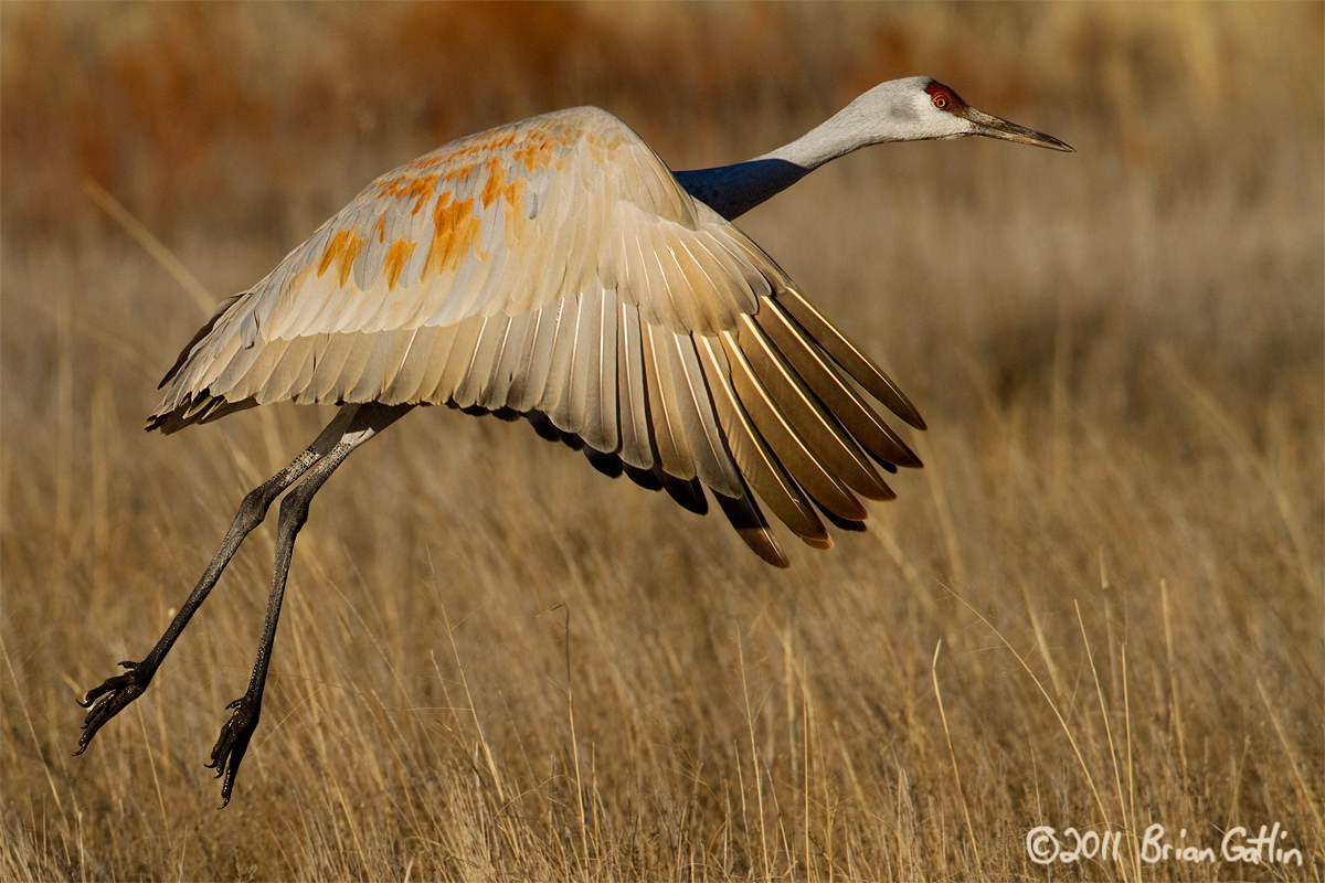
I'm interested to see what people think of this one. There are some things that I like better than the previous one I posted which got great response (thanks!), but there are a couple things that are eating at me. I had to crop from the bottom and left to get a good comp with less room behind the bird, but I'm concerned that it is too tight on top and right. Also, the bird is facing just a little too much away from me.

Your comments and critiques are appreciated. Please view larger version if possible.

Canon 7D, 500mm, tripod

Manual exposure, 1/5000, f/6.3, ISO 400

Crop to 73% of original (13.1 of 18MP)

Comments

12 comments
Comment posted by Philip Hodgkins on January 24, 2011 at 12:46 PM
Pros: very precise detail, pleasing background and foreground, good stop-motion and well chosen DOF. The look away is not a real problem, as there is some implied eye contact.

Cons: As you said, it needs room at the top. More room at the right would be good as well.
Registered on July 24, 2006, 2741 Posts, 12349 Comments
Comment posted by SandyRichardsBrown on January 24, 2011 at 2:14 PM
Very nice crane! The pose is lovely (not to worry that it is not exactly parallel to you) , and there is good light. More room on the top and right would be good, but it's not always possible.
I'd be happy with this shot!
Sandy
Registered on November 24, 2003, 3937 Posts, 12909 Comments
Comment posted by Jim Hackley on January 24, 2011 at 2:32 PM
I like the feather display and detail on the wing, actually it has good detail all around on the larger image. Wonderful directional light brings out the colors but it does appear a little tight on the top to me, still a very fine image.
Registered on September 17, 2009, 302 Posts, 5535 Comments
Comment posted by Keith Bauer on January 24, 2011 at 3:14 PM
Nice image of the Sandhill. Texture in the bird is great, as is the exposure. For me it is just too tight in the frame. These big birds need room to fly.
Registered on November 20, 2003, 458 Posts, 4836 Comments
Comment posted by Ron Bielefeld on January 24, 2011 at 4:46 PM
I agree with Keith on this one Brian. This bird needs more room all around IMO. Great shot overall for detail, but too tight for my taste.
Registered on December 6, 2008, 360 Posts, 7132 Comments
Comment posted by Bill Leggett on January 24, 2011 at 5:46 PM
Very good detail, Brian. Agree that it could benefit from a bit more real estate, but still nice. On the techs side, wondering if you really needed 1/5000 and f6.3, maybe ISO 200 and a bit slower shutter would be an option, just a thought.
Registered on July 21, 2004, 706 Posts, 3233 Comments
Comment posted by Marc Dubuc on January 24, 2011 at 9:47 PM
Very nice image. I like the details on the plumage. I agree with the previous comments on allowing more room on top and right (if possible...).
Registered on January 4, 2011, 59 Posts, 229 Comments
Comment posted by Balan Vinod on January 24, 2011 at 11:58 PM
Beautiful image Brian ..the detail is outstanding and nice complimenting BG,,,,one bit room would have been better ..


Balan Vinod
Registered on March 20, 2006, 889 Posts, 2312 Comments
Comment posted by Jagdeep Rajput on January 25, 2011 at 6:57 AM
I agree with the suggestions, a cool image, well captured.
Jagdeep Rajput
Registered on April 29, 2008, 686 Posts, 2857 Comments
Comment posted by Howard Cheek on January 25, 2011 at 11:13 AM
A bit more detail apparent in this closer frame Brian..
I prefer your previous post of this one, with it's overall comp more interesting IMO.
Both are very nice, excellent work :toast:
Registered on July 24, 2008, 1201 Posts, 10758 Comments
Comment posted by Joel DeYoung on January 25, 2011 at 11:48 AM
Wonderful colors and excellent details. I think you captured the moment very well. While I do agree that it is a little tight, I do like this none the less. Nicely done. :toast:
Registered on July 12, 2009, 92 Posts, 1074 Comments
Comment posted by Mia McPherson on January 25, 2011 at 7:20 PM
Brian,

Love the light, wing position, background, sharpness and details. For me the composition is too tight all around. Especially over the head and right side of the frame.
Registered on June 25, 2007, 491 Posts, 12566 Comments