Nature Photographers Network
This is the preserved archive of the original Nature Photographers Network. The community continues at naturephotographers.network.
Sebastian Fall + Repost
‹ PreviousLandscape GalleryNext ›

Sebastian Fall + Repost

by Peter Richter

Gallery: LandscapePosted January 15, 2011197 views10 comments
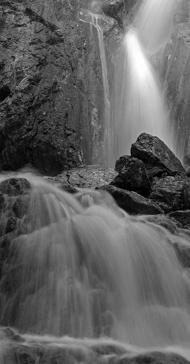
Today afternoon I took this shot in one of my favorite places, the Sebastian Fall in Lower Austria. Due to thaw and rain during the last days there is a higher level of water in our region. In January this fall is usually frozen.

Olympus E510, 14-54mm/2.8-3.5 at 23mm, f/22, 1/2s, ISO 100

Comments

10 comments
Comment posted by Peter Richter on January 15, 2011 at 4:17 PM
In addition, the original color version
Registered on November 10, 2010, 218 Posts, 2723 Comments
Comment posted by Paul Wegemann on January 15, 2011 at 6:48 PM
I like the comp overall, Peter, but I do think the water in the lower half would benefit from some brightening and a bit of contrast. I'm referring the B&W version here.
Registered on December 14, 2006, 58 Posts, 1888 Comments
Comment posted by Tony Kuyper on January 15, 2011 at 7:25 PM
I agree with Paul. The water is very important here, and bringing out the highlights will better emphasize it's texture.
Registered on November 1, 2003, 364 Posts, 22328 Comments
Comment posted by dean hebert on January 15, 2011 at 7:28 PM
I like the comp and prefer the colour version(slightly). It appears to be blown-out at the top of the falls and as Paul said could use a bit of brightness and contrast on the bottom. I like the movement of the water. :toast:
Registered on August 4, 2010, 70 Posts, 1132 Comments
Comment posted by Peter Richter on January 15, 2011 at 8:00 PM
Thanks for your comments, here is a repost with slightly enhanced contrast and brightness in the lower part.

Peter
Registered on November 10, 2010, 218 Posts, 2723 Comments
Comment posted by Paul Duval on January 15, 2011 at 11:14 PM
Peter,
Very nice conversion, you could take the advice or leave it is, I would be a little cocnerned of loosing the impact of the midground rocks and the lit falls above by brightening the foreground, maybe just a hair and little contrast to bring out the rocks under the water. Howevere this is an image with impact just as it is.

Paul
Registered on June 30, 2009, 508 Posts, 1907 Comments
Comment posted by Dietrich Gloger on January 16, 2011 at 3:39 AM
This looks really good Peter! I like the composition a lot, very well arranged. There's a good "flow" of lines from top to bottom, and the aspect ratio works really well for the scene. I agree that it is kinda dark in the lower half, the repost is only a subtle change but in the right direction. I also like the bw treatment. Good work!
Registered on January 26, 2007, 360 Posts, 9876 Comments
Comment posted by Bill Maile on January 16, 2011 at 9:49 AM
Definitely prefer the B&W version here, nice spot.
Registered on March 2, 2009, 984 Posts, 2518 Comments
Comment posted by R.Bill Moser on January 16, 2011 at 1:02 PM
I like this one a lot. I think this is a good comp. I do also agree that it's a bit dark at the bottom part of the image..........I'd prefer the black & white version, though.
Registered on January 29, 2010, 285 Posts, 4281 Comments
Comment posted by Barry Vangrov on January 17, 2011 at 7:50 PM
Definitely b&w rather than color, no contest. I'll agree with some of the others that the foreground needed lightening and more contrast so the repost is much better but you could probably take it even farther. Would also benefit with some noise reduction on the lower waterfall. Well composed scene.
Registered on September 1, 2009, 148 Posts, 749 Comments