Comment posted by Jorne de Bruin on January 10, 2011 at 5:54 AM
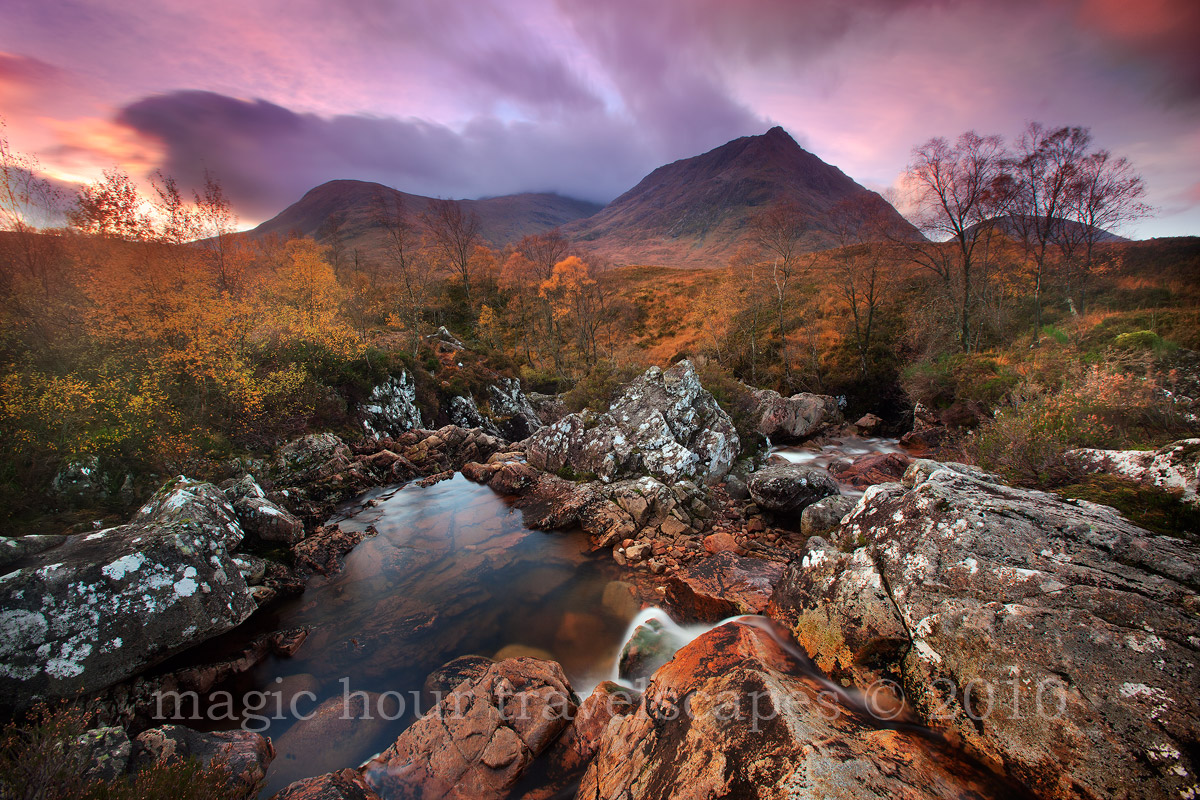
Lovely scene Kah Kit! The fg and bg work really well, and I really like the long exposure effect here on the sky (would not have minded to see a little more of that sky even).
Only realy nit I have are the darker trees in the urc, they stand out to me (and draw my eye). I however do know that is very hard to get right.
Superb image overall, makes me regret missing Glencoe on my last trip to Scotland!
Registered on June 26, 2008, 178 Posts, 2136 Comments
Comment posted by Abdulmajeed Aljuha on January 10, 2011 at 7:34 AM
every item in this picture was fit in the right place. I love it.
Registered on December 4, 2010, 77 Posts, 149 Comments
Comment posted by Jeremy Kessler on January 10, 2011 at 8:05 AM
Beautiful Image, love those fall colors.
Registered on September 13, 2007, 36 Posts, 1283 Comments
Comment posted by Hamed Musharbak on January 10, 2011 at 8:06 AM
wonderful indeed
amazing colors
Registered on June 1, 2009, 372 Posts, 2282 Comments
Comment posted by Abdullaziz Bin Ali on January 10, 2011 at 8:13 AM
seems you had a great adventure there
like the scene
Registered on May 31, 2009, 112 Posts, 1590 Comments
Comment posted by Eva McDermott on January 10, 2011 at 8:56 AM
Breathtaking detail, color and light Kah Kit. I also like how you can see beneath the surface of the pool. Very enjoyable image.
Registered on January 4, 2009, 1015 Posts, 13229 Comments
Comment posted by Robert Dayton on January 10, 2011 at 10:09 AM
Lovely light on a beautiful composition. This makes
me want to go to Scotland some day.
Registered on November 11, 2008, 281 Posts, 3958 Comments
Comment posted by Luis Argerich on January 10, 2011 at 10:21 AM
This one looks a little confusing and distorted to my eyes. The foreground has a strange shape and the background is a little blurry so I can't find a pleasant section of the photo to look at.
Registered on December 22, 2009, 91 Posts, 1349 Comments
Comment posted by Max Waugh on January 10, 2011 at 10:44 AM
Lots of interesting elements to look at, IMO, and I like the color. The darker lower left corner keeps drawing my attention, which is my only real issue with the image.
Max
Registered on September 26, 2008, 428 Posts, 2329 Comments
Comment posted by Debashis Bandyopad on January 10, 2011 at 10:52 AM
W W... Excellent image IMO...Like everything about it..
Registered on June 24, 2007, 130 Posts, 1309 Comments
Comment posted by Wayne Simpson on January 10, 2011 at 11:03 AM
Great shot Kah Kit! Quite a complex composition very well executed. I like the subtle bit of interest that the bits of moving water add. I wonder if the top portion (excluding the bright spot on left) could use a tiny bit of brightening... but only ever so slightly.
Registered on December 11, 2006, 303 Posts, 924 Comments
Comment posted by Andreas Resch on January 10, 2011 at 11:04 AM
That's some kick-ass landscape and the array of textures and tones is just amazing. My only nit would be the slight distortion.
Registered on November 14, 2007, 322 Posts, 6101 Comments
Comment posted by Ian Cameron on January 10, 2011 at 11:19 AM
Hi Kah Kit. This is quite a different view and despite its complexity I think it works really well. Great mix of autumn colour and red stained iron rich rocks. I quite like the feathery birch trees on the right too.
Ian
Registered on August 6, 2004, 1125 Posts, 3318 Comments
Comment posted by Kent Mearig on January 10, 2011 at 11:35 AM
What strikes me the most is the excellent variety of colors. Obviously some dominate, but I love the bits of green especially. The whitish lichens are probably also important to the overall feel. I'm a little bummed that I feel like I see the grad line very clearly.
Registered on September 4, 2006, 237 Posts, 4748 Comments
Comment posted by Edward Nunez on January 10, 2011 at 11:54 AM
Love the color, and range of light. Initially, I thought it needed a specific point of interest, but it is an image to digest slowly, and appreciate the little details. Beautiful!
Registered on April 19, 2007, 65 Posts, 711 Comments
Comment posted by Paul DeCesare on January 10, 2011 at 12:10 PM
My goodness, that must have been beautiful wo see in person. Your comp is great, my eye plants into that image and doesn't want to leave. This needs to be printed 20x30" or larger, I know it would be a winner. You know, the only part that tugs my eye a little is the darkness on the peaks from the grad filter, they seem just a hair too dark, but that's subjective really, others may like the mystery of the background that it invokes.
Great image.
Registered on August 31, 2007, 29 Posts, 202 Comments
Comment posted by Morris McClung on January 10, 2011 at 12:16 PM
My first impression was the peaks and the trees on the right are a little too dark as well. Just a touch of work on those to balance the light a little more and this will be magnificent! Love the color and the comp!
Registered on May 7, 2007, 670 Posts, 19650 Comments
Comment posted by Bill Chambers on January 10, 2011 at 1:01 PM
What a beautiful scene, and so nicely captured. I like everything about this - no nits whatsoever.
Registered on April 10, 2005, 753 Posts, 21216 Comments
Comment posted by Stan Rose on January 10, 2011 at 1:07 PM
Interesting scene, nice atmosphere--my only nit is the grad issue already mentioned, which affected not only the exposure but color balance here (just throw the grads away, KK--youll feel a great weight--well an ounce or two anyways--lifted off your shoulder )
Registered on September 15, 2005, 836 Posts, 17099 Comments
Comment posted by Dietrich Gloger on January 10, 2011 at 3:52 PM
Awesome scene Kah Kit. Very well composed and some great conditions captured. Despite the gradline issues, I see some kind of softness issue farther into the scene, very noticable in the larger version on the left side. Not sure if its due to windmovement.
Registered on January 26, 2007, 360 Posts, 9876 Comments
Comment posted by Aaron Burdick on January 10, 2011 at 4:35 PM
Beautiful colors and detail! I think that the foreground could be a little darker in parts.
Registered on May 1, 2009, 31 Posts, 197 Comments
Comment posted by Kah Kit Yoong on January 10, 2011 at 4:47 PM
Hey Didl, it was some wind movement that caused the blurring of leaves on the left. I'm aware of the grad line and initially processed this with a lighter top 1/3 of the frame but didn't like the effect. The mountains looked unnaturally bright with the sun rising directly behind it so should really fall into shadow.
Registered on September 27, 2006, 636 Posts, 10682 Comments
Comment posted by Ian Haskell on January 10, 2011 at 5:18 PM
You did get some good weather then! Nice to see a different viewpoint.
Ian
Registered on October 30, 2008, 24 Posts, 673 Comments
Comment posted by Eric Good on January 10, 2011 at 7:29 PM
Wow, what a feast for the eyes! The mixture of colors is quite beautiful. I might favor a little less cyan in the reflection and maybe a little more magenta there. I actually like the slight magenta introduced from the grad. Good stuff as usual.
Registered on March 17, 2007, 116 Posts, 4764 Comments
Comment posted by Kah Kit Yoong on January 10, 2011 at 8:02 PM
This was an exceedingly difficult exposure. I used three GND filters, two for the top and a second one upside down so that the magenta colour cast was uniform throughout. In my processing I removed some of the magenta from the bottom 2/3 which in hindsight may be causing a disturbing discrepancy. In this rework I've put back some magenta in the foreground and done some sharpening on the trees affected by wind movement. I've also lightened the peaks somewhat. Thanks.
Registered on September 27, 2006, 636 Posts, 10682 Comments
Comment posted by Wayne Simpson on January 10, 2011 at 8:06 PM
Great re-work! The difference is subtle, but is an improvement on an already amazing image!
Registered on December 11, 2006, 303 Posts, 924 Comments
Comment posted by Harry Lichtman on January 10, 2011 at 8:19 PM
Ka Kit - The colors are pretty amazing and good use of the GND-I can't detect the transition. The mid ground is a bit busy for me, but not much to offer on suggestion for this. Fro other images I've seen of the area, this seems the norm. Nice take on this.
Registered on September 17, 2010, 304 Posts, 3507 Comments
Comment posted by Tony Kuyper on January 10, 2011 at 10:26 PM
Although I'd've had a hard time suggesting how to improve this image, your assessment and changes definitely make it better. Complex and very lovely scene.
Registered on November 1, 2003, 364 Posts, 22328 Comments
Comment posted by Todd Liotine on January 10, 2011 at 10:39 PM
The colors and textures make it and the repost is much better
Registered on July 1, 2008, 131 Posts, 671 Comments
Comment posted by Steve Sieren on January 11, 2011 at 2:28 AM
Excellent color!
Registered on January 2, 2008, 360 Posts, 5321 Comments
Comment posted by Doug Roane on January 11, 2011 at 2:42 AM
it was sure a productive trip for ya! congrats on that. This image is excellent - great as is
Registered on December 12, 2008, 213 Posts, 2226 Comments
Comment posted by Chris Chamberlain on January 11, 2011 at 5:26 AM
You were so fortunate to get to Scottland, I'd love to go. This has a lot of impact due to the amount of movement you got for the 8 sec exposure. Love the autumn color all over this scene too. The foreground might be just a tad bright? Lovely shot!
Chris
Registered on March 13, 2007, 500 Posts, 8365 Comments
Comment posted by Kevin Trinkner on January 11, 2011 at 9:58 AM
Beautiful! Wonderful colors and great light. Could spend a long time looking in this one. I might be tempted to darken the fg rocks just a tad, but that is just me.
Great stuff!
Registered on June 30, 2008, 203 Posts, 2641 Comments
Comment posted by Nick Bristol on January 11, 2011 at 7:22 PM
Beautiful. Fantastic light and color. I also like this comp alot. The repost looks awesome to me. Nice work, Kah Kit.
Nick Bristol
Lone Rock, WI
Registered on February 1, 2004, 752 Posts, 14140 Comments

Comments
34 commentsOnly realy nit I have are the darker trees in the urc, they stand out to me (and draw my eye). I however do know that is very hard to get right.
Superb image overall, makes me regret missing Glencoe on my last trip to Scotland!
amazing colors
like the scene
me want to go to Scotland some day.
Max
Ian
Great image.
Ian
Chris
Great stuff!
Nick Bristol
Lone Rock, WI