Comment posted by Austin Thomas on January 10, 2011 at 12:16 PM
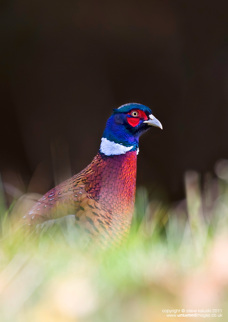
Lots to like in this one Steve. Strong eye contact, great foreground and great background.
Cheers
Austin
Registered on March 7, 2008, 45 Posts, 207 Comments
Comment posted by jack chapman on January 10, 2011 at 1:30 PM
nice detail and colours, composition doesn't quite work for me though
Registered on January 29, 2007, 17 Posts, 74 Comments
Comment posted by Roy Bailey on January 10, 2011 at 2:05 PM
The light works to realy show the colours.Dark background works here also.I think this guy is going to be sucessful on the ladies front if he can get through the rest of the season.
Registered on November 16, 2008, 24 Posts, 486 Comments
Comment posted by Ian Mason on January 10, 2011 at 3:25 PM
Not so sure about this one Steve. I generally like OOF foregrounds, but I find this a bit bright. It seems to drag the eye away from that superb blue plumage.
Registered on December 14, 2005, 399 Posts, 2305 Comments
Comment posted by John Robinson on January 10, 2011 at 5:37 PM
Steve
Looked at this a few times and I reckon there's something a bit bright about the colours . The whites seem a little "blueish" to me and the blue a little too "blue "( maybe my gear) Perhaps a slice off the left would help too.
Cheers
JohnR
Registered on March 2, 2008, 535 Posts, 2453 Comments
Comment posted by Stephen Kaluski on January 11, 2011 at 3:07 AM
Interesting, I thought this might be a 'marmite' image and based on the replies both here and from across the pond, views are divided. Occasionally you have to put something in, just to test the water.
Personally I like it based on the diversity of colours ranging from the almost translucent, but bright foreground colours, to the rich bold colours of the Pheasant set against the dark BG colour however it's all subjective. I agree with John about cropping but not from the LHS, but just tighter in, cropping more off the top, but no 'blueish' hue/cast.
Jack if the comp you feel doesn't work, be keen to know how you would crop it, as it would be helpful to know.
Appreciate the feedback.
Steve
Registered on March 25, 2007, 189 Posts, 1064 Comments
Comment posted by Sandra Hendrikse on January 11, 2011 at 3:39 AM
Works fine for me. Colours are really great.
Registered on January 23, 2008, 48 Posts, 769 Comments
Comment posted by Robert Lawrence on January 11, 2011 at 6:24 AM
Hello Steve,
I can see where JR is coming from here as the blue on the head appears almost 'electric' on my equipment and I'm not getting that on any other posts. However, as I'm not seeing any apparent cast on any of the whites other than the collar I'm assuming that the blue really was that bright and that any effect on the collar is via reflection from the head.
As for comp, there is such a strong 'stare to the right' from the bird that I feel a landscape format with more space in that direction would have made a stronger composition. As posted I feel that the black space at top (apart from being great for text etc) is a bit superfluous. I quite like the highlighted foreground.
Registered on February 13, 2008, 3 Posts, 163 Comments
Comment posted by jack chapman on January 11, 2011 at 8:47 AM
Hi Steve
Sorry i guess my comment wasn't very useful on it's own.
For me it isn't so much the crop that is the problem but the pose that spoils the composition. Hard to explain without sounding a bit odd, but for me it is the way the bird comes from a wide base then narrows to a leaning point (sounds odd already). It gives me a feeling that the pheasant is falling forward. In fact i don't generally like profile shots of pheasants, unless it is a full body shot with a lot of space around it, perhaps the tail acts as aesthetic counterweight. Don't if any of the above makes sense to anyone outside my head, i find it hard to articulate my own compositional taste when it comes to anything harder than the rule of thirds. Anyway it isn't unique to your image most of my own pheasant pics fall foul of my internal unwritten (or understood) rules of composition.
Fairly certain this one is just me though
Jack
Registered on January 29, 2007, 17 Posts, 74 Comments
Comment posted by Stephen Kaluski on January 11, 2011 at 12:45 PM
Hi Rob, if it is the 'crown' then it is just down to who it was shot as nothing has been done to it apart from slightly lightening the head in Levels, but this was done as an overall adjustment. If I remember correctly the light was over my right shoulder as you see it and the light after 9.00 did start to get quite harsh, hence the bright grass etc. I think you have a point about shooting landscape for a stronger comp, the space above as is was to allow for text and should have been reduced prior to posting, hence a tighter crop comment.
Hi Jack, thanks for the reply, as I have issue about constructive feedback, I just like it when it is qualified to aid the comment. I do agree that it is hard to convey ones thoughts at times without sounding rude or confusing, LOL, just go with it.Surely this is what a Forum is about, discussion rather than nice image or looks good to me. Appreciate taking the time to reply.
cheers
Steve
Registered on March 25, 2007, 189 Posts, 1064 Comments
Comment posted by John Robinson on January 12, 2011 at 6:24 AM
Hi Steve
Its the beak which was the main reason for suggesting a colour problem as well as the neck band. The top mandible to me looks a little odd - most of the ones I see are a sort of pale yellowy fawn colour.
Maybe it had been feeding in something strange
JohnR
Registered on March 2, 2008, 535 Posts, 2453 Comments

Comments
11 commentsCheers
Austin
Looked at this a few times and I reckon there's something a bit bright about the colours . The whites seem a little "blueish" to me and the blue a little too "blue "( maybe my gear) Perhaps a slice off the left would help too.
Cheers
JohnR
Personally I like it based on the diversity of colours ranging from the almost translucent, but bright foreground colours, to the rich bold colours of the Pheasant set against the dark BG colour however it's all subjective. I agree with John about cropping but not from the LHS, but just tighter in, cropping more off the top, but no 'blueish' hue/cast.
Jack if the comp you feel doesn't work, be keen to know how you would crop it, as it would be helpful to know.
Appreciate the feedback.
Steve
I can see where JR is coming from here as the blue on the head appears almost 'electric' on my equipment and I'm not getting that on any other posts. However, as I'm not seeing any apparent cast on any of the whites other than the collar I'm assuming that the blue really was that bright and that any effect on the collar is via reflection from the head.
As for comp, there is such a strong 'stare to the right' from the bird that I feel a landscape format with more space in that direction would have made a stronger composition. As posted I feel that the black space at top (apart from being great for text etc) is a bit superfluous. I quite like the highlighted foreground.
Sorry i guess my comment wasn't very useful on it's own.
For me it isn't so much the crop that is the problem but the pose that spoils the composition. Hard to explain without sounding a bit odd, but for me it is the way the bird comes from a wide base then narrows to a leaning point (sounds odd already). It gives me a feeling that the pheasant is falling forward. In fact i don't generally like profile shots of pheasants, unless it is a full body shot with a lot of space around it, perhaps the tail acts as aesthetic counterweight. Don't if any of the above makes sense to anyone outside my head, i find it hard to articulate my own compositional taste when it comes to anything harder than the rule of thirds. Anyway it isn't unique to your image most of my own pheasant pics fall foul of my internal unwritten (or understood) rules of composition.
Fairly certain this one is just me though
Jack
Hi Jack, thanks for the reply, as I have issue about constructive feedback, I just like it when it is qualified to aid the comment. I do agree that it is hard to convey ones thoughts at times without sounding rude or confusing, LOL, just go with it.Surely this is what a Forum is about, discussion rather than nice image or looks good to me. Appreciate taking the time to reply.
cheers
Steve
Its the beak which was the main reason for suggesting a colour problem as well as the neck band. The top mandible to me looks a little odd - most of the ones I see are a sort of pale yellowy fawn colour.
Maybe it had been feeding in something strange
JohnR