Nature Photographers Network
This is the preserved archive of the original Nature Photographers Network. The community continues at naturephotographers.network.
Fog on Fire
‹ PreviousLandscape GalleryNext ›

Fog on Fire

by Wayne Simpson

Gallery: LandscapePosted January 5, 2011173 views15 comments
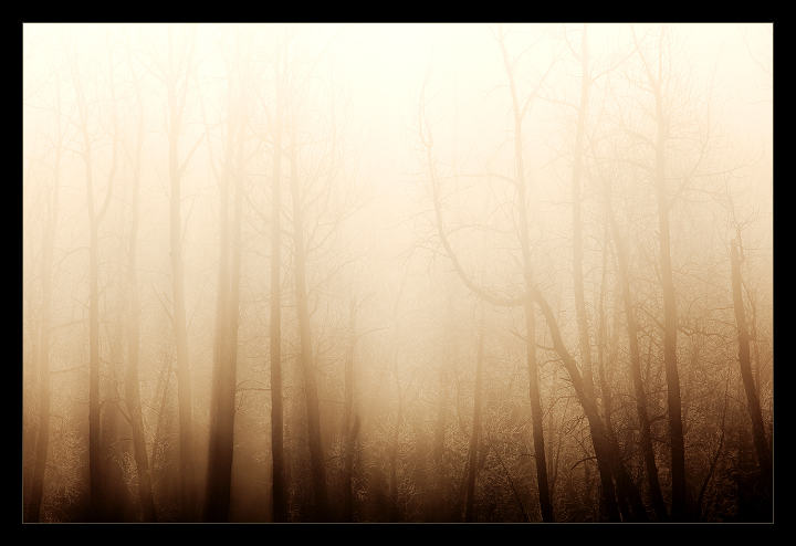
I don't think I have shared this one here yet. This was taken just outside of Calgary one morning when there was heavy ice fog. This forest was backlit with warm morning light which really seemed to show off the delicate bit of ice on the tree branches. I also loved the transition of highlight to shadow on this one. I realize it's a little different and not perfection (top may be a little hot and bottom may be a little dark) but I kind of like the contrast. I'm curious what others think. Thanks for looking!

5d II
300 f/4
f/16
iso 100
1/320 sec
polarizer

Comments

15 comments
Comment posted by Adam Gibbs on January 5, 2011 at 2:59 PM
I like it Wayne. I like the abstract quality of the image without losing the sense of what the subject is.
Registered on November 1, 2003, 168 Posts, 870 Comments
Comment posted by Peter Richter on January 5, 2011 at 3:06 PM
Sometimes also the lack of absolute perfection makes an image likeable - like this! Maybe the bottom could be lightened a bit according to the foggy atmosphere; but the blinding sunlight is impressive.

Peter
Registered on November 10, 2010, 218 Posts, 2723 Comments
Comment posted by Aaron Feinberg on January 5, 2011 at 3:28 PM
OOOOO that's pretty cool. This works well as an abstract but would love to see something more intimate with just the bottom 1/3 so we can check out that ice on the thin branches

aF
Registered on October 26, 2009, 399 Posts, 2789 Comments
Comment posted by SandyRichardsBrown on January 5, 2011 at 3:31 PM
Very appealing!
IMO, the dark areas at the bottom are a bit TOO dark for the feel of this image.
You might play around with it a bit more and see what you think.

Sandy
Registered on November 24, 2003, 3937 Posts, 12909 Comments
Comment posted by Kah Kit Yoong on January 5, 2011 at 8:23 PM
I like the gradation in tone from top to bottom, wouldn't change a think. Just wonderfully atmospheric.
Registered on September 27, 2006, 636 Posts, 10682 Comments
Comment posted by Floris van Breugel on January 5, 2011 at 10:11 PM
Fascinating and mysterious, Wayne. I love the ghostly feel to this. I really appreciate the artistry in this one.
Registered on December 19, 2008, 306 Posts, 4840 Comments
Comment posted by Tony Kuyper on January 5, 2011 at 11:01 PM
Pretty neat, Wayne. The warm color makes the almost un-fog-like and adds a lot of interest to the frame.
Registered on November 1, 2003, 364 Posts, 22328 Comments
Comment posted by Raymond D Smith on January 5, 2011 at 11:29 PM
It's almost like you are looking at a reflection Wayne. I think it's a wall hanger for sure, the detail on the frosted limbs at the bottom of the frame must be awesome. Cheers
Registered on January 22, 2009, 12 Posts, 479 Comments
Comment posted by dean hebert on January 6, 2011 at 1:01 AM
Very subtle and not in-your -face. I realy like having to search for details. :toast:
Registered on August 4, 2010, 70 Posts, 1132 Comments
Comment posted by Yan Zhang on January 6, 2011 at 1:09 AM
This is a nice image, very moody and mysterious.
Registered on April 10, 2010, 28 Posts, 292 Comments
Comment posted by Guy Tal on January 6, 2011 at 9:06 AM
Surreal! I love everything about it, Wayne. Beautiful tones and transitions. A very unique and compelling image.

Guy
Registered on November 1, 2003, 566 Posts, 15507 Comments
Comment posted by Balan Vinod on January 6, 2011 at 10:57 AM
Beautiful image Wayne ....wonderful abstract here ...and the trees vanishing into thin air is what i like about this image ..well done ..

Balan Vinod
Registered on March 20, 2006, 889 Posts, 2312 Comments
Comment posted by Scott Fricke on January 6, 2011 at 12:31 PM
Gorgeous image Wayne! I disagree with your thoughts about it being too light at the top and dark at the bottom, it looks terrific to me. I like that the trees almost fade into the light at the top and the almost sepia tone is very appealing, really nice work here.
Registered on January 19, 2007, 133 Posts, 1448 Comments
Comment posted by Anthony Vincent on January 7, 2011 at 6:14 PM
Spooky Wayne. Very different I like it.
Registered on February 5, 2009, 199 Posts, 2775 Comments
Comment posted by Pramod Viswanath on January 8, 2011 at 6:01 AM
Painting!
Registered on December 4, 2008, 60 Posts, 697 Comments