Nature Photographers Network
This is the preserved archive of the original Nature Photographers Network. The community continues at naturephotographers.network.
Designs Of Winter + B&W
‹ PreviousLandscape GalleryNext ›

Designs Of Winter + B&W

by Catherine Reilly

Gallery: LandscapePosted December 27, 2010137 views7 comments
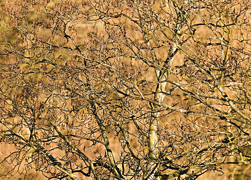
An older image reprocessed. Not sure I handled the sharpening quite right… But anyway I remember how the design of the branches tickled me, especially in the winter afternoon light of the PNW.

Appreciate your comments; thanks.

Comments

7 comments
Comment posted by Bill Chambers on December 27, 2010 at 8:48 AM
I like this a lot Catherine. You managed to get order out of chaos and the light is very nice. I'm on my work monitor (lousy), but the sharpening looks good on it. Thanks for sharing.
Registered on April 10, 2005, 753 Posts, 21216 Comments
Comment posted by Steve Sieren on December 27, 2010 at 11:31 AM
The sharpening seems fine to me and details shine in this one. It's almost monotone, I like the golden hues.
Registered on January 2, 2008, 360 Posts, 5321 Comments
Comment posted by Lori Kincaid on December 27, 2010 at 12:56 PM
The structure of the branches against the golden background is very nice. It's hard to extract order from such chaos in soft light, much less in sunlight, but you've done it here. Nice work!

Lori
Registered on November 15, 2003, 90 Posts, 2033 Comments
Comment posted by Catherine Reilly on December 27, 2010 at 4:25 PM
I decided to add a B/W version for comments, too. Experimented with sharpening settings in Ps unsharp mask, so would love to hear what you think. Also on the B/W conversion-- appropriate for the image? quality? Thanks again.
Registered on August 16, 2006, 603 Posts, 9192 Comments
Comment posted by Tony Kuyper on December 27, 2010 at 8:07 PM
Nice abstract presentation. I like the contrast between the sharply focused foreground and the oof background.

Just noticed, B&W pretty cool too. Takes the abstraction a bit further.
Registered on November 1, 2003, 364 Posts, 22328 Comments
Comment posted by Barbara Graham on December 28, 2010 at 10:34 AM
I love the color version, the dark lines against the golden/beige colors.
Registered on July 27, 2010, 1310 Posts, 5035 Comments
Comment posted by Lon Overacker on December 28, 2010 at 3:50 PM
Catherine,

Good eye for seeing and crafting this mass of branches. What makes this work is that the background is far enough away and out of focus enough to let the tree get separated from that background. The color version does that much better, IMHO. The tonal values in the b&w version aren't helping the background separate itself from the tree nearly as well as the color version.

Sharpening looks pretty good in both versions, although I suspect this is suffering more from jpg compression than anything else.

Lon
Registered on November 24, 2006, 521 Posts, 19147 Comments