Nature Photographers Network
This is the preserved archive of the original Nature Photographers Network. The community continues at naturephotographers.network.
Edge of Existance
‹ PreviousLandscape GalleryNext ›

Edge of Existance

by Harry Lichtman

Gallery: LandscapePosted December 20, 2010253 views16 comments
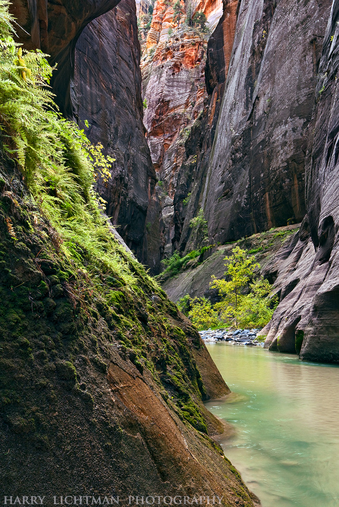
I was amazed how ferns and trees manage to survive the water scoured canyons of Zion. I was attractred to the backlit foliage and the play of contrast betwen the foliage and the towering stone walls.

Canon 5D MarkII
17-40L, polarizing filter, single exposure, f18, ISO 100

Comments

16 comments
Comment posted by Anish Desai on December 20, 2010 at 7:58 PM
Nicely layered composition, and I agree the contrast between the foliage and shaded walls is lovely. The water also has a luminescent quality that adds to the mood.
Registered on May 23, 2009, 49 Posts, 410 Comments
Comment posted by Lon Overacker on December 20, 2010 at 8:00 PM
Harry,

This has much more of a prehistoric look and feel than anything else I've seen from the canyons of Zion. Maybe it's the unexpected ferns growing, but this is certainly a unique view. I may have to sit and think on this one because it's not grabbing me like most of your other images from Zion. Not sure what it is. Maybe a crop up from the bottom would concentrate the composition a little more, bringing more of a contrast between the backlit ferns and the towering walls? Maybe drop the highlights although technically there's nothing wrong with the highlights, or color or contrast for that matter. Wish I could put my finger on it. An excellent and unique view and capture of the canyon here, but just not grabbin' me as much as your other images. ok, I said that already...

Lon
Registered on November 24, 2006, 521 Posts, 19147 Comments
Comment posted by Harry Lichtman on December 20, 2010 at 8:14 PM
Lon - I think there is a static feel to this one that bothers me a little, but at the same time makes it a little diferent than some of the other canyon images with the rushing water. Sometimes it's difficult to figure out what it is you like or dislike - I have considered a tighter crop from the bottom up, which would might decrease the sense of height in the canyon. Thanks for your perspective!
Registered on September 17, 2010, 304 Posts, 3507 Comments
Comment posted by Guy Tal on December 20, 2010 at 8:48 PM
Beautiful and original composition. I like this one a lot. The variety of greens mixed in with the hues in the rock are just wonderful.

Guy
Registered on November 1, 2003, 566 Posts, 15507 Comments
Comment posted by Lon Overacker on December 20, 2010 at 9:25 PM
Harry,

Good point and I understand about the sense of height of the canyons. But I wanted to drop back in and let you know that I played with this (I wouldn't post unless permission of course) and dropping off the highlights in a TK Brigh Brights mask to .75 in a Levels Adj layer really makes this pop. Makes the original look like there's a slight glare. And the other thing I think of is that there isn't enough of the river to pull the eye in to the frame.

I'm liking this more, I think with a couple tweaks.

Lon
Registered on November 24, 2006, 521 Posts, 19147 Comments
Comment posted by Harry Lichtman on December 20, 2010 at 10:09 PM
Lon - Feel free to post your adjustments - I'd be interested. I agree about the dissapearing river thing. Once done with my southwest edits, I am going to try TK mask tutorial to see if I can figure them out. I am almost feeling like I am not being critical enough with my edits and am ending up with lots of Narrows images.
Registered on September 17, 2010, 304 Posts, 3507 Comments
Comment posted by Kah Kit Yoong on December 20, 2010 at 10:12 PM
To be honest, this one is not working for me. Half of the foreground is taken up with that wall on the left which isn't too interesting and seems something of an obstruction. I do like the light in the background on the trees but it seems to emphasize the dull left bottom area all the more.
Registered on September 27, 2006, 636 Posts, 10682 Comments
Comment posted by Lon Overacker on December 20, 2010 at 10:32 PM
Thanks Harry,

Let's see how this looks. It's subtle and you might have to put two browsers next to each other to see the difference. but for those who can notice the difference, I didn't use any saturation adjustments. Using TK's Luminosity masks and creating a Levels Adj layer use a "Light Lights" mask (sorry I was incorrect earlier when I said Bright Brights.) Just toning down the highlights in the ferns actually makes them appear to be more saturated. It also takes the gleen off the rock face. I also very slighty reduced the red channel to give the very gray rocks a little edge towards blue. That's just my personal thought on that.

Also the crop. I still think this retains a vertical presence.

Just my crack at it. Thanks for letting my give it a shot. Let me know what you think.

Lon

edit: If it were mine, I would now work on selectively desaturating the greens in the background and perhaps even the reds at the far top of the canyon wall. Some unintended consequences.... :smile:
Registered on November 24, 2006, 521 Posts, 19147 Comments
Comment posted by Harry Lichtman on December 20, 2010 at 10:42 PM
Lon - I do like the effect the corrections have on the ferns, but the mid ground river rocks look too blue, and the mid ground grasses/shrubs, deep water areas too sat. or cyan, probably due to the reds adjustment. WHile the crop helps out the rock interest, even less river and the interesting rocks just below the water have been eliminated. Some selective processing obviously would help, but as Kah Kit just mentioned, it may be a matter of composition vs. processing. I'll re-shoot tomorrow and try to change things up! :biggrin:

Thnaks for taking the time to make the adjustments. Hope I can do it that fast after some practice!
:wavey:
Registered on September 17, 2010, 304 Posts, 3507 Comments
Comment posted by Lon Overacker on December 20, 2010 at 11:00 PM
Harry,

Good call on the river rock, didn't even pay attention to that. I was going to mention too that processing a 2-300KB JPG isn't quite the same as a full image with all the pixels available. But definitely would need some selective processing. I also see what happened to the water. So, a half-a**ed try - but this does have great potential.

Lon
Registered on November 24, 2006, 521 Posts, 19147 Comments
Comment posted by Hamed Musharbak on December 21, 2010 at 9:16 AM
i like this one harry

the colors are wonderful & the light as well

Hamed
Registered on June 1, 2009, 372 Posts, 2282 Comments
Comment posted by Lori Kincaid on December 21, 2010 at 1:48 PM
I really like this a lot, Harry. It isn't the dramatic reflected light I'm used to seeing from Zion and I find that very refreshing. Very nice work!

Lori
Registered on November 15, 2003, 90 Posts, 2033 Comments
Comment posted by Adam Gibbs on December 21, 2010 at 3:27 PM
The ferns are a great bonus Harry, they add a nice contrast to the red cliffs in the background. If anything I might crop a tad off the bottom.
Registered on November 1, 2003, 168 Posts, 870 Comments
Comment posted by Dean Sauskojus on December 22, 2010 at 6:02 PM
Love the greens flowing through this image and the contrast of those dark impending walls. Great work Harry.
Registered on September 29, 2009, 137 Posts, 2659 Comments
Comment posted by Kah Kit Yoong on December 22, 2010 at 7:17 PM
I think the rework is much better and makes it quite a successful image, although not in your top tier shots; obviously not every image can be.
Registered on September 27, 2006, 636 Posts, 10682 Comments
Comment posted by Catherine Reilly on December 25, 2010 at 7:46 PM
Another marvelous photo from the canyon lands, Harry. Really liking your images a lot! :cool:
Registered on August 16, 2006, 603 Posts, 9192 Comments