Nature Photographers Network
This is the preserved archive of the original Nature Photographers Network. The community continues at naturephotographers.network.
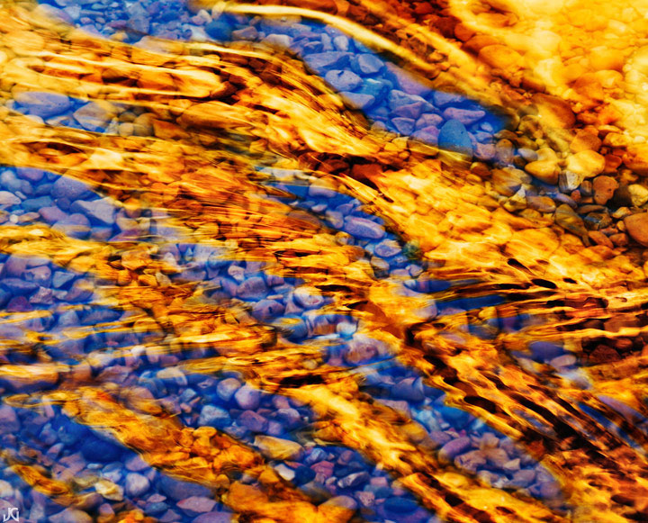
Canyon Flames *w/edit*
‹ PreviousLandscape GalleryNext ›

Canyon Flames *w/edit*

by Jimmy Gekas

Gallery: LandscapePosted December 13, 2010193 views26 comments
Southern Utah

I shot this at the same time I shot Ripples of Time. It is basically the same shot, but with a different set of ripples and crop. I also made sure that the blues stayed blue here...not purple/magenta. Maybe too much like the other image, but I like the extra number of flames and this could work well if printed and displayed next to the other. I'd love to hear your comments, especially after viewing the first one I posted. Thanks.

Comments

26 comments
Comment posted by Marc Adamus on December 13, 2010 at 1:41 PM
Wow, if I had to pick I might take the other but considering I had missed that one I'm really glad you posted. Both are just wonderful!
Registered on September 17, 2005, 780 Posts, 8091 Comments
Comment posted by Philip Hodgkins on December 13, 2010 at 2:01 PM
I would take the first one. This one looks a bit over processed.
Registered on July 24, 2006, 2741 Posts, 12349 Comments
Comment posted by Bill Chambers on December 13, 2010 at 2:06 PM
The rocks underwater really make this for me. The saturation looks a little high on this to me.
Registered on April 10, 2005, 753 Posts, 21216 Comments
Comment posted by Todd Liotine on December 13, 2010 at 2:21 PM
I missed the first one, but this one is great. If had one comment if might be the upper right corner doesn't flow with the rest of the image (kind of distracting)
Registered on July 1, 2008, 131 Posts, 671 Comments
Comment posted by Arnab Banerjee on December 13, 2010 at 3:04 PM
I like both - but for this one, the red/blue saturation feels a bit overpowering. I would think of toning that down a bit
Registered on January 3, 2007, 313 Posts, 2270 Comments
Comment posted by Jake Case on December 13, 2010 at 3:23 PM
I agree that the saturation is high on this one, but I really love how you can see the details of the pebbles on this one. The other one has perhaps a better shape to the "flames", but the flames here are great too. I choose this one. Great work!
Registered on December 13, 2010, 38 Posts, 167 Comments
Comment posted by Joel Hazelton on December 13, 2010 at 3:44 PM
Jimmy- They're both great! I think that I would prefer this one if you can pull back the saturation just a bit.
Registered on August 6, 2008, 194 Posts, 1315 Comments
Comment posted by Harley Goldman on December 13, 2010 at 3:50 PM
The other one is tough to top. I would not mind pulling down the saturation a bit and burning down the top right corner. My eye keeps getting pulled up there. I do like the look of the underwater pebbles in this one. Cool stuff.
Registered on November 19, 2003, 586 Posts, 11271 Comments
Comment posted by Raymond D Smith on December 13, 2010 at 4:03 PM
I am really enjoying the surface tension of the water in this pic Jimmy. Excellent eye to see this. Cheers
Registered on January 22, 2009, 12 Posts, 479 Comments
Comment posted by Phil Pogledich on December 13, 2010 at 4:21 PM
Wow, this is really nice. I absolutely think it's an exceptional shot and those gold reflections are wonderful. Like the others I find the upper RHC is a tad imposing and perhaps burning it down would help. Regardless, this is still quite powerful.
Registered on August 24, 2009, 123 Posts, 3099 Comments
Comment posted by Adam Gibbs on December 13, 2010 at 5:08 PM
Intense colour, great simple graphics, love it Jimmy.
Registered on November 1, 2003, 168 Posts, 870 Comments
Comment posted by Jason Kim on December 13, 2010 at 6:04 PM
I like both, but there is something about the original you posted that is more striking. It's a bit more mysterious and the texture on the water is wonderful. I would agree that they might work very well together as prints.
Registered on July 1, 2006, 60 Posts, 1233 Comments
Comment posted by Morris McClung on December 13, 2010 at 7:00 PM
Unbelievable! Wow is this one of the best abstracts I have ever seen! Unless it was the other one. :biggrin:
Registered on May 7, 2007, 670 Posts, 19650 Comments
Comment posted by David Chauvin on December 13, 2010 at 7:14 PM
You are on a roll with these abstracts, Jimmy. This is mesmerizing! :cool: :cool:
Registered on August 5, 2004, 1007 Posts, 5595 Comments
Comment posted by Jeremy Kessler on December 13, 2010 at 8:35 PM
Incredible! definitely was not prepared for this from the thumbnail. :toast:
Registered on September 13, 2007, 36 Posts, 1283 Comments
Comment posted by Vance Gese on December 13, 2010 at 8:53 PM
Amazing, Jimmy. Love the color contrasts and the luminous quality of the reflected light. Gorgeous.
Registered on November 13, 2008, 298 Posts, 6629 Comments
Comment posted by Naret Visesvongsa on December 13, 2010 at 10:59 PM
Great image Jimmy. You craft a beautiful pictures from the ordinary subject. Congratulation.
Registered on November 10, 2010, 6 Posts, 73 Comments
Comment posted by Floris van Breugel on December 14, 2010 at 12:46 AM
Fascinating abstract, Jimmy. Really beautiful combination of yellows and blues, and the pebbles add a wonderful deeper dimension. I prefer the composition of this one, but the more conservative colors of the other post.
Registered on December 19, 2008, 306 Posts, 4840 Comments
Comment posted by Jimmy Gekas on December 14, 2010 at 1:46 AM
Thanks for the great input. I have been going a bit overboard on the saturation at times lately, so it is refreshing for me to hear that I need to dial it down a bit. In addition to the decrease in overall saturation, I darkened down the upper righthand corner. Hope this helps.
Registered on July 26, 2007, 244 Posts, 2807 Comments
Comment posted by Guy Tal on December 14, 2010 at 7:28 AM
Absolutely beautiful, Jimmy! I love the combination of blue and gold and the little pebbles visible through the surface. Wonderful work.

Guy
Registered on November 1, 2003, 566 Posts, 15507 Comments
Comment posted by Harry Lichtman on December 14, 2010 at 10:32 AM
Fantastic shot. I prefer this one to the other one. Sat. either way works for me. Doesn't look like you have blown out detail even with the higher sat. Must have been col to watch the colors change with the ripples. Hipnotic! :toast:
Registered on September 17, 2010, 304 Posts, 3507 Comments
Comment posted by Chris Chamberlain on December 14, 2010 at 10:45 AM
From the thumb, I thought this was going to be maybe too bold/intense in the brightness. But, I was wrong! The stripes of color/light really work here. The clarity of the water showing the pebbles on the bottom only makes it better. Nice!

Chris
Registered on March 13, 2007, 500 Posts, 8365 Comments
Comment posted by Kah Kit Yoong on December 14, 2010 at 11:58 AM
I prefer the rework. This is really superb. Gorgeous!
Registered on September 27, 2006, 636 Posts, 10682 Comments
Comment posted by Anthony Vincent on December 14, 2010 at 6:31 PM
Great striations and colors Jimmy. Pretty impressive color palette.

Thanks for sharing
Registered on February 5, 2009, 199 Posts, 2775 Comments
Comment posted by Rick Gomez on December 14, 2010 at 8:13 PM
Geez this is cool! The repost is better, but I wouldn't have made an issue about the original.
Registered on March 3, 2007, 206 Posts, 1853 Comments
Comment posted by Tony Kuyper on December 14, 2010 at 11:45 PM
Neat image. First one looks better on my laptop, but it's hard for me to say. What a wonderful comp and light.
Registered on November 1, 2003, 364 Posts, 22328 Comments