Nature Photographers Network
This is the preserved archive of the original Nature Photographers Network. The community continues at naturephotographers.network.
The Quiet  + B/W Version
‹ PreviousLandscape GalleryNext ›

The Quiet + B/W Version

by Scott Smorra

Gallery: LandscapePosted December 12, 2010349 views22 comments
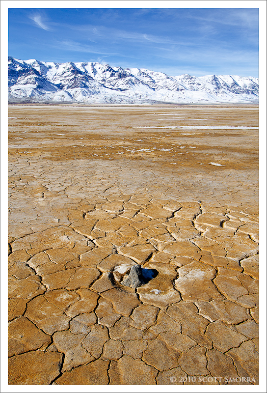
Steens mountain towering above the Alvord Desert of Oregon. The quietness of this location was amazing. There was no wind and absolutely no ambient noise. This "hear your heart beating and ears ringing" quietness is not something I've experienced before.

I've been trying to do more midday photography recently and this is my latest attempt. I've also provided a black and white version for comparison. Please let me know which version you prefer and why.

Nikon D7000, 12-24 Nikkor Dx, polarizer
3 exposure blend for DOF 1/30 sec at f/13, ISO 100. The camera was only a few inches from the foreground rock and it wasn't possible to get everything in focus in a single exposure.

Comments

22 comments
Comment posted by Scott Smorra on December 12, 2010 at 7:23 PM
B/W version.
Registered on November 2, 2009, 161 Posts, 2143 Comments
Comment posted by John Mumaw on December 12, 2010 at 8:19 PM
I prefer the b&w because it shows the contrast of the playa much better and is more appealing in midday light.
Registered on September 9, 2005, 62 Posts, 2289 Comments
Comment posted by Anne K. Rusk on December 12, 2010 at 9:02 PM
The color palette is beautiful so I like the color version better. The B&W is interesting as well, but I'd dodge the clouds a little more. Wonderful place!
Registered on October 10, 2010, 65 Posts, 904 Comments
Comment posted by Jeremy Kessler on December 12, 2010 at 9:39 PM
Tough to choose between the two, but I think I like the color more. Great work.
Registered on September 13, 2007, 36 Posts, 1283 Comments
Comment posted by Donald Case on December 12, 2010 at 10:12 PM
I like both with a slight nod to the b & w. The foreground is really interesting, like you could do some abstracts with it.
Registered on January 28, 2010, 45 Posts, 99 Comments
Comment posted by Jason Kim on December 12, 2010 at 10:44 PM
I prefer the color version, Scott. I think I'm a sucker for golds and blues, especially when they're together. This place has a barren beauty about it.
Registered on July 1, 2006, 60 Posts, 1233 Comments
Comment posted by Tony Kuyper on December 12, 2010 at 11:13 PM
Both versions look good--color has nice warm/cool contrast and B&W has nice overall contrast. What a great title to go with the image.
Registered on November 1, 2003, 364 Posts, 22328 Comments
Comment posted by SandyRichardsBrown on December 12, 2010 at 11:39 PM
A beautiful and peaceful place for sure - love it there.
Excellent images - both of them.
The color showcases the great sky, mountains, and deseret patterns, so is my favorite of the two.
However, the B&W emphasizes the patterns since there is no color to pull the eye.
Such a great vista would work well with a landscape orientation too.
Sandy
Registered on November 24, 2003, 3937 Posts, 12909 Comments
Comment posted by Ben Horne on December 12, 2010 at 11:44 PM
This is a very nice photo of opposites. First, there is the color -- blue versus tan. Secondly, there is the texture: cracked playa versus high clouds in the sky. Finally, there is the environment -- desert versus mountain. The result is an almost dream-like feel.

My only nit is the angle of the shot. The mountains in the background taper off in the distance as they span from left to right. My eye moves with the diminishing mountains right off the right side of the composition. I feel like a step to the right, and shooting back toward the left would fix this.

This is of course assuming that there isn't something just outside the left side of the frame that would prohibit this, or that the mountains do not continue in similar fashion to the left.
Registered on August 27, 2009, 51 Posts, 959 Comments
Comment posted by Joel Hazelton on December 13, 2010 at 12:56 AM
Very well done, especially for midday. My vote goes to the color, although they're both great.
Registered on August 6, 2008, 194 Posts, 1315 Comments
Comment posted by Floris van Breugel on December 13, 2010 at 1:23 AM
It sure is an incredible place out there, huh. I prefer the color version, as it makes me feel like I'm there better than the black and white.
Registered on December 19, 2008, 306 Posts, 4840 Comments
Comment posted by Naret Visesvongsa on December 13, 2010 at 1:33 AM
Scott, nice work. You turn out the ordinary subject to be part of beautiful image. BW version look very nice for me..
Registered on November 10, 2010, 6 Posts, 73 Comments
Comment posted by Kah Kit Yoong on December 13, 2010 at 1:48 AM
Prefer the colour version. Somehow the BW looks rather flat. The colours come through quite nicely despite the midday light. Good result under tough conditions.
Registered on September 27, 2006, 636 Posts, 10682 Comments
Comment posted by Lon Overacker on December 13, 2010 at 3:39 AM
Scott,

Excellent near/far composition. The patterns in the dried mud anchor the scene well. The color combo works well, although they're mid-day color... :wink: And for that alone, I think the b&w really stands out for me and actually portrays the location beautifully. Great contrast and tonal range and I think even the patterns in the mud are enhanced with the conversion.

The color version is good, but I really think the b&w version is a winner!

Lon
Registered on November 24, 2006, 521 Posts, 19147 Comments
Comment posted by Catherine Reilly on December 13, 2010 at 4:22 AM
Amazing. B/W because the details stand out better.
Registered on August 16, 2006, 603 Posts, 9192 Comments
Comment posted by Brigitte Lorenz on December 13, 2010 at 5:23 AM
Great work...I prefer the colored version

Brigitte
Registered on January 10, 2009, 187 Posts, 1507 Comments
Comment posted by Lori Kincaid on December 13, 2010 at 8:08 AM
I relish the quiet, something few people get to experience in this world filled with ambient noise, both literally and figuratively. Beautiful scene. I prefer the B&W.

Lori
Registered on November 15, 2003, 90 Posts, 2033 Comments
Comment posted by Jake Case on December 13, 2010 at 3:33 PM
I think the black and white brings out the textures better, and has a "cleaner" look to it. However, the rock in the middle of the mud cracks is better emphasized in the color version, and the color contrast does work nicely. I would lean ever so slightly toward the color just because the rock is such a focal point in the composition and seems to get lost in the black and white. I'd keep both of them because they're both great images.
Registered on December 13, 2010, 38 Posts, 167 Comments
Comment posted by Barry Ashenhurst on December 13, 2010 at 4:46 PM
I think the colour works fine, Scott, but the whole thing looks a little light to my eye. Have you looked at it one to two thirds of a stop darker?
Registered on August 4, 2009, 253 Posts, 455 Comments
Comment posted by Kevin Trinkner on December 14, 2010 at 9:45 AM
Very nice scene Scott, love the contrasting colors and great detail. Has a nice crisp feel to it. Great capture.
Registered on June 30, 2008, 203 Posts, 2641 Comments
Comment posted by Chris Chamberlain on December 14, 2010 at 11:18 AM
Such stark beauty, I love it! I can see the affinity for the b&w, but, I still prefer the color. Both are excelllent!

Chris
Registered on March 13, 2007, 500 Posts, 8365 Comments
Comment posted by Jim Hackley on December 14, 2010 at 12:52 PM
Wonderful composition, I like the B&W better due to the constrast layers between the dark sky, snow capped mts and cracked earth with one lone rock. Well done.
Registered on September 17, 2009, 302 Posts, 5535 Comments