Nature Photographers Network
This is the preserved archive of the original Nature Photographers Network. The community continues at naturephotographers.network.
Bouquet scan + repost
‹ PreviousFlora GalleryNext ›

Bouquet scan + repost

by Gary Yeoh

Gallery: FloraPosted December 11, 2010133 views16 comments
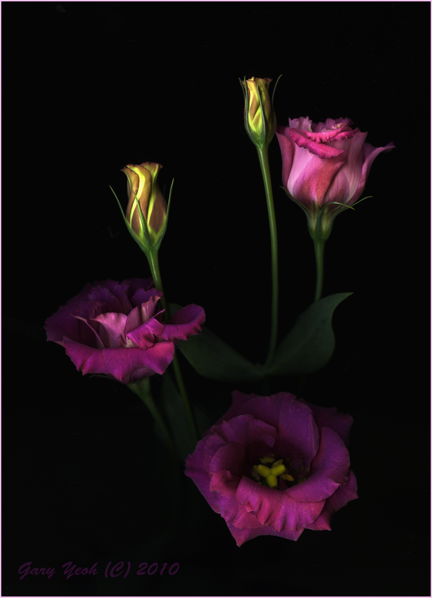
Went to the florist today and was attracted to this cut flowers which I took home to scan (don't know the name, so ID would be appreciated). Also took a few images with the camera but like the scan better.

Epson 4900 scan @600 dpi. CS5 vivezia 2 filter, darkened. No sharpening. Thanks for viewing and C&C appreciated.

Comments

16 comments
Comment posted by Bob Duff on December 11, 2010 at 6:40 AM
Gary, I like the comp and flowers used. They seem to work will with scanning. Not having any experience myself I notice both you sand Pat darken the image before posting. Do you get any problems with blown highlightings when scanning or can you control that. Would also be nice to see an as scanned image then the PP image to see the differences. Thanks for shareing.
Registered on April 21, 2010, 160 Posts, 1675 Comments
Comment posted by Pat Sampson on December 11, 2010 at 6:50 AM
Gorgeous work Gary. A well balanced composition for my part along with elegant lines and shapes. Love the rich color as well. This is my favorite so far.

pat
Registered on May 19, 2007, 953 Posts, 15989 Comments
Comment posted by Gary Yeoh on December 11, 2010 at 8:41 AM
@Bob
This is an unprocessed file straight out of the scan - resize to 720 on CS5. The darkening brings out the color a bit more.
Registered on September 1, 2009, 588 Posts, 8184 Comments
Comment posted by David W. Kelly on December 11, 2010 at 10:13 AM
Wonderfully arranged and oh so beautiful Gary. :toast:
Registered on October 7, 2005, 883 Posts, 6590 Comments
Comment posted by Ian Wolfenden on December 11, 2010 at 12:26 PM
Love the mood of this, Gary, and the metallic tones. Interesting comparison between the two techniques - the colour is definitely richer in the scanned version, though the flower centres are clearer in the unprocessed example.
Registered on May 18, 2007, 1108 Posts, 7647 Comments
Comment posted by Carol Hyman on December 11, 2010 at 1:52 PM
Gary, I like the repost of the image the best of the two. Can't help with the ID. The metallic tones are interesting but this image doesn't cut it for me. Gary, I've seen you do far better work. But remember, that's just my 2-cents LOL

Christmas cheers,

Carol
Registered on January 18, 2007, 597 Posts, 8062 Comments
Comment posted by Gino Cortez on December 11, 2010 at 3:49 PM
Very nice composition and lighting,
Registered on November 23, 2010, 57 Posts, 396 Comments
Comment posted by Morris McClung on December 11, 2010 at 5:34 PM
So very artistic! Wonderful soft rich color and light. :toast:
Registered on May 7, 2007, 670 Posts, 19650 Comments
Comment posted by Bill Fach on December 11, 2010 at 10:07 PM
Gary: I'll give a slight nod to the repost but I like them both very much. One of my goals for 2011 is to try scanning. You and Pat are setting a fine standard. >=))>
Registered on November 1, 2003, 1805 Posts, 26981 Comments
Comment posted by Ed Lowe on December 12, 2010 at 9:16 AM
I love the glow and soft delicate feel of this presentation, Gary. Both you and Pat are doing some wonderful work with your scans. Very artistic.

Ed
Registered on February 7, 2004, 414 Posts, 7115 Comments
Comment posted by scott lanz on December 12, 2010 at 1:51 PM
Very artistically arranged and captured. :toast:
Registered on November 14, 2003, 840 Posts, 12902 Comments
Comment posted by Albert Darmo on December 12, 2010 at 6:39 PM
Hi Gary :wavey Thanks for showing: both versions. both have an appeal to me. The darker color tones always win out . :biggrin: The composition and color is gorgeous :toast:
Albert Darmo. Canada
Registered on November 25, 2008, 1386 Posts, 11978 Comments
Comment posted by Ken Smith on December 12, 2010 at 10:12 PM
Gary, the second version is a solid notch above first. Of course, we all have our opinions. That aside, this is gorgeous! Beautiful....there are some shots that seems both rich and creative...this one has that. Well done!
Registered on September 5, 2008, 449 Posts, 2444 Comments
Comment posted by Krunal Janani on December 13, 2010 at 12:24 AM
Both images are outstanding Gary & both have a very diff. feel to it keep up the good work :toast:
Registered on September 16, 2010, 60 Posts, 1370 Comments
Comment posted by Giuseppe Guadagno on December 13, 2010 at 4:03 PM
Gary, composition and light are splendid. I like both and prefer the first post, as I love mood and mistery in the floral images. Very elegant and tasteful. Bravo!
Registered on February 3, 2007, 827 Posts, 5052 Comments
Comment posted by Nathan Buck on December 14, 2010 at 3:35 AM
Wonderful comp Gary. These are lisianthus. Great color and a beauty of a shot.

Nathan
Registered on November 1, 2003, 1101 Posts, 13589 Comments