Gallery: LandscapePosted November 30, 2010441 views25 comments
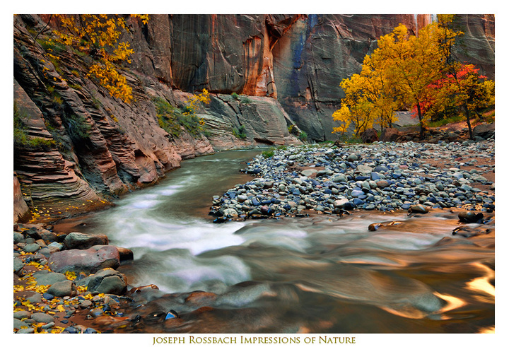
From an amazing afternoon hiking the Virgin River Narrows. The Cottonwoods were at peak in most sections of the inner canyon and the reflected light was wonderful. Thanks for your comments! Joe
Comments
25 comments
Comment posted by Keith Bauer on November 30, 2010 at 11:26 AM
Oh my.... the flow (no pun intended) of this composition really works for me. Love the color palette. The two brightest areas on the LRC pull me a way a little. Lovely image.
Registered on November 20, 2003, 458 Posts, 4836 Comments
Comment posted by Gino Cortez on November 30, 2010 at 11:32 AM
Wow! These colors are killer! They seem bold yet balanced throughout. Nice leading line with the river as well.
Registered on November 23, 2010, 57 Posts, 396 Comments
Comment posted by Robert Stough on November 30, 2010 at 11:47 AM
Beautiful canyon light and a fine composition. I might have liked a little more of those lovely golden reflections on the lower right but this is excellent just as it is.
Registered on November 20, 2010, 26 Posts, 273 Comments
Comment posted by Luke Ormand on November 30, 2010 at 12:11 PM
The fall colors and mix of blues and greys in the rocks is awesome. The golden lighting on the water at the LRC is magical... I love everthing about this.
Registered on February 4, 2009, 1093 Posts, 7035 Comments
Comment posted by Andreas Resch on November 30, 2010 at 12:32 PM
What a place! Love the composition you have chosen for this one. My only concern are the bright highlights in the LRC which look great but pull the eye out of the image.
Registered on November 14, 2007, 322 Posts, 6101 Comments
Comment posted by Kah Kit Yoong on November 30, 2010 at 12:39 PM
Beautiful range of colours. I sort of agree that the strong highlights in the right lower corner are a not in an ideal position but overall a most appealing image.
Registered on September 27, 2006, 636 Posts, 10682 Comments
Comment posted by Joseph Kayne on November 30, 2010 at 12:48 PM
Excellent image. I would try to burn down the highlights a little in the bottom right. Joe.
Registered on November 1, 2003, 573 Posts, 2619 Comments
Comment posted by Marc Adamus on November 30, 2010 at 1:32 PM
Nice running into you down there, Joe. I like the design of this one. Normally I'd like to see more of that beautiful gold in the water closer to the main path of the image, but the yellow on all four corners frames the river nicely.
Registered on September 17, 2005, 780 Posts, 8091 Comments
Comment posted by Paul Marcellini on November 30, 2010 at 2:07 PM
I might try to tone down those corner highlights but otherwise a very nice engaging image. The blues seem a touch over-saturated to me but otherwise love the processing.
Registered on November 27, 2007, 250 Posts, 2468 Comments
Comment posted by Ian Plant on November 30, 2010 at 2:07 PM
my favorite bend in the Narrows! Beautifully rendered buddy.
Registered on July 7, 2008, 271 Posts, 1657 Comments
Comment posted by Ron Huff on November 30, 2010 at 3:55 PM
Beautiful image- well done.
Ron Huff
Registered on August 31, 2010, 69 Posts, 440 Comments
Comment posted by Vance Gese on November 30, 2010 at 4:38 PM
Gorgeous, Joe. Absolutely gorgeous.
Registered on November 13, 2008, 298 Posts, 6629 Comments
Comment posted by Nick Bristol on November 30, 2010 at 5:32 PM
This is beautiful, Joe. I like the comp you choose and the colors are wonderful. Really nice work.
Nick Bristol
Lone Rock, WI.
Registered on February 1, 2004, 752 Posts, 14140 Comments
Comment posted by Jeremy Kessler on November 30, 2010 at 7:15 PM
The glow in those highlights are fantastic, spectacular work.
Registered on September 13, 2007, 36 Posts, 1283 Comments
Comment posted by John Mumaw on November 30, 2010 at 7:57 PM
The bend in the river and those beautiful autumn colors separate this scene from most of the usual compositions I see from here. Agree with the others re: burning down the highlights a bit in the lower right corner. Excellent work!
Registered on September 9, 2005, 62 Posts, 2289 Comments
Comment posted by Lon Overacker on November 30, 2010 at 8:17 PM
Joe,
I think Zion gets the trophy for most posts this season, Yosemite coming in at a comfortable second.
Absolutely love the composition here and the "flow" that was mentioned earlier. The balance is excellent, especially with the grouping of cottonwoods and maple up top.
Perhaps a bit saturated, but we're at the personal choice level here... And so the only small nit I have would be to tone down the bright reflections in the LRC. Not an image killer though.
Such a wonderful place and a beautiful capture.
Lon
Registered on November 24, 2006, 521 Posts, 19147 Comments
Comment posted by Jason Kim on November 30, 2010 at 8:49 PM
Wonderful composition, Joe. A very lovely scene of the Narrows.
Registered on July 1, 2006, 60 Posts, 1233 Comments
Comment posted by William Vrolyk on November 30, 2010 at 9:48 PM
This is a treat to the eyes, Joseph. The colors throughout are beautiful and amazing.
Will
Edmonton, Alberta
Canada
Registered on November 1, 2003, 278 Posts, 3524 Comments
Comment posted by Kent Mearig on December 1, 2010 at 12:35 AM
Oh that the blown highlights (otherwise not objectionable really) weren't tucked down into that corner. I think there are enough other interesting things going on to pull me out of there, but I do keep getting sucked back down. I like the "one wall" perspective and composition though.
Registered on September 4, 2006, 237 Posts, 4748 Comments
Comment posted by John Williams on December 1, 2010 at 10:56 AM
I'm really enjoying this one. Excellent processing to bring out the color in the canyon to match the fall colors. I too would darken those reflection in the lrc, to a level that matched the yellow in the other corners, and back down the blues just a tad where they are the strongest on the rocks.
Registered on September 6, 2007, 221 Posts, 5985 Comments
Comment posted by Michael J Greene, on December 1, 2010 at 11:29 AM
Joseph,
I love the scene. It looks like you might have some clipping in the whitest of rapids. Also, the rocks and a little of the walls are looking dangerously purple. For the web, I think this works great. I'd desaturate those rocks if you are going to print big though....Anyways, I love this shot.
Michael
Registered on June 18, 2009, 86 Posts, 2317 Comments
Comment posted by Zack Clothier on December 2, 2010 at 2:14 AM
Very nice canyon shot Joe, just wish there was a little more of those reflections in the water, but not a big deal. I might try toning the brightest ones down just a little though.
Registered on January 28, 2010, 343 Posts, 2257 Comments
Comment posted by Anthony Vincent on December 2, 2010 at 7:16 AM
Such a cool canyon Joseph
Great framing and with the fall colors everything looks so good.
Nice work
Registered on February 5, 2009, 199 Posts, 2775 Comments
Comment posted by Jimmy Gekas on December 2, 2010 at 1:06 PM
Gorgeous! Probably my favorite takes on the narrows from all the recent photos. Lots of great color, motion and those sweet, sweet reflections!
Registered on July 26, 2007, 244 Posts, 2807 Comments
Comment posted by Tyson Fisher on December 2, 2010 at 3:43 PM
In a way, the bright water in the LRC play a compositional role in helping to frame the rest of the scene. This image definitely works for me. Great work!
Registered on September 17, 2008, 44 Posts, 623 Comments

Comments
25 commentsRon Huff
Nick Bristol
Lone Rock, WI.
I think Zion gets the trophy for most posts this season, Yosemite coming in at a comfortable second.
Absolutely love the composition here and the "flow" that was mentioned earlier. The balance is excellent, especially with the grouping of cottonwoods and maple up top.
Perhaps a bit saturated, but we're at the personal choice level here... And so the only small nit I have would be to tone down the bright reflections in the LRC. Not an image killer though.
Such a wonderful place and a beautiful capture.
Lon
Will
Edmonton, Alberta
Canada
I love the scene. It looks like you might have some clipping in the whitest of rapids. Also, the rocks and a little of the walls are looking dangerously purple. For the web, I think this works great. I'd desaturate those rocks if you are going to print big though....Anyways, I love this shot.
Michael
Great framing and with the fall colors everything looks so good.
Nice work