Nature Photographers Network
This is the preserved archive of the original Nature Photographers Network. The community continues at naturephotographers.network.
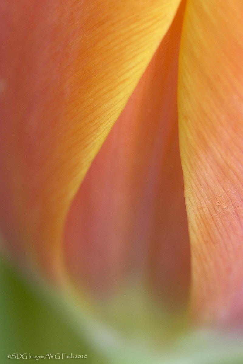
Tulip Tear
‹ PreviousFlora GalleryNext ›

Tulip Tear

by Bill Fach

Gallery: FloraPosted November 20, 2010162 views20 comments
Sony A700
Minolta 200mm macro
ISO 200, 1/6 @ f8

Chrissy and I have been traveling a lot over the past month so you may have noticed my spotty appearances on the gallery. Many thanks especially to Pat who did his usual superb job of commenting, posting, and experimenting with new techniques and overall being a fabulous moderator. I bought some tulips a couple weeks ago to shoot for abstracts and had a pretty productive session. This will be the first of a short series. All comments welcome. >=))>

Comments

20 comments
Comment posted by Philip Hodgkins on November 20, 2010 at 2:30 PM
I like everything here except the green glob at the bottom, Bill. On the other hand, my wife likes it! :biggrin:
Registered on July 24, 2006, 2741 Posts, 12349 Comments
Comment posted by Carol Hyman on November 20, 2010 at 2:58 PM
Bill, this is beautiful. An upside down heart :smile: Most appealing are the soft colors.

Cheers,

Carol
Registered on January 18, 2007, 597 Posts, 8062 Comments
Comment posted by Giuseppe Guadagno on November 20, 2010 at 3:09 PM
Bill, who well begins ..... I like the drawing of an imaginary bud of tulip created between the two leaves; and the harmony of the delicate colors. I love it just as it is.
Cheers.
Registered on February 3, 2007, 827 Posts, 5052 Comments
Comment posted by Bob Duff on November 20, 2010 at 3:46 PM
Bill, I've looked at this image a couple of times. I like what you have done with the tulip. Great choice on POV and DOF. The colour remind me if sorbet (do you supply the spoons as well?) :smile: i' m somewhat in agreement with Phil re the green on the bottom. I thought about a 1/3 crop from the bottom, but that would leave the image pretty flat so don't know. Perhaps taking the LHC much lighter like the right would do the trick. How about that for a very definitive opinion. Resting peacefully on top of the fence.
Registered on April 21, 2010, 160 Posts, 1675 Comments
Comment posted by Phillip Noll on November 20, 2010 at 6:24 PM
Very pretty! Nice perspective. I think I would prefer a little more DOF but that's just my preference. The green doesn't bother me but you might increase the luminosity of the green channel just a bit so its not so dark. :toast:
Registered on November 17, 2003, 207 Posts, 1083 Comments
Comment posted by Pat Sampson on November 20, 2010 at 9:05 PM
Great comp Bill and everything else looks perfect to me also. No problem with the green at the bottom. I'm looking forward to seeing the rest of the series.

pat
Registered on May 19, 2007, 953 Posts, 15989 Comments
Comment posted by scott lanz on November 20, 2010 at 10:00 PM
Excellent comp. The lines creating the angled tulip bulb shape give this real artistry, and I like the orange/green bicolors. Terrific image.
Registered on November 14, 2003, 840 Posts, 12902 Comments
Comment posted by Barbara Graham on November 20, 2010 at 10:17 PM
To me this is beautiful as posted. The colors are soft but full, and the lines are so beautiful.
Registered on July 27, 2010, 1310 Posts, 5035 Comments
Comment posted by Albert Darmo on November 20, 2010 at 10:58 PM
Hi Bill :wavey: A fascinating abstract. The lines , light and color are sublime :smile:
Albert Darmo. Canada
Registered on November 25, 2008, 1386 Posts, 11978 Comments
Comment posted by Brigitte Lorenz on November 21, 2010 at 5:03 AM
very lovely, Bill... wonderful soft colors and comp.

Brigitte
Registered on January 10, 2009, 187 Posts, 1507 Comments
Comment posted by Ian Wolfenden on November 21, 2010 at 1:28 PM
A classic for me, Bill - the soft focus area at the top of the stems just right for setting off the lines of the petals. Beautiful, simple composition.
Registered on May 18, 2007, 1108 Posts, 7647 Comments
Comment posted by Mauro Pasquero on November 21, 2010 at 1:33 PM
Very nice shot, Bill. Nice to see your images again.
Mauro
Registered on January 21, 2010, 650 Posts, 2500 Comments
Comment posted by Gary Yeoh on November 21, 2010 at 10:14 PM
Bill:
A very good abstract indeed. The green does not bother me. It would be interesting to rotate this 180 degree to show the upside down heart instead of a tear drop.
Registered on September 1, 2009, 588 Posts, 8184 Comments
Comment posted by Catherine Reilly on November 22, 2010 at 1:00 AM
NICE plane of focus, Bill, and way shallow. Did YOU use tubes?? Can't wait to see more of this adventure! :smile:

Catherine: This is a straight shot with the 200mm. About the only time I use tubes is on my 300mm to get a closer focus capability. I never use tubes on a zoom unless for some reason I feel the need for self inflicted frustration. :wink:
Registered on August 16, 2006, 603 Posts, 9192 Comments
Comment posted by Krunal Janani on November 22, 2010 at 1:06 AM
Your POV has made an pretty flower even more prettier Bill, the green is not bothering me & i like the way it is :toast:
Registered on September 16, 2010, 60 Posts, 1370 Comments
Comment posted by Morgan Casey on November 22, 2010 at 9:53 AM
This is beautiful. I really like the comp and colors. Wonderfully done. :smile:
Registered on November 16, 2010, 22 Posts, 269 Comments
Comment posted by Bruce King on November 22, 2010 at 8:15 PM
I like this a lot Bill. The textures revealed in the larger version are really nice. The green doesn't bother me but I like Phillip's idea of increasing luminosity there. :toast:
Registered on January 14, 2010, 276 Posts, 2212 Comments
Comment posted by Balakumar Kaushik on November 23, 2010 at 10:26 AM
Beautiful image Bill. Liked the colours. And shape formed by the petals.
Image reminds me of Ram's style.
Registered on January 4, 2008, 98 Posts, 1403 Comments
Comment posted by Debashis Bandyopad on November 23, 2010 at 1:18 PM
Bill, this is most beautiful... You sure had a very successful session :toast: :toast:
Registered on June 24, 2007, 130 Posts, 1309 Comments
Comment posted by Morris McClung on November 26, 2010 at 11:50 AM
The outline of the tear is so strong it overcomes the oof green area, imo. Great color and light, and good use of dof. I like it.
Registered on May 7, 2007, 670 Posts, 19650 Comments