A little Yosemite +rework
by Lon Overacker
I'm a little hesitant to post this on the heels of Harley, Chris and Youssef, but had to jump in just to say hello and that I'm still here. Been about 10 days since I got back from Yosemite and I still don't have my film (ok, I dragged my feet sending it in.) So, since I have NO new work since JULY!, I thought I would go back in time to 1996!
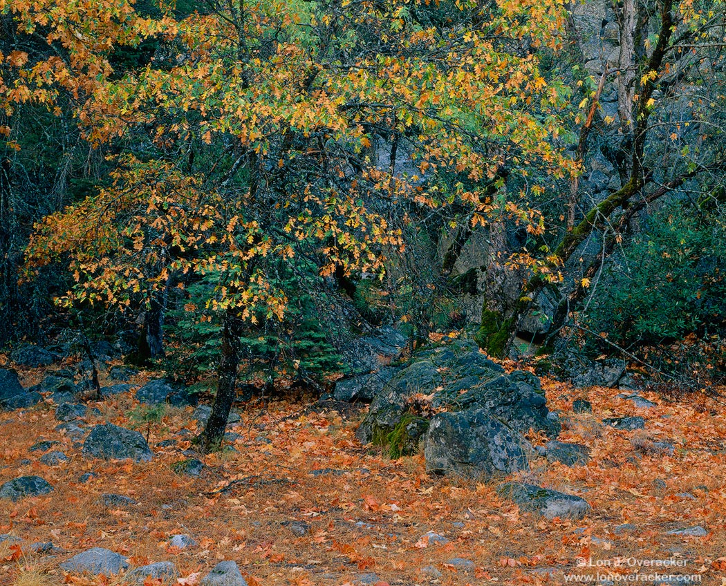
I just recently re-worked this trying to get my processing juices flowing in anticipation of a new batch of slides. This is one of the images with so much tiny detail that it really gets crunched getting to the web and is almost not worth displaying. The large version had to be sized to 1050 and 50% quality for posting. The smaller web version is even worse. But hopefully the idea comes through and you like the image.
Any and all comments and critiques are welcome. I played a lot with the blue/cyan's reducing them quite a bit from the scan. Is the granite still too blue? just right? Also dropped the greens and boosted the reds a little to enhance the forest floor a little it. Would be curious to hear your thoughts on color/sat.
some 4x5 camera, Nikkor 210mm and Velvia 50 I'm pretty sure.
Thanks!
Lon

Comments
28 commentsI can't wait to see the reults of your latest efforts from our trip.
--P
The composition is lovely. I like how the stone on the right leads the eye in. I'll bet you photographed this under clear blue skies while in the shadows. The blue is really strong in the image and I think it is drowning out the other colors. The detail is, as always with 4x5, awesome. Can't wait to see some of your new work.
Chris
thanks again!
- Dan.
The Zen Master of Trees doth protest too much. The repost is fine, but the original has more zip. I'm surprised, Yosemite granite especially in some areas has so much mica in it, that it has an overall bluish grey cast. So I think you went a little to far back on the blue in the second, but it's all personal opinion. I'll probably get a protest from Preston on my assessment of Yosemite granite that's ok. Moisture can affect cast as well darkening the rocks.
Paul
Hell, I really can't critique this much as you did this 14 years ago, and with film nonetheless, which you still shoot, so I'm just going to end this super long sentence with my typical...wicked.
Seriously though, it's a highly detailed photograph, and I believe your pp is spot on.
Nick Bristol
Lone Rock, WI.
I didn't know you ever shot Velvia 50. It must have been on sale somewhere.
--P
Blue, blue, blue... and coming from a guy who nitpicks about blue all the time.
I guess in the end it's hard to strike a balance between real, actual and measured color, vs. what we perceive and wish for in our minds...
Lon
I do prefer the second post. Too bad about compression issues, but that is normal as we know from these much finer detailed shots, especially trees. Although we all might agree on the blue casts in shade for the most part, unless it's pruned down it makes all the other colors lose their appeal & detail edges IMO. As you work mostly with the V-100F there is a tendency for it to lean towards magenta / reds. As I use the V-50 almost all the time, I find in the shade it's almost an automatic grab the Cyan / Blue sliders and crank them way down, again, from what I see from my own use of the V-50. The change you made is very noticeable to me in the back wall area. That to me looks much better in the second image.
G-O-R-G-E-O-U-S!