Nature Photographers Network
This is the preserved archive of the original Nature Photographers Network. The community continues at naturephotographers.network.
Spring Pastels
‹ PreviousLandscape GalleryNext ›

Spring Pastels

by David Edwards

Gallery: LandscapePosted November 13, 2010192 views9 comments
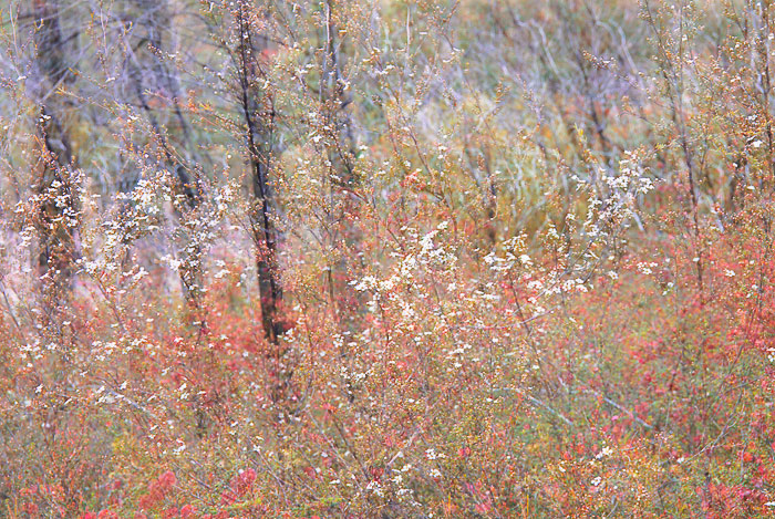
The wildflowers were in abundance during a recent trip to Girraween NP in Queensland, so I was inspired to start a new project called 'Wildflower Impressions' by utilizing the in-camera multiple exposure feature on my Nikon D80.

Many thanks for your thoughts, C&C.

David.

Comments

9 comments
Comment posted by Morris McClung on November 13, 2010 at 6:41 PM
Nice effect and beautiful color. It does give an impressionistic feel.

Isn't it great that on this forum, you can see spring happening down where you are, and fall up here? And even a little winter thrown in.
Registered on May 7, 2007, 670 Posts, 19650 Comments
Comment posted by Eva McDermott on November 13, 2010 at 7:06 PM
Wonderful effect David! Very painterly effect with some beautiful color.
Registered on January 4, 2009, 1015 Posts, 13229 Comments
Comment posted by beth summer on November 13, 2010 at 9:36 PM
This is lovely, David and I believe you achieved what you were after. Only very minor nit...I might dodge the one little trunk (actually it might be a large stick?) that is darker than all the others...kind of on the left half side...it draws me eye and keeps me from looking all around the image....just my .02 worth. Looking forward to see more of your wildflower impressions.
Registered on November 1, 2003, 437 Posts, 5220 Comments
Comment posted by Tony Kuyper on November 13, 2010 at 9:47 PM
This is quite abstract, actually, but very nice too. The selective focus contributes nicely to the abstract quality.
Registered on November 1, 2003, 364 Posts, 22328 Comments
Comment posted by Andreas Resch on November 14, 2010 at 5:00 AM
I like it David because it's different and uses the shallow DOF in a very effective and creative way.
Registered on November 14, 2007, 322 Posts, 6101 Comments
Comment posted by Pat Sampson on November 14, 2010 at 8:14 AM
David,

Just glancing at the the thumbnail, the color palette reminded me of some of Monet's images that I like. The thumbnail, doesn't do it justice. I do agree with Beth that the sharp black vertical about a third of the way from the viewer's left get's more attention than it deserves and would soften and lighten it a little. Good use of the in-camera multiple exposure feature. Beautiful image. You might be interested in looking at Nathan Buck's weekly picks and gallery. He's been using this technique off and on for several years now. He generally posts over in the flora gallery.

pat
Registered on May 19, 2007, 953 Posts, 15989 Comments
Comment posted by David Edwards on November 14, 2010 at 2:53 PM
Thanks everyone for your comments, and thank you Pat for recommending Nathan's work. I've had a look at his galley and his work is just beautiful. cheers :smile:
Registered on December 6, 2008, 142 Posts, 2623 Comments
Comment posted by Eric Good on November 15, 2010 at 3:30 PM
This is quite nice! It appears almost like an overlapping of several different images with its subtle abstract qualities. I agree about dodging that darker area in the UL third, but this more than works as presented too. Good stuff!
Registered on March 17, 2007, 116 Posts, 4764 Comments
Comment posted by Albert Darmo on November 15, 2010 at 9:56 PM
Hi david :wavey: You captured marvelous color and abstract form ... . very pretty!!
Albert Darmo. Canada
Registered on November 25, 2008, 1386 Posts, 11978 Comments