Gallery: LandscapePosted November 2, 2010108 views6 comments
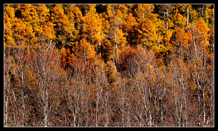
XTI, 70-200L f4 @ 118mm, f11 @1/80. ISO 200 B+W CPL. Went to South lake today up in The Eastern Sierras. Saw this on the way. I really missed the fall season this year, wasn't much left. Thanks for looking
Comments
6 comments
Comment posted by John Williams on November 2, 2010 at 9:34 AM
You did a great job with what remained. The contrast of the background and the leafless foreground works great. This may be a monitor issue, but it looks a tad too contrasty (maybe compression??) to me.
Registered on September 6, 2007, 221 Posts, 5985 Comments
Comment posted by Dorin Bofan on November 2, 2010 at 10:40 AM
Although the light is harsh, I really like the strong contrast it creates. The layering works very good.
Registered on April 30, 2007, 122 Posts, 3086 Comments
Comment posted by Stan Rose on November 2, 2010 at 10:59 AM
I think it is too contrasty--and unfortunately, it's probably the harsh light that is causing that issue, not the pp, which looks good to me. Cool subject, wrong lighting.
Registered on September 15, 2005, 836 Posts, 17099 Comments
Comment posted by Jason Kim on November 2, 2010 at 10:48 PM
I think it's pretty nice how you have the foreground trees lacking their leaves, but with the backdrop in full Fall colors.
Registered on July 1, 2006, 60 Posts, 1233 Comments
Comment posted by Mike Ryan on November 3, 2010 at 3:41 PM
The light may be a bit contrasty but that's nature for ya. Compositionally I think this image is excellent with a nice contrast of bare and thick trees. Good work.
Registered on June 29, 2008, 85 Posts, 636 Comments
Comment posted by Eric Good on November 3, 2010 at 4:46 PM
Well seen! I don't mind the contrast of the light here at all. In fact, I think it better distinguishes the fg element from the bg. I might prefer a more 4x5 ratio with a crop off the right side. There's a few brighter trunks over there that pull my eye a tad much. Nice find!
Registered on March 17, 2007, 116 Posts, 4764 Comments

Comments
6 comments