Nature Photographers Network
This is the preserved archive of the original Nature Photographers Network. The community continues at naturephotographers.network.
Heart of Gold
‹ PreviousLandscape GalleryNext ›

Heart of Gold

by Chad Merrell

Gallery: LandscapePosted October 30, 2010162 views5 comments
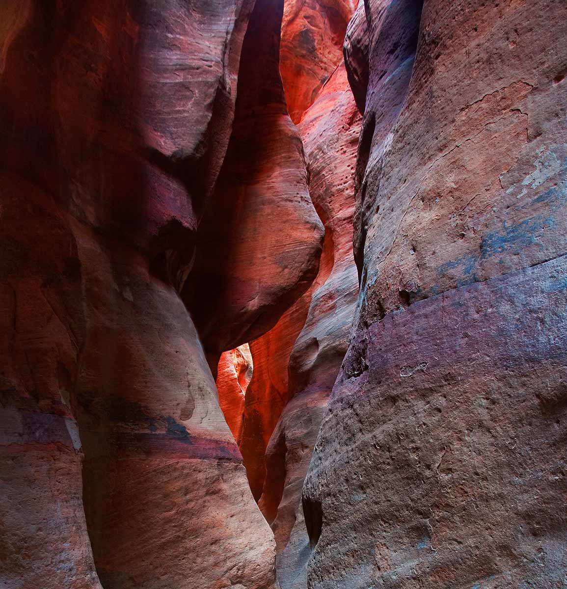
I am (as always) interested in suggestions on how this could be better. Is the hot spot too hot? I actually fooled with this one quite a bit to even out the contrast between the right and left sides and to eliminate some distractions. Thanks for all of the suggestions and help that I get. I am learning from the masters.

Comments

5 comments
Comment posted by Larry Fischer on October 30, 2010 at 9:26 AM
I have not read any other comments.
The hot spot has texture in the enlargement so it isn't blown. I think it is the focal point and works OK.
This is a great photo from the aspect of composition, lines, and texture.
If it were my photo I would make the upper rock just left of center more crisp. Everything else seems in focus but it seems slightly blurred.
the fisch
Registered on July 28, 2008, 155 Posts, 874 Comments
Comment posted by Doug Roane on October 30, 2010 at 1:51 PM
This is good, Chad, and I especially like the detail present - expept the upper left rock, which appears soft - not sure why, since the rest looks pretty sharp even in the bg
Registered on December 12, 2008, 213 Posts, 2226 Comments
Comment posted by Jim Greenwood on October 30, 2010 at 2:35 PM
Love the title! In response to your specific question, no I do not think the hot spot is too hot. You didn't include any stats, so it's more difficult to make a critique. However, everything to the left of the wall on the right looks slightly soft to me, as if you were focused on the wall on the right which is closest to the camera, instead of attempting to focus at the hyperfocal distance.
Registered on November 9, 2003, 229 Posts, 1523 Comments
Comment posted by Tony Kuyper on October 30, 2010 at 8:28 PM
The hot spot is actually a nice focal point, I think. I really like the colors and textures in this. Your "fooling around" turned out well, IMO.
Registered on November 1, 2003, 364 Posts, 22328 Comments
Comment posted by Eric Good on October 31, 2010 at 3:11 PM
Colors and exposure control looks very nice to my eye. I'd probably favor a crop off the left side (just inside that line in the LLC). I like how that places the main pathway off center. Good stuff!
Registered on March 17, 2007, 116 Posts, 4764 Comments