Gallery: WildlifePosted October 25, 201085 views6 comments
Brad, Steve and Peter, followed your suggestions...What do you guy'd think?
Comments
6 comments
Comment posted by Gary Marquart on October 25, 2010 at 3:23 PM
Hey Jerry.
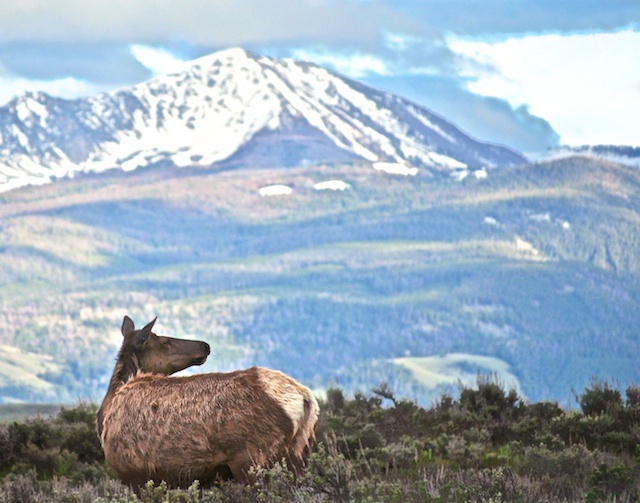
To me this has the potential to be a really nice shot. I didn't catch it the first time you posted it but my first reaction of this post was the elk is a little too far to the left but then I checked out your first post and as far as left and right goes I like where you had the elk positioned the first time better, but even in the first post I feel that maybe there should have been a little more leg room for the elk at the bottom and in this post the leg room is completely gone. I do feel the lighting on the elk is better in this post but there needs to be more room at the bottom of the photo IMO.
Registered on October 24, 2009, 126 Posts, 799 Comments
Comment posted by Lon Sharp on October 25, 2010 at 10:16 PM
The cow looks better, but here the background is beginning to feel washed out. By using some selective adjustments for just the main subject and foreground, leaving the background as originally posted, you will have the best of both...
Registered on December 9, 2007, 258 Posts, 9892 Comments
Comment posted by Steve Canuel on October 26, 2010 at 1:12 AM
I personally like the cow's placement better in this one although I agree with Gary about more room at the bottom. May be difficult to get both (left placement, more room at the bottom) from the original. With this one it seems like she's enjoying the view more.
Registered on September 12, 2010, 53 Posts, 660 Comments
Comment posted by Vincent Grafhorst on October 26, 2010 at 1:21 PM
Awesome scene Jerry, that backdrop is jaw-dropping! However, I do echo the comments made below.
Registered on February 24, 2006, 504 Posts, 7203 Comments
Comment posted by Robert Bunch on October 26, 2010 at 2:26 PM
I think this is a very nice shot in a spectacular setting so I would work on it a little more to try to perfect it. I like the first post better in all respects except the elk is too contrasty and dark so I would redo the first post in regards to crop and positioning of the elk but I would lighten up the elks body and reduce the contrast just a bit. I think the mountain BG looks better in the original post also. It looks too light in the repost.
Registered on May 18, 2004, 124 Posts, 2503 Comments
Comment posted by Brad Hill on October 27, 2010 at 8:56 AM
Hi Jerry,
I like how you brightened up the elk (retrieval of shadow detail), and the closer placement to the left side of the frame. I prefer the amount of space at the bottom of the image in the first version...and tend to agree that the background was less washed out in the previous version. Lots to consider, eh?
Thanks for putting in the effort to re-work this...cheers...
Brad
Registered on May 29, 2007, 431 Posts, 6061 Comments

Comments
6 commentsTo me this has the potential to be a really nice shot. I didn't catch it the first time you posted it but my first reaction of this post was the elk is a little too far to the left but then I checked out your first post and as far as left and right goes I like where you had the elk positioned the first time better, but even in the first post I feel that maybe there should have been a little more leg room for the elk at the bottom and in this post the leg room is completely gone. I do feel the lighting on the elk is better in this post but there needs to be more room at the bottom of the photo IMO.
I like how you brightened up the elk (retrieval of shadow detail), and the closer placement to the left side of the frame. I prefer the amount of space at the bottom of the image in the first version...and tend to agree that the background was less washed out in the previous version. Lots to consider, eh?
Thanks for putting in the effort to re-work this...cheers...
Brad