Nature Photographers Network
This is the preserved archive of the original Nature Photographers Network. The community continues at naturephotographers.network.
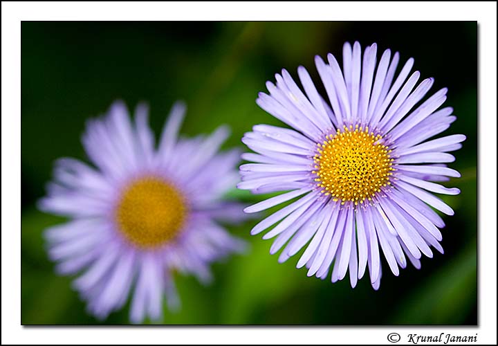
Himalayan fleabane + Repost
‹ PreviousFlora GalleryNext ›

Himalayan fleabane + Repost

by Krunal Janani

Gallery: FloraPosted October 22, 201046 views12 comments
I hope i'm not boring u guys with the ongoing Himalayan series :razz:
After looking in the big screen i feel i sud have given the image more breathing space, wot do u guys think??

Flower Name:- Himalayan fleabane (Erigeron multiradiatus)
Av-5.0, Tv-200, Handheld, 100mm

Comments

12 comments
Comment posted by Miro Susta on October 22, 2010 at 5:21 AM
I like the colors. The right side is perfect but I'd allow more space at the left side (especially left down). Nicely done Krunal. :wink:
Registered on August 18, 2006, 719 Posts, 3736 Comments
Comment posted by Carol Hyman on October 22, 2010 at 7:35 AM
Hi Krunal,

I think you've done a great job of separating the FG Fleabane from the OOF BG one. I think if you flip this image horizontally, you will be very, very pleased with the result.

The in-focus flower will really stand out.

I think you could use just a little more space on the bottom but not too much.

Nice job.

Carol

I like the Repost. Do you? Krunal, as far as content fill it works best on small places. When adding canvas, it helps a little but still cloning is necessary. And it does take some practice. Here's a good article. http://www.all-things-photography.com/cloning-in-photoshop.html. Have fun and god luck.
Registered on January 18, 2007, 597 Posts, 8062 Comments
Comment posted by Craig Strand on October 22, 2010 at 7:44 AM
Boring? If they are all as beautiful as this, please bring them ON! I like this a lot Krunal, the OOF Bloom and BG really has the main bloom almost popping off the screen. Good job!
Registered on March 30, 2008, 416 Posts, 2885 Comments
Comment posted by Pat Sampson on October 22, 2010 at 7:52 AM
I'd probably give the image a little more room on the bottom. The trade off is that the viewer will see a little less detail in the sharp bloom. I like your composition in this and the dof decision. You're certainly not boring me with your Himalayan series.

I'd try Carol's idea on the flip I think.

Pat
Registered on May 19, 2007, 953 Posts, 15989 Comments
Comment posted by Krunal Janani on October 22, 2010 at 9:47 AM
here it goes carol :wink:
i've not added canvas as i've still not learn how to clone it properly after adding canvas
maybe i've to get CS5 (asap) and jus use content fill :biggrin:
Registered on September 16, 2010, 60 Posts, 1370 Comments
Comment posted by Bruce King on October 22, 2010 at 11:26 AM
Himalayan Fleabane.......I love the name and the image. I like space around the subject most of the time, especially if the bg is interesting and this one is. So, I agree it would benefit from more room. The dark and light tones are very nice and the conflicting focus on the blossoms make it very appealing. :toast:
Registered on January 14, 2010, 276 Posts, 2212 Comments
Comment posted by scott lanz on October 22, 2010 at 1:38 PM
Really like the colors and details in the foreground flower. Good choice on the DOF. The back flower complements and does not compete. Not sure why the suggestion was made to flip this horizontally. Looks pretty much the same to me. Maybe vertically?
Registered on November 14, 2003, 840 Posts, 12902 Comments
Comment posted by Ramamohan Pai on October 22, 2010 at 5:28 PM
Krunal, I have no preference for either orientation :smile: - both work just fine for me. Superb details, complementary colors and a good echo effect :toast:
Registered on November 1, 2003, 550 Posts, 9037 Comments
Comment posted by Gary Yeoh on October 23, 2010 at 12:42 AM
Krunal:
Enjoying your Himalayan series, so keep them coming.
Like the echo effect with good choice of DOF.
Registered on September 1, 2009, 588 Posts, 8184 Comments
Comment posted by Nathan Buck on October 23, 2010 at 2:33 AM
Hi Krunal.

The repost is my favorite of the two. For me the flow of that one is better. I really like the use of the DOF. Great color too.

Nathan
Registered on November 1, 2003, 1101 Posts, 13589 Comments
Comment posted by Morris McClung on October 26, 2010 at 6:37 PM
Nice color, light, dof, and pov. Our language reads left to right, which is probably why the repost appeals to us Westerners. I would be curious to see if someone whose language reads right to left would like the first post better. :biggrin:
Registered on May 7, 2007, 670 Posts, 19650 Comments
Comment posted by Krunal Janani on October 27, 2010 at 10:14 AM
after seeing the flipped version even i like it more, & yea i agree with you Morris on the language point :smile:
Registered on September 16, 2010, 60 Posts, 1370 Comments