Nature Photographers Network
This is the preserved archive of the original Nature Photographers Network. The community continues at naturephotographers.network.
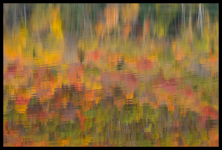
Autumn Ripples
‹ PreviousLandscape GalleryNext ›

Autumn Ripples

by Justin Reznick

Gallery: LandscapePosted October 18, 2010250 views27 comments
Some of you had mentioned that the reflection in the pond from my last image posted would be a great abstract. Seems fitting to follow up with my abstract image from the same fantastic morning.

Ricker Pond State Park, Vermont

Canon 7D
Canon 70-200mm f/4L IS
ISO 400
f/16
1/13 sec.

Comments

27 comments
Comment posted by Chris Chamberlain on October 18, 2010 at 12:52 AM
Been studying Monet, huh? This is fantastic! Really can't get better than this in a fall color reflection abstract. Really nice. Oh, by the way, the first full view was excellent too!

Chris
Registered on March 13, 2007, 500 Posts, 8365 Comments
Comment posted by Art Escobado on October 18, 2010 at 12:53 AM
looks nice-i think it can work upside down too
Registered on January 7, 2007, 0 Posts, 775 Comments
Comment posted by Lon Overacker on October 18, 2010 at 12:56 AM
Justin,

Now, just flip this "up side down" and you'll have a "real" abstract version. I suppose that's an option that probably makes people react differently - but it's an option you might explore.

But no matter, as Chris puts it so well, this is fantastic!

I think the reason that I"m thinking of flipping this is that the dark greens and bare trunks would work very well to anchor the scene - at the bottom of the frame.

But regardless, the colors, the abstract nature of the reflection and the soft ripples really make this one special. No doubt this will make a stellar print!

Lon
Registered on November 24, 2006, 521 Posts, 19147 Comments
Comment posted by Justin Reznick on October 18, 2010 at 1:11 AM
Thanks for the feedback so far! For comparison here's the upside down version:

Registered on November 24, 2009, 79 Posts, 515 Comments
Comment posted by Vance Gese on October 18, 2010 at 1:19 AM
Beautiful autumn abstract, Justin. The pattern and colors are outstanding. Really like the tree trunk lines coming across as a nice counter to the color. Really well done.
Registered on November 13, 2008, 298 Posts, 6629 Comments
Comment posted by Lon Overacker on October 18, 2010 at 1:20 AM
Hmmmmmmm, maybe I was wrong.... :rolleyes:

For some reason, the top of the original post seems a tad dark than the "bottom" of the re-post. I'm sure just an illusion. Maybe darkening the "bottom" of the flipped version... but now I'm really not sure.

Let's see what others think, but I'm not so sure of my suggestion now. (And no worries, my impression of this beautiful abstract reflection hasn't changed in the least!)

Lon
Registered on November 24, 2006, 521 Posts, 19147 Comments
Comment posted by Chip Phillips on October 18, 2010 at 1:24 AM
Very pretty Justin. Very painterly. I like the fact that you can see some of the tree trunks. I like the upside down version.
Registered on November 26, 2007, 128 Posts, 1436 Comments
Comment posted by Giovanni Russello on October 18, 2010 at 2:01 AM
Very beautiful.
The original post works much better IMO.

great stuff.
gio
Registered on January 21, 2007, 95 Posts, 1617 Comments
Comment posted by scott lanz on October 18, 2010 at 7:37 AM
Excellent. Another alternative is a panorama of the the bottom 1/2 (of the original post). I think this would work as well.
Registered on November 14, 2003, 840 Posts, 12902 Comments
Comment posted by Arild Heitmann on October 18, 2010 at 7:38 AM
wonderful abstract, Justin!
Registered on October 13, 2010, 27 Posts, 378 Comments
Comment posted by Barbara Graham on October 18, 2010 at 8:07 AM
This image framed looks exactly like a beautiful painting. I can see it hanging on someone's wall, a really large canvas.
Registered on July 27, 2010, 1310 Posts, 5035 Comments
Comment posted by Mitch Moraski on October 18, 2010 at 8:12 AM
Hey Justin,

Nice comp dude! This is just 20 minutes from my home. Great area. A favorite stopping ground of mine. Fall this year here in VT was so-so. I've seen better. Groton Forest is always primed with great color however. :toast: :toast: :toast:
Registered on August 3, 2008, 105 Posts, 590 Comments
Comment posted by Nick Bristol on October 18, 2010 at 9:26 AM
Great fall color abstract, Justin. Very pretty to look at.

Nick Bristol
Lone Rock, WI
Registered on February 1, 2004, 752 Posts, 14140 Comments
Comment posted by Bill Chambers on October 18, 2010 at 9:54 AM
This is very nice Justin. I might boost the contrast just a bit, but I'm on an uncalibrated monitor at the moment, so that might be unwarranted. Overall, just beautiful. I would definitely print this large and hang proudly.
Registered on April 10, 2005, 753 Posts, 21216 Comments
Comment posted by Kurt Budliger on October 18, 2010 at 9:58 AM
Very nice reflection and color throughout. Not sure which I prefer :confused:
Registered on June 11, 2006, 113 Posts, 2116 Comments
Comment posted by Joseph Rossbach on October 18, 2010 at 10:16 AM
Beautiful refection Justin. the color looks tremendous man!!! :toast:
Registered on November 25, 2005, 484 Posts, 1377 Comments
Comment posted by Justin Reznick on October 18, 2010 at 11:44 AM
Mitch - I keep hearing fall was so-so, I can't wait to go back and see it hit full stride!
Registered on November 24, 2009, 79 Posts, 515 Comments
Comment posted by Laurent Baig on October 18, 2010 at 12:14 PM
Very nice, Justin.
Registered on January 12, 2005, 206 Posts, 6784 Comments
Comment posted by Floris van Breugel on October 18, 2010 at 1:40 PM
Fascinating, Justin. I love how there's both little ripples, as well as clearly defined blotches belonging to individual trees, and the trunks as well.
Registered on December 19, 2008, 306 Posts, 4840 Comments
Comment posted by Eric Good on October 18, 2010 at 2:05 PM
Very painterly... love it!
Registered on March 17, 2007, 116 Posts, 4764 Comments
Comment posted by Tony Kuyper on October 18, 2010 at 3:55 PM
Yeah. That's better. :toast:
Registered on November 1, 2003, 364 Posts, 22328 Comments
Comment posted by Harley Goldman on October 18, 2010 at 4:43 PM
Really sweet abstract, Justin. Very Monet, as mentioned.
Registered on November 19, 2003, 586 Posts, 11271 Comments
Comment posted by Bill Leggett on October 18, 2010 at 5:36 PM
Excellent abstract, Justin! I like it both ways. A couple of options for cropping you might consider: one is to crop about 20% from the top to exclude most of the trunk reflections, or another to crop from the right to exclude the three bunched together. Fine work!
Registered on July 21, 2004, 706 Posts, 3233 Comments
Comment posted by Anthony Vincent on October 18, 2010 at 8:43 PM
The flipped version rocks..... I think you can coax a little more color out :smile:

Well seen Justin
Registered on February 5, 2009, 199 Posts, 2775 Comments
Comment posted by Cliff Dodge on October 18, 2010 at 11:28 PM
Very artistic looking. Nice capture. :smile:
Registered on March 25, 2006, 125 Posts, 507 Comments
Comment posted by Morris McClung on October 19, 2010 at 10:17 AM
Marvelous abstract. Great color and the ripples lend an impressionistic feel. The flip is even better for effect.
Registered on May 7, 2007, 670 Posts, 19650 Comments
Comment posted by Robert Dayton on October 19, 2010 at 11:59 PM
Beautiful, Justin!
Registered on November 11, 2008, 281 Posts, 3958 Comments