Nature Photographers Network
This is the preserved archive of the original Nature Photographers Network. The community continues at naturephotographers.network.
WC#453 Fall Colors
‹ PreviousWeekly Challenge GalleryNext ›

WC#453 Fall Colors

by Ryan Rosebush

Gallery: Weekly ChallengePosted October 11, 201067 views7 comments
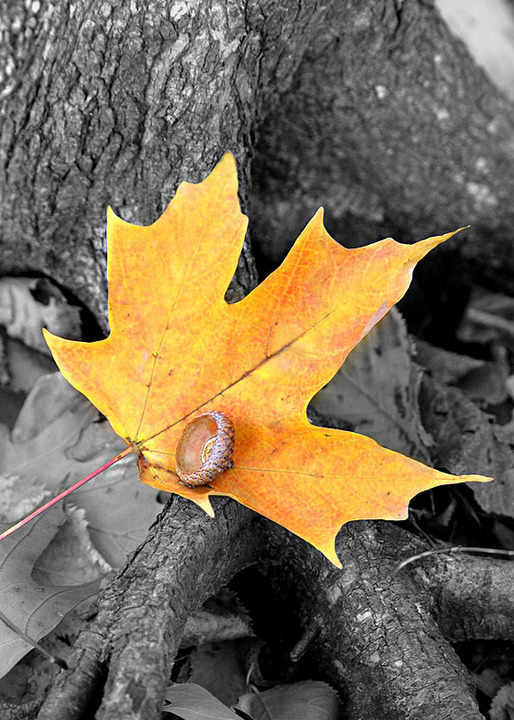
Here is an autumn photograph that I took up in Michigan which has been altered in Photoshop using the history brush tool. My goal was to make the background black/white with the idea that it would better bring out the color on the leaf.

Canon 20D
Canon 24-70mm f/2.8L at 70mm
ISO400 1/25 sec f/4

Comments

7 comments
Comment posted by Gary Minish on October 12, 2010 at 3:36 AM
I like the color contrast in this, Ryan. It looks like you accomplished your goal. I'm not sure what that is holding the leaf down but I think I would like it better without it. Still, a very nice image.
Registered on February 4, 2006, 625 Posts, 3583 Comments
Comment posted by Bill Chambers on October 12, 2010 at 10:53 AM
Very neat image Ryan, and excellent PS processing. :toast:
Registered on April 10, 2005, 753 Posts, 21216 Comments
Comment posted by Stan Rose on October 12, 2010 at 7:33 PM
Nice subject, and i kind of like the acorn cap. The top of the leaf looks a bit blurry, otherwise everything looks good. My personal opinion of the technique is that it has been done so often (and usually with flowers or other bright objects) that it has become a bit cliche and gimmicky, but that's just the way i see it and the public at large should be your target audience--not me! If it were mine, i would have desaturated the leaf and saturated the background--but that is why im a starving artist :wink:
Registered on September 15, 2005, 836 Posts, 17099 Comments
Comment posted by Bob&Charly Nelson on October 13, 2010 at 3:35 PM
The top of the leaf looks a little OOF to me, but I like the effect you've captured here. I usually use this for the brides and their flowers, but why not nature.
Bob
Registered on October 27, 2005, 289 Posts, 4202 Comments
Comment posted by Jim Greenwood on October 13, 2010 at 9:01 PM
An oft used technique, but you’ve employed it well here. The upper right corner is a little distracting to me. I’d suggest cropping off the top to eliminate this, or alternatively doing a local highlights adjustment of that bright area.
Registered on November 9, 2003, 229 Posts, 1523 Comments
Comment posted by John Williams on October 14, 2010 at 1:07 PM
Love the acorn, it is a nice highlight.
Registered on September 6, 2007, 221 Posts, 5985 Comments
Comment posted by Gary Reed on October 16, 2010 at 3:46 PM
I think from an art point the colour works. I don't like the acorn on a maple leaf.. Not sure why..my brain just screams...USE an OAKLEAF.... :razz:
Registered on September 19, 2009, 198 Posts, 1074 Comments