Nature Photographers Network
This is the preserved archive of the original Nature Photographers Network. The community continues at naturephotographers.network.
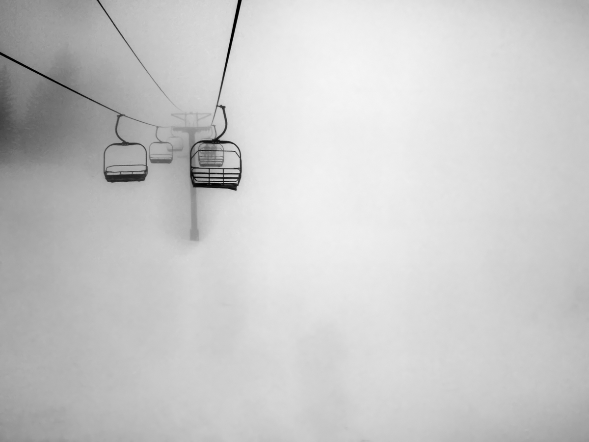
Chairlift In the Clouds
‹ PreviousMan & Nature GalleryNext ›

Chairlift In the Clouds

by Jonathan Sinclair

Gallery: Man & NaturePosted October 4, 2010155 views4 comments
This is a repost of an image from february 2010.
I took this image during winter of 2009 at Red Mountain Ski Resort. At the top of the mountain it was so thick, we could not even ski.

Because of this photograph, I was chosen as a 2010 Photo Life Canadian Emerging Photographer. One of 37 Canada wide.

I am very excited as this is my first image to get published, and in a nation wide photography magazine!!

f/5.6 1/400 sec ISO 64

Comments

4 comments
Comment posted by Morris McClung on October 4, 2010 at 11:33 PM
Very artistic!
Registered on May 7, 2007, 670 Posts, 19650 Comments
Comment posted by Sam Chrysanthou on October 4, 2010 at 11:46 PM
This image has GREAT mood and is a good example of a composition dependent on tonal contrast to make it work. I am perplexed though about your fast shutter speed and low ISO; did you mean ISO 6400?

Compositionally, this image is almost top-shelf. For me, there are two main flaws with this picture. One is merging. If you were able to obtain this photograph without merging between the chair on the right and the chairlift pole, then I would rank this image as one of the top photographs I've seen this year.

The second flaw that I can see is the half included spruce on the left of the image frame. While the trees add a bit of exciting drama to this image, the disembodied branches on the left are a distraction and not an aid to the most important parts of this image.

I hope I am not coming across too harshly as this image has a lot going for it. But, in my mind high tonal contrast does not erase compositional weaknesses in the final image.
Registered on December 18, 2007, 71 Posts, 1191 Comments
Comment posted by Ian Cameron on October 5, 2010 at 4:41 AM
Cool. Like it minimalist and eerie. There are some disconcerting shadows around the tower and at the 5 O'Clock position beneath the right hand chair which look like Photoshop heals. If these were attended to I think it might be improved further. I don't mind the cut off tree or the overlap on the chair and pole as the tones separate well enough, one being very dark the other a much lighter grey.
Registered on August 6, 2004, 1125 Posts, 3318 Comments
Comment posted by Andrew Finlayson on October 6, 2010 at 6:57 PM
Great use of negative space in this image. I'd agree with Samanthas insightful comments but I still really like this image. Well done.
Registered on July 29, 2010, 26 Posts, 404 Comments